GitClear's most evolved feature has done a lot of evolving over the years.
link2019: v1 Debut of Commit Activity Browser
The first version of the Commit Activity Browser introduced the idea of sizing commits based on how much Diff Delta (durable code change) each commit contained:
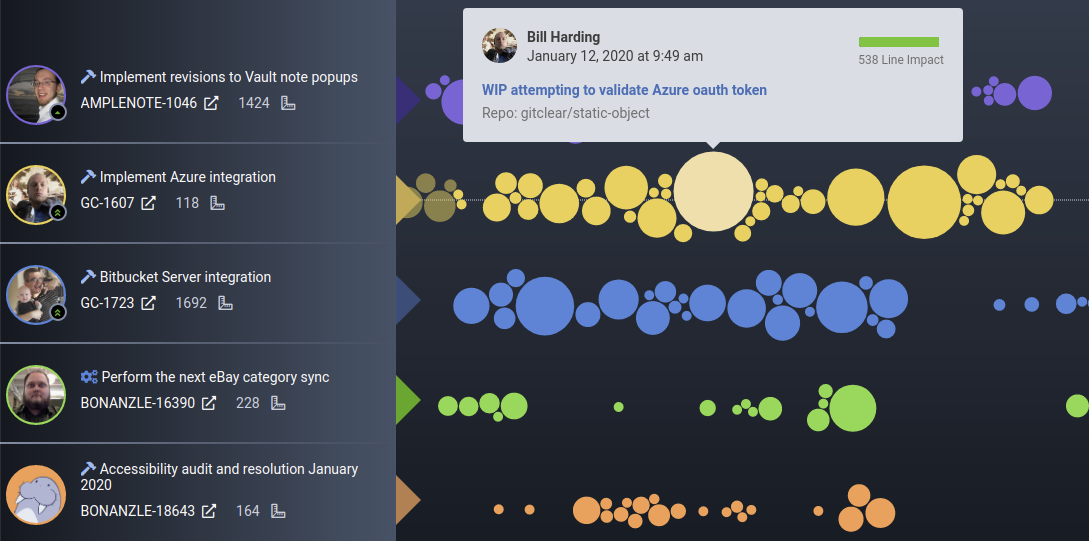
There wasn't a lot to see, and there was no means to configure the coloring at this point, but it was still exciting to have a single view that could show how many commits were being made by each team member, regardless of which repo those commits were being made to.
link2020: v2 Adds customization in grouping
The second version of the browser added two key upgrades: user-controlled commit group size (one day or three day?) and being able to quickly see which commits were missing a Jira ticket (the ones with the line through them)
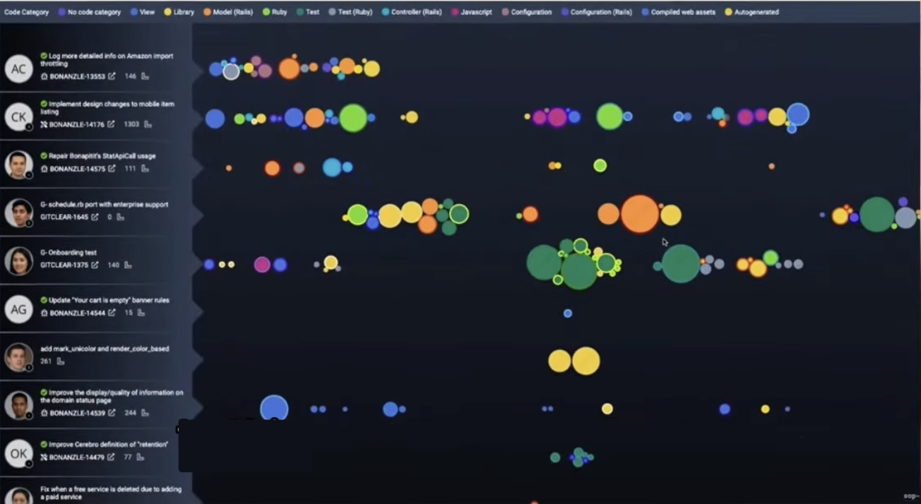
v2 added detailed left side details & indication of whether a Jira was known for commit
The coloring was still static, and any settings change required a page load (as did seeing earlier commits) but this was the first version that we started to have customers sign up to get access to.
link2022: v3 Adds customized coloring, more commit labels
By 2022, we were making videos about the CAB, as it had become a very powerful tool at this point. We had put a lot of polish into the left pane presentation, to give a sense for how this developer's week has progressed relative to their median from the past year. We also offered informative tooltips and commit borders that correspond to the group the commit was in:
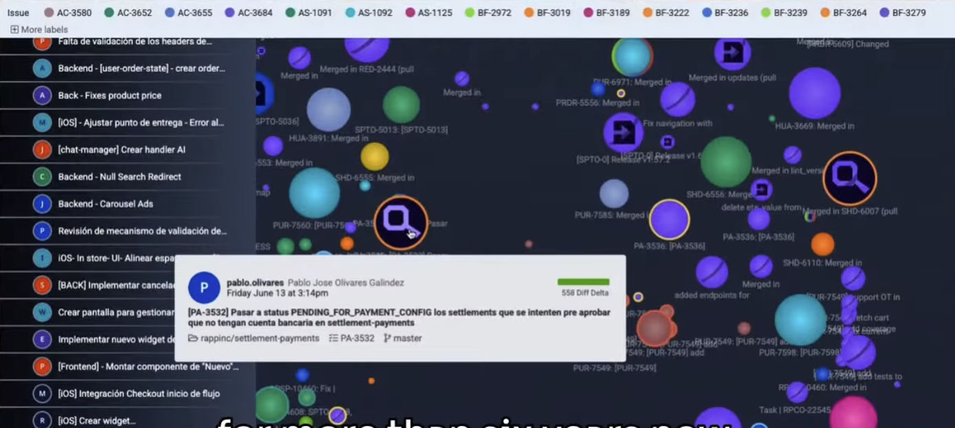
v3 added 3d depth to commit circles
By this point, you could also click on any commit or group to see the changes underway in GitClear's diff viewer. The page often took 10+ seconds to load, but once it did, users could customize how their commits were colored by choosing from "Repo+branch," "pull request," etc.
link2025: v4 Per-day loading, infinite drag-to-scroll, real-time config updates
By this point, the wind was at our back – we had a highly functional tool that we were using every single day to instant-capture the state of our development effort. What we still needed was a way to guess which commits were most important among an often-large cluster of possibilities. New icons to the rescue:

Litany of different iconography utilized to pinpoint when an important change happened
We also added the option to annotate each commit with a snippet of its checkin note:
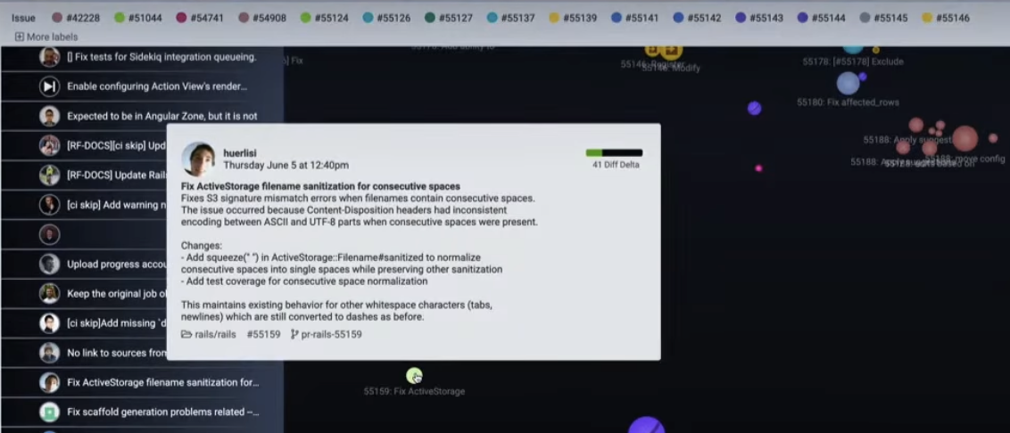
v5 added optional, hard-to-read text
While the convenience of our new icons was making the tool more useful than ever, the biggest improvement we pursued during v4 was structural: load time. We rewrote the Commit Activity Browser from the ground-up, to utilize per-date commit loading, which allowed us to easily cache activity from past days into insta-returned JSON. Better still, loading commit activity per-date opened the door to draggable commit history:
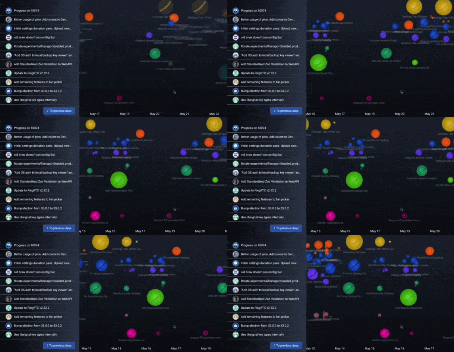
v5 introduces the means to grab a date and scroll
Not to mention config changes that are now instantly applied, if you want to swap between seeing commits by "repo+branch" or "Jira ticket worked on."
link2026: v5 Adds group labeling, drag positioning
At this point, we're starting to get indulgent. Yes, we can see what is happening at a glance. Yes, we can see when dependencies and migrations are happening across all our repos. Yes, we can drag back through an entire sprint to see the various projects underway.
But to see the actual commit content, we still had to either read the tiny (often overlapping) per-commit checkin messages, or go hover on a commit. The long-term dream has always been to have a single page that conveys everything happening in every repo, without requiring user interaction. To that end, we debut group titles:
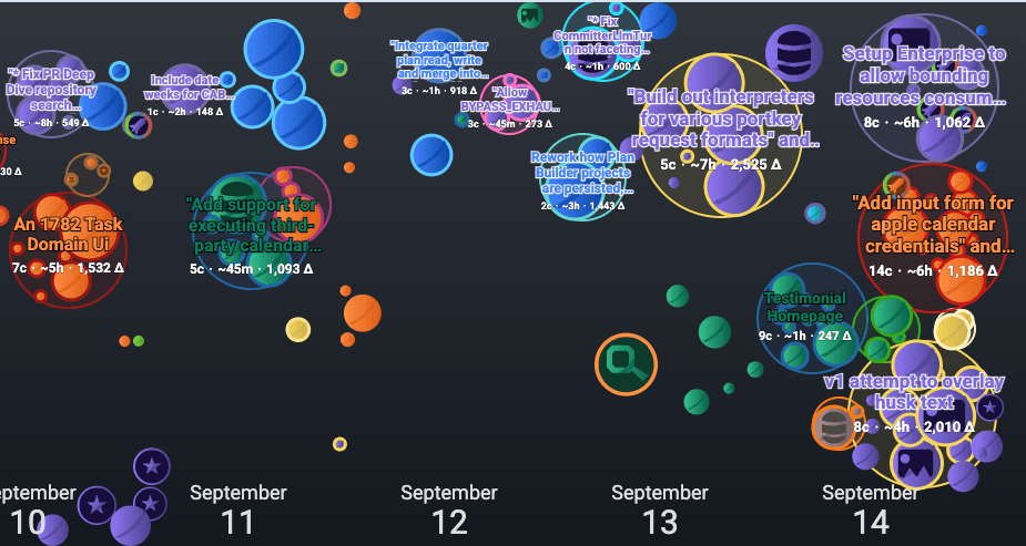
The first release where entire groups of functionality are visible at a glance
This is a momentous leap in terms of being able to convey the totality of what a team is working on across all of its repos. Along with allowing per-group titles to be shown, v5 also introduced:
Outline and bundle commit groups. Previously, commit groups were identifiable only by virtue of sharing a border color. Now, they cluster together and include a "husk" border to reinforce their shared identity
Click and hold a commit to drag it to a new location within its date. All dragged commits have their position stored after a drag, so subsequent page loads will attempt to render the group where you left it.
Enlarged date labels. The date of the commit activity was easy to miss when the labels were small.
Auto-shrink overcrowded committer+dates. Now that development has been supercharged, it has gotten more difficult to fit commits into the width we were allocating to each date. To address this, we now calculate the cumulative area of each committer's commits for a day, and we shrink them to half-size if they won't fit into the area available for a day.
linkConclusion: A picture is worth a lot of words
When committers only authored 1-3 commits per day, it was OK to use tools that only showed commit history for a single repo, without a sense for which commits were large or small. That time has passed.
In order to understand everything being pushed by modern committers and their assistants, it has become inescapably apparent that new ideas are needed to help teams follow everything being authored. Combining the Commit Activity Browser with our co-evolving Diff Viewer, we believe that GitClear provides a valuable glimpse into the truth of progress.
If it helps developers skip out from a mandatory daily meeting to describe "what's new," so much the better!
Did you enjoy this post? We have considered doing a companion article on "Historical Diff Viewer," since our diff viewing experience has evolved in concert with the Commit Activity Browser. It's unclear if the public has an appetite for such "inside baseball" timelines, so email hello@gitclear.com if you think that would be a story you'd like to read?