link1. Status without Standup Meetings
The Commit Activity Browser eliminates the need to break a developer's flow state every morning on behalf of getting an update on which ticket(s) they're working on. Every ticket being worked on is presented, alongside the developer's code and the rate at which it's coming together. Check out our visual usage guide to Commit Activity Browser.

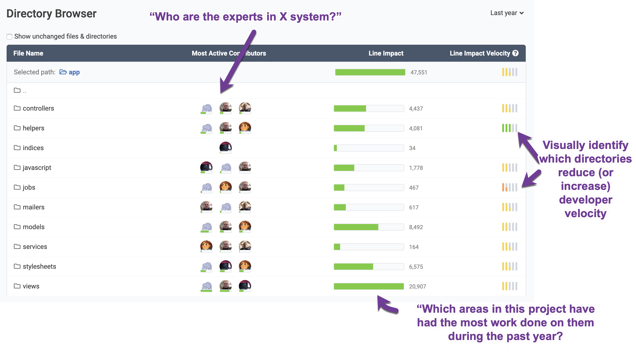
link2. Google Maps for your repo
The Directory Browser answers essential questions that GitHub, GitLab, et al can't. Which modules have been getting actively developed during the past year? Who has been working on them? Which directories correspond to rapid evolution vs which stymie & frustrate the dev team? Find all the prominent landmarks in your repo. Learn more about Directory Browser.
link3. Industry Benchmarks Comparison
How does your team's median developer compare to today's iconic technology behemoths? It turns out that what makes Microsoft, Google and Facebook so unique is how much they get done at scale, relative to other companies their size (who tend to get bogged down with meetings and process). Read our Industry Benchmarks launch blog.

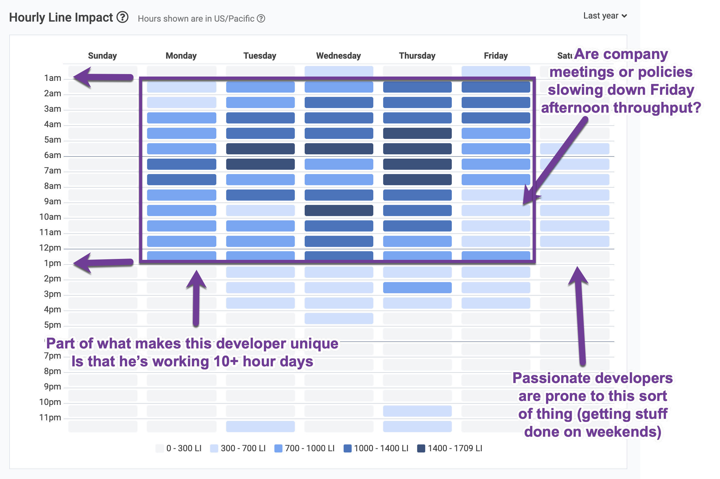
link4. Isolate productivity dead zones
The Hourly Line Impact graph lets us understand the weekly patterns of the team, or its individual developers. The Hourly Line Impact graph for trueadm (from the screenshot we showed in #3) is shown below. You can see a couple spots that are pretty light (Friday afternoon, mid-day Tuesday), but on the whole, this guy is what Paul Graham would call "a coding animal." Deep dive into the Hourly Line Impact graph.
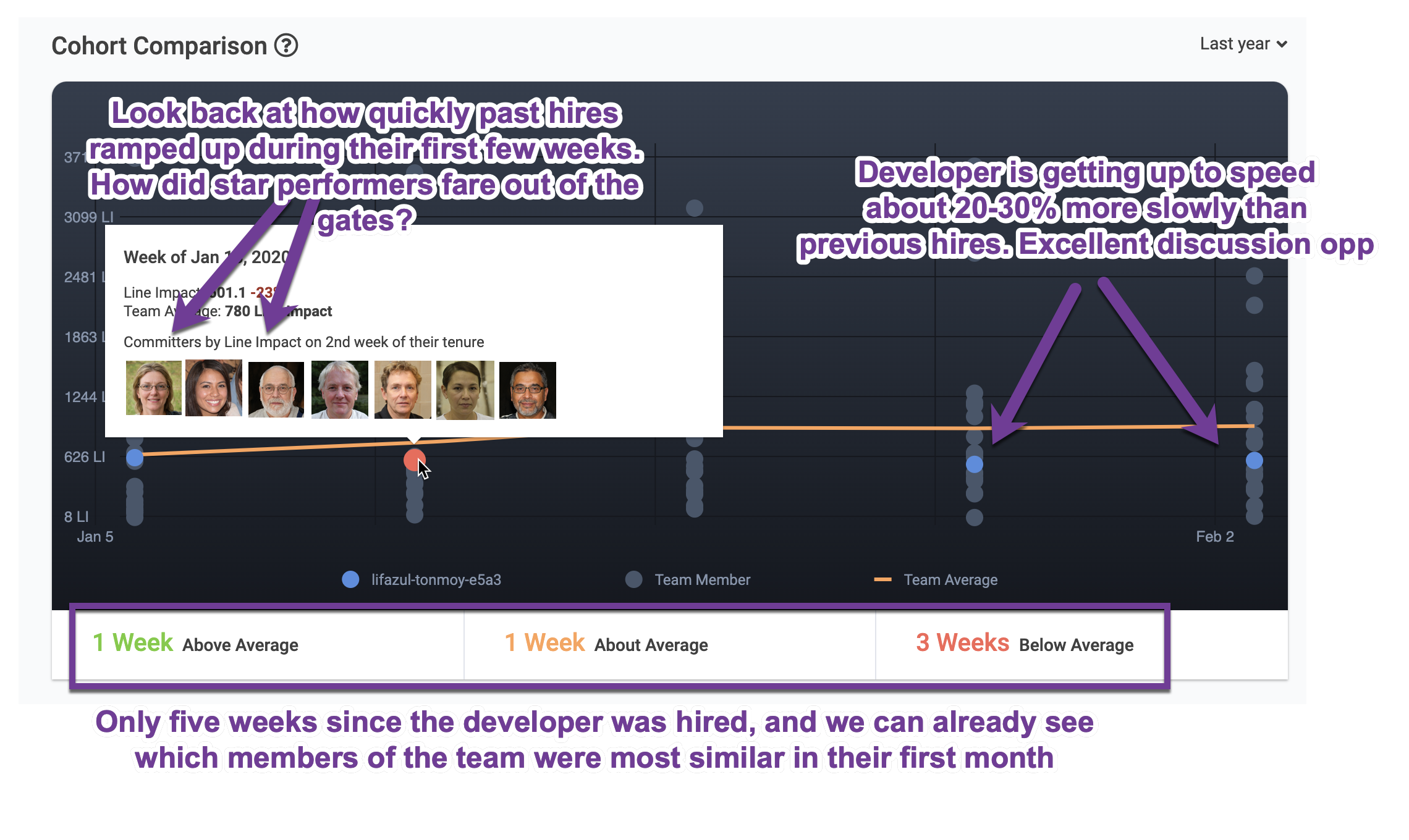
link5. Don't wait 3-6 months before helping new hires
The Developer Cohort Report is GitClear's most celebrated feature. Because we can process the entire history of a repo, we can immediately recognize when we've hired an outstanding new contributor 🔥, or somebody who could benefit from manager intervention. This report is the perfect conversation starting point for a manager who wants to help their new hire. It also contributes to measuring how effective a company's onboarding process is, so that can be continuously improved from hire-to-hire. The screenshot below shows a developer who was hired 5 weeks ago -- during three of those weeks they've contributed less than past hires averaged during their first five weeks at the company. Help your new hires hit the ground running.
link6. Who are the domain experts?
The Domain Experts report (under the "Issues" tab) serves to identify a project's domain experts. This can help a manager make informed decisions about who to send a particular ticket toward, even if the manager is new to the team and has very little history about their developers' relative strengths. It can also help new developers identify who to chat with if they get stuck trying to implement a type of technology that is new to them. See also: the release notes on Domain Experts.

link7. Is the PR process running efficiently? Do bugs make it through the process?
The team Pull Request report evaluates how smoothly a team's collaborative process is running. The report presents all facets of the collaborative process, answering questions like: How big have pull requests been when submitted (the smaller the better)? How much revision was necessary after the pull request was submitted? How much revision occurred after the pull request was merged? And quite a bit more.
All PR stats can be viewed at the team-level, or at the individual developer level.

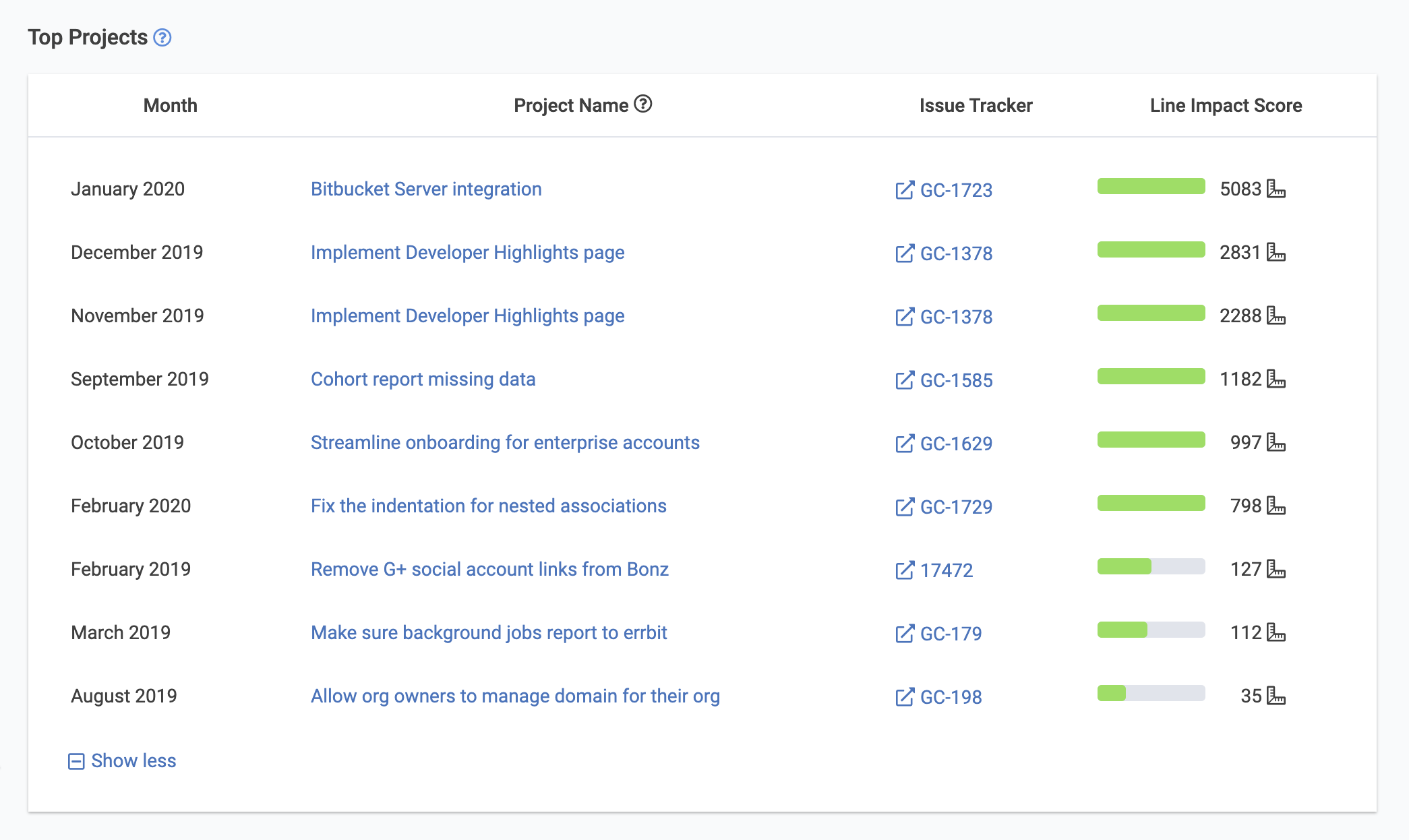
link8. Biggest Jira ticket worked by month
A developer's Project Summary tab indicates the biggest Jira ticket they worked on during each month of the past year. This visualization provides an effective countermeasure to avoid recency bias when making decisions at annual review time. If you're a manager who considers their developer's issue tracker tickets during the annual review process, this table will shave an hour or two from every annual review you prepare. At the same time, it will give you a chance to reflect on whether projects completed half a year ago ended up being successful, bug-ridden, or ongoing maintenance problems. Each month provides a link to the code that implemented the issue, and to the ticket description in Jira.
link9. Celebrate the best of what every developer brings to the team
Each developer has their own "Highlights" report that calls out specifics of how they're making the project a better place. It answers questions like: does this developer carve out time review their teammates' code? Are they removing more code than the average developer? Do they consistently add tests for their code? Do they document the code they write? Here's a sample of what we showcase on the developer highlights page:

link10. Identify teams whose habits maximize velocity
How much did your team get done this month vs past months? How did 2019 look compared to 2018? Answers to the highest-level questions are available with a few clicks using GitClear. We do more than any competitor to create apples-to-apples (aka "well normalized") cross-team data comparisons. This means you can check out how code activity is trending across different regions or Agile methodologies. Imagine being able to compare the productivity per developer in Eastern Europe to that of their U.S. counterparts. We help you spot the most productive teams in your organization -- so you can understand what makes them tick and do more of it.

linkContext is king
While it's not a "flashy feature" per se, it's worth noting that every report shown above is flexible with regard to the time range and developers featured.
When you sign up for GitClear, we'll analyze the entire history of your repos, even if that history stretches back 10+ years. You can then pinpoint any date range within the entire history of the company to be analyzed.
These stats can be viewed at the repo level, organization level, or "entity" level, which aggregates all of the organizations across the entire company.
Managers can also create arbitrary "teams" of developers, like "front-end developers," "new hires," "system architects," "recent code school grads," "L7 developers," etc. This ensures that if you're viewing a page like the Cohort Report, you're only comparing like-with-like.