Thanks to 10 years of Google DORA research, the software industry has absorbed a basic lexicon of "metrics used by successful developer teams." But the ecosystem of "Developer Analytics" tools only began to take hold in the early 2020s, with the ascent of GitClear, GetDX and LinearB. Outside of DORA, there has been no single ledger of "what reliable software metrics exist?" let alone "what metrics are most often indicative of a team living up to its full potential?"
Thus the origin of this page: to serve as an "Illustrated Encyclopedia of Developer Analytic Metrics." If there is a developer metric worth knowing, you will find it - with units (and often, pictures) - by the conclusion of this tome.
As of 2025, this page describes about 80 developer metrics. All metrics are available to GitClear customers. You can build your favorites into a custom dashboard, and compare "Outlier Teams" on the dimensions that matter most to you (Story Points, Lead Time, Defect Rate, etc). Many of the metrics are also available to customers of GitKraken Insights, since GitClear's API supplies the data used there.
Retrieved stats can be aggregated:
By date: Any data can be filtered arbitrarily. Selectable date ranges allow stats to be viewed "by past week," "by a specific time range," "within the past two sprints," or even "past 15 years." Plus everything in-between, for Elite subscribers.
By team. As part of our policy on Developer Friendly metrics, GitClear encourages customers to evaluate results collectively, as a team. Teams can be created via API, importing from GitHub, or by emailing an invite link.
By resource. Stats can be viewed by repo, organization, or by "collection of organizations."
Depending on the report, and whether developer access has been granted, it is often possible to segment a report by committer. This allows developers to review their history & better understand their strengths and challenges.
To receive notifications when your stats are getting bad, see Team goals: Pick up to 30 team goals to ensure code quality, developer experience, more.
linkTable of Contents
For those who don't sit down and sequentially read their encyclopedias.
linkAI Impact & Developer Cohort Stats
linkDeveloper Satisfaction & Code Sentiments
linkTech Debt & Code Quality
linkGoogle DORA Stats
linkIssue Tracker & Sprint Stats
linkPull Request Stats
linkVelocity and Domain Expert Stats
All ~80 of these metrics are available with a Elite or Enterprise subscription. Most are also available via a trial or a Pro subscription.
linkAI Impact & Developer Cohort Stats
Before we begin counting up GitClear's code metrics for DORA, issues, and velocity let's start with a few appetizers that help assess AI usage for those using Claude Code (Teams or Platform), GitHub Copilot, Cursor, Augment or Gemini CloudAssist.
Stat Name | Description | Date Defined By | Reports API Segment |
Prompt Acceptance Percent | Percent of non-tab (line-complete) suggestions accepted: non_tab_approval_count / non_tab_suggestion_count. | AI provider usage_date |
|
Prompt Suggestion Count | How many non-tab (line-complete) prompts the AI showed; sum of prompted_request_count. | AI provider usage_date |
|
Tab Acceptance Rate | Percent of tab (inline) suggestions accepted: tab_accept_count / tab_prompt_count. | AI provider usage_date |
|
Tab Suggestion Count | How many tab (inline) suggestions the AI offered; sum of tab_suggest_count. | AI provider usage_date |
|
AI Provider Lines Added | Lines the AI provider reported as added; sum of lines_added_count. | AI provider usage_date |
|
AI Provider Lines Deleted | Lines the AI provider reported as deleted; sum of lines_deleted_count. | AI provider usage_date |
|
Engaged AI Developers | Count of distinct committers (or provider committer identities, for default team) that had any AI provider activity in the interval. | AI provider usage_date |
|
Inactive AI Provider Accounts | Seated developers minus engaged AI developers — those with a seat but no provider activity in the interval. | AI provider usage_date (paired with team's committer_active_dates.stat_date) |
|
AI Usage Cost | Dollar spend on AI provider usage outside monthly subscriptions; sum of cents_cost. | AI provider usage_date |
|
All Suggestions Count | Total AI suggestions (tab + non-tab); sum of all_suggest_count. | AI provider usage_date |
|
Review Minute AI Cohorts | PR review minutes per cohort member, grouped by AI-usage cohort. | Cohort week start_date (TeamCommitterHistoryWeek) |
|
Churn Percent AI Cohorts | Churned-line count per cohort member, grouped by AI-usage cohort. | Cohort week start_date |
|
Diff Delta AI Cohorts | Diff Delta per cohort member, grouped by AI-usage cohort. | Cohort week start_date |
|
Commit Count AI Cohorts | Commits authored per cohort member, grouped by AI-usage cohort. | Cohort week start_date |
|
Story Point AI Cohorts | Story points resolved per cohort member, grouped by AI-usage cohort. | Cohort week start_date |
|
Test Code AI Cohorts | Test-file Diff Delta per cohort member, grouped by AI-usage cohort. | Cohort week start_date |
|
Total Token Count | All tokens consumed: uncached input + output + cache reads + cache writes. | AI provider usage_date |
|
Input (Uncached) Token Count | Full-price input tokens (not served from or written to cache); sum of input_token_count. | AI provider usage_date |
|
Input Cached Read Token Count | Discounted input tokens served from cache; sum of cached_read_input_token_count. | AI provider usage_date |
|
Input Cached Write Token Count | Premium-priced input tokens written to cache; sum of cached_write_input_token_count. | AI provider usage_date |
|
Output Token Count | Tokens the model generated; sum of output_token_count. | AI provider usage_date |
|
AI-Assisted Commit Percent | Share of commits that included any AI-generated lines: commit_count_with_ai_lines / commit_count. | Commit authored_at |
|
Diff Delta per AI Dollar | AI-attributed Diff Delta divided by dollars of AI provider spend: delta_from_llms / ai_cost_cents. | Mixed — numerator on commit authored_at, denominator on AI provider usage_date |
|
linkPrompt Acceptance Rate and Tab Acceptance Rate per language model
When a developer explicitly prompts the AI with a question, what percentage of those interactions result in the developer utilizing the response they were given? What about when the AI makes a suggestion by showing lightened text that can be inserted by pressing tab? GitClear measures both, on a per-model (e.g., Claude Sonnet vs ChatGPT vs Gemini) basis:
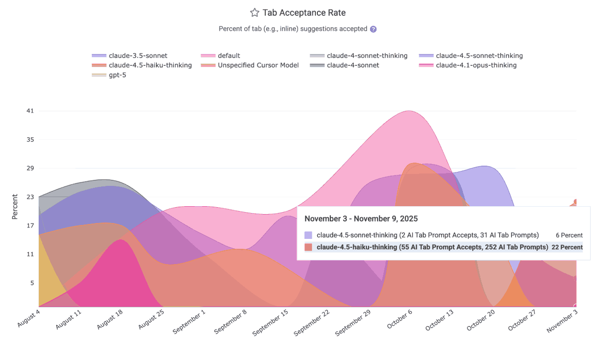
This data is ideal for helping to disseminate within a team which LLMs have been producing the most applicable results over the past month. It is available via the Reporting API as ai_prompt_acceptance_percent and ai_tab_acceptance_percent. The per-model data is available to all AI providers except the default GitHub Copilot business tier, which labels all LLM acceptances as "Default Model" as of Q4 2025.
For more detail about how, exactly, each provider's response data is transformed into "prompt request count," read on.
linkPrompt Suggestion Count and Tab Suggestion Count per language model
Calculating the number of suggestions per AI provider requires applying judgement for what, exactly, counts as a "suggestion."
If you don't want to get lost in the weeds, simply think about "Tab Suggestion Count" as "How many times did the AI suggest code the developer could press 'tab' to insert as code?"
Think about "Prompt Suggestion Count" as "How many times did the AI make suggestions to the developer, outside its suggestions on how to finish the line the developer is typing?"
In the Reports API, the count of ad hoc suggestions the AI made to the developer as they were writing code is known as tab_prompt_count. The sum of suggestions made to the developer in all other contexts is approximated as non_tab_prompt_count. These numbers can be multiplied by the acceptance rate to get the number of accepted suggestions for "tabs" and "prompts."
In terms of specific technical details, Copilot derives the "Prompt Suggestion Count" by summing total_code_suggestions per-editor, per-model. Cursor gets it by summing together "chat requests," "composer requests," "agent requests," "applied suggestions," "accepted suggestions," and "rejected suggestions" to get a grand total of requests (=> suggestions) and opportunities the user had to accept a suggestion.
linkAI Provider Lines Added and AI Provider Lines Deleted
How many lines does your AI Provider report have been added and deleted by developers using it? These graphs show the view from the AI Provider's side of the ledger:
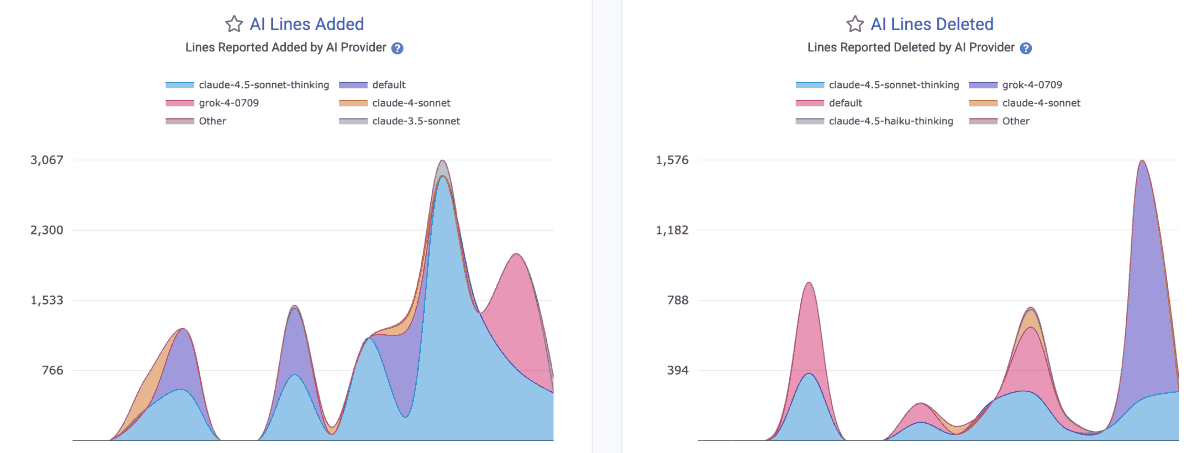
They are available in the Reports API as ai_lines_added_count and ai_lines_deleted_count.
Note that there is no guarantee that the developer will go on to commit the lines that they accepted from an AI. In fact, as often as not, developers will accept a block of code in order to get it into a state where they can start picking it apart -- by deleting large swaths that are non-applicable, or by making large modifications to the initially inserted lines.
linkEngaged AI Developers and Inactive AI Developers
How many developers on the team are regularly using AI vs not? These metrics help understand the adoption trend for AI across the team. The Reports API segments for these are ai_engaged_committer_count and ai_inactive_committer_count
The calculation of "Engaged" committers varies by AI provider. Since Github Copilot does not, by default, report the total number of active users per language (all of their per-language data reports "Engaged" users), we periodically query Github to assess when each developer was last active with AI. For all time after the customer has signed up, this allows us to derive a maximally accurate count of the number of developers that are participating in Copilot use in a given day or week. For historical data, we fall back to what Github reports as the "Engaged" user count, which they differentiate from "Active Users" by explaining in their documentation "A stricter version of 'Active Users,' this tracks the number of employees who use a tool multiple days per month. The exact number should depend on your company’s definition of what an engaged user should be. A growing number of "Engaged" indicates that users are moving beyond initial experimentation and are beginning to form a habit."
The derivation of "Engaged AI Developers" for Cursor is more simple, as they report all stats on a per-developer basis, so we can simply evaluate over the history of AI usage how many developers were active Cursor users per-day or per-week.
To calculate "Inactive AI users," we subtract the count of seated committers in a given time period by the number of users that were deemed to be "Engaged AI users"
linkAI Usage Cost
When the AI API reports a cost ascribed to the developer's requests, it will be returned as ai_cost_cents. This does not include the base subscription cost that typically makes up the bulk of the monthly invoice for business customers of Copilot, Cursor and Claude.
linkAll Suggestions Count
The all_suggestion_count aggregates all of the request & suggestion metrics available per provider. It can be thought of as the "global barometer for how much AI use is occurring"? It combines all tab and prompted suggestions.
linkReview Minute AI Cohorts and Churn Percent AI Cohorts
How much downstream cost is there to the teammates of heavy AI users? These graphs help pick apart the extent to which AI use can negatively effect the teammates of those who use it.
 |  |
While it is natural to expect that the productivity gap between "Power Users" and "Non-Users" to be mirrored in the "Teammate Review Minutes" (because "authoring more code" probably means "more time required to review that code"), a team hopes that the difference between these groups is no larger than than the gap in their code output. These segments are known in the Reports API as teammate_review_minute_cohorts_per_committer and churn_line_count_cohorts_per_committer.
linkDiff Delta by AI Usage Cohort and Commit Count by AI Usage Cohort
What is the net difference between "developers who utilize AI with the highest frequency" and their counterparts? The Diff Delta by Cohort graph shows the volume of durable code change that has been generated per developer in an AI Cohort for each recent week.

A common pattern among terms measured: the Power User cohort has steadily gained ground to become the most prolific authors of durable code
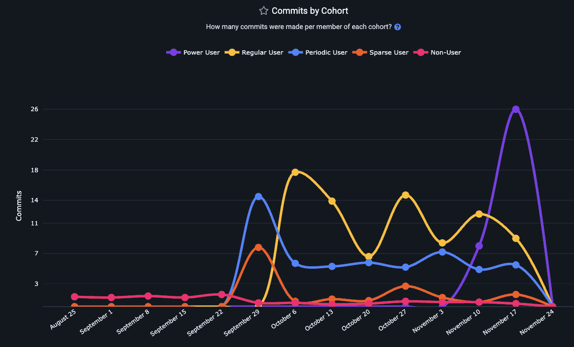
The pattern holds true for Commit Count as well as Diff Delta
Read more about GitClear's AI Cohort Stats, or access this segment in the Reports API as delta_cohorts_per_committer. Another option to retrieve a measure of developer productivity with AI is commit_count_cohorts_per_committer.
linkStory Points Completed per AI Cohort
How many Story Points are being completed by each AI Cohort? In the Reports API, story_point_cohorts_per_committer reveals the relative Story Point velocity for developers with varying levels of AI adoption.
linkPull Requests Opened per AI Cohort
Does more AI use translate to more pull requests getting opened for review?
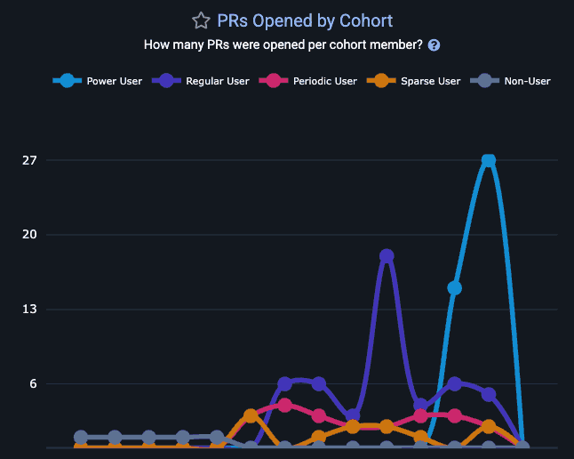
Gauge how the number of PRs opened per week for this team is impacted by AI use
As with any GitClear chart, you can hover over a segment to understand how many developers are present at each cohort:
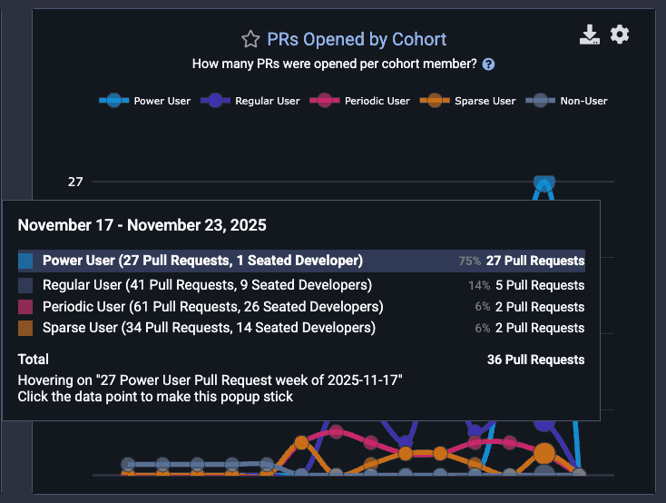
Common pattern: Few "Power User" AI developers, but the one that does exist is opening 4x more PRs than teammates
This can yield potent signal that can help non-AI users make a data-backed decision about "whether" and "how" to adopt AI.
linkTest Delta per AI Cohort
One of the clearest benefits of AI adoption for many teams is the improved frequency of test-writing. To evaluate the extent to which your largest AI adopters are also your largest participants in maintaining the repo's test infrastructure, use test_delta_cohorts_per_committer.
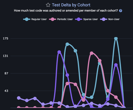
This graph is also available on site, by visiting the "AI" tab and choosing the "Cohorts" sub-tab.
linkCopy/Paste lines per AI Cohort
This is a graph that GitClear's AI Code Quality research has proven to be highly correlated with greater AI adoption.
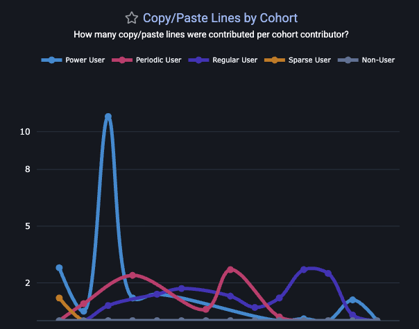
The Copy/Paste Cohort graph lets you understand both "the extent to which AI is directly contributing to more copy/paste" and "when (on what tickets/project) is the copy/paste duplication occurring?" If unrealistic deadlines are a concern for a team, managers may find developers more willing to reduce their self-review on behalf of delivering a "resolved" ticket faster, even if that means seeding tech debt for future maintainers.
linkToken counts: Sum total, uncached tokens, input (read/write) cache, output counts
All the token counts used to calculate the cost of an AI interaction are present among GitClear's stat segments. Select token counts are also shown on the "AI Usage" sub-tab within "AI Impact" tab in primary navigation.
linkAI-Assisted Commit Percent
What percentage of commits have evidence of AI assistance?
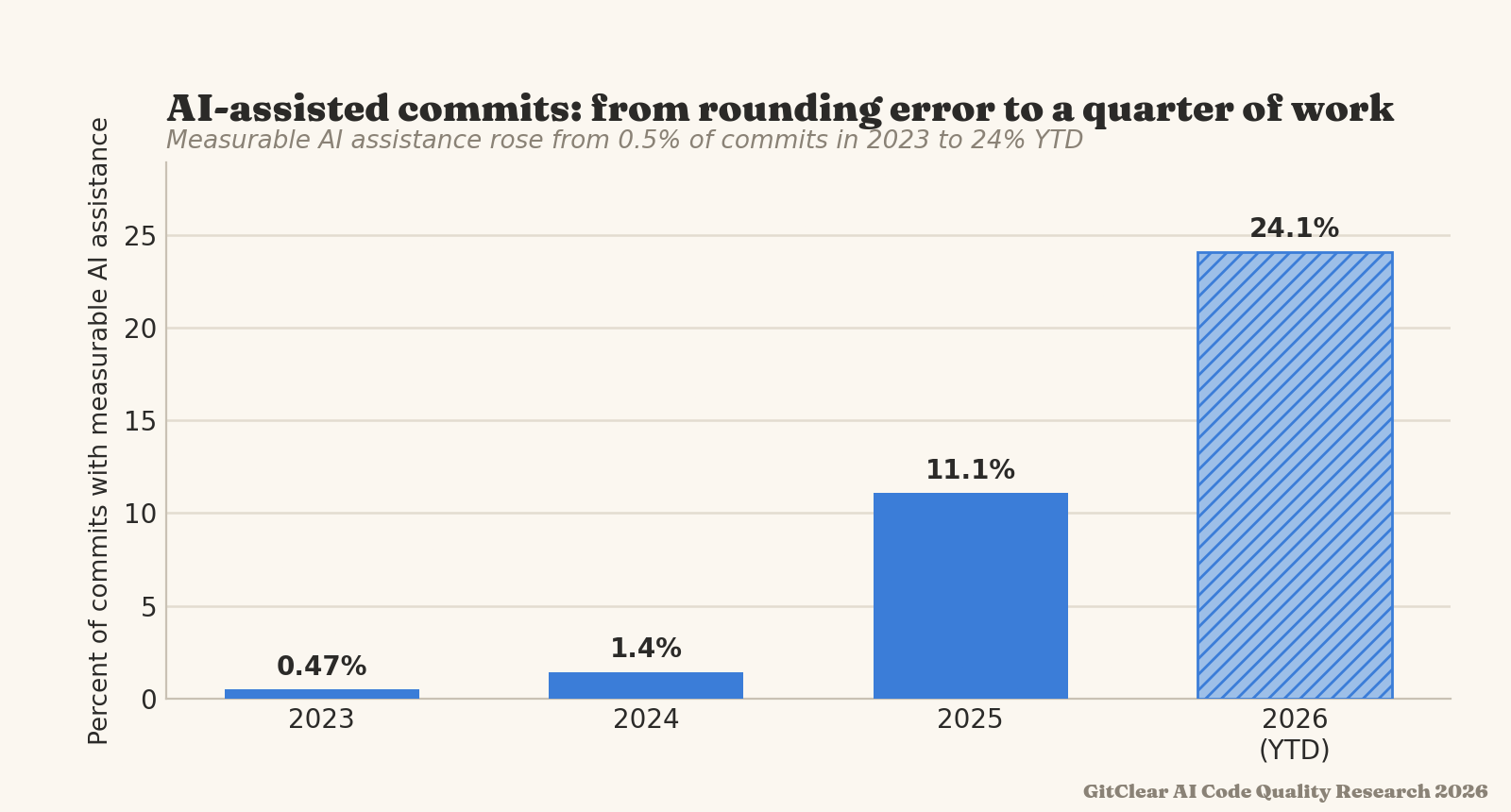
AI-assisted commits can be derived by a number of different factors: commit author, commit message, function prefix, Claude telemetry, or the AI Provider "line added/deleted" stats, extrapolated to the work that a committer made within a day.
linkDiff Delta per AI Dollar Spent
How much durable code change was committed per dollar spent on AI? As of initial implementation, this metric does not include cost of monthly subscription: it is calculated by analyzing the cost returned by AI provider (when available), or by combining the token use of the developer with the per-token costs for a given AI provider.
linkDeveloper Satisfaction & Code Sentiments
Arguably the #1 essential metric to gauge whether developers feel they are working in an environment conducive to maximizing their potential. Developer surveys can be configured to allow anonymous or non-anonymous responses.
linkDeveloper happiness
Use Developer Sentiment surveys to schedule periodic surveys that instrument Satisfaction-oriented questions.
linkDelivery performance
Are the teams' processes for "continuous integration" and "deployment" easy to understand and sufficiently fast to execute? Developer Sentiment survey => Delivery Performance & Architecture illuminate answers to these questions.
linkDocumentation
Do developers have access to the docs they need to get up to speed rapidly? Including questions from "Documentation" category allow a team to measure this directly.
linkProductivity/satisfaction
Does the developer get to work on tasks that create value, and do they get to do it as effectively as possible? The "Productivity" questions on the Sentiment Survey are especially relevant for teams that are hoping to offload more creative work to AI.
linkReliability
As Google DORA reported in 2025, a 25% increase in AI adoption currently implies a ~10% increase in defects. Get specific feedback from the team on factors that impact site reliability.
linkTech Debt & Code Quality
GitClear has developed a reputation as a foremost researcher of how AI agents impact various attributes of code quality. Our "Code Quality" tab aggregates a wide array of quality measurements.
 |  |
Stat Name | Description | Date Defined By | Reports API Segment |
Connective Line Rate | How frequently do added lines call out to functions/methods? | When commit with function-calling line was authored |
|
Copy Paste Percent | What percent of changed lines are duplicated lines? | When commit with copy/paste line was authored |
|
Refactor (Move) Percent | What percent of changed lines are "line cut/pasted from one file/function to another"? | When commit with moved line was authored |
|
Duplicate Block Line Count | What was the sum of code lines changed among "duplicate code blocks": sequences of 5+ lines whose content is identical | When were the commits that created or perpetuated blocks of duplicate code |
|
Duplicate Block Rate | Relative to the sum of meaningful code changes, how often are new duplicate code blocks introduced? | Commit that introduced new duplicate block(s) |
|
Legacy Refactor Percent | What percentage of developer work is being spent updating code that's more than a year old? | Date on which an old line was updated |
|
Obfuscation Rate | What's the frequency of utilizing state-obscuring concepts like "catch/rescue," "safe navigation" and stubs? | When the commit was authored |
|
Quality Cornerstones: Documentation Frequency | What percentage of work is on adding or updating code documentation? | When commit was authored with changes in documentation |
|
Quality Cornerstones: Test-Writing | What percentage of work is on adding or updating tests (unit, integration, system, etc)? | When commit was authored that changed test files |
|
Bug Work Percent | Sum of Diff Delta from commits that reference an issue of type "bug," with commits that mention words defined as "bugfix words" like "fixed" | When commit that fixes a bug was authored |
|
Churned Line Percent | What percentage of changed lines in non-ignored files were updating a line that had previously been changed within the past 10 days? | When was code authored that updated recently added/changed lines? |
|
Tech Debt Priorities | Which directories in a repo are hardest for developers to modify? The "Tech Debt" tab shows repos with lowest Diff Delta velocity | When were commits authored that changed a small amount of code after a long time working on it? | N/A - Tech Debt tab |
File Complexity | How dense is the conditional branching & looping within a file? A proxy for Cyclomatic Complexity. | State of the file at each commit graphed | N/A - PR & Directory Browser |
File Coupling | What percentage of the commits for a particular file also involved changing a secondary file? | When were commits authored that changed two files together | N/A - PR & Directory Browser |
Oversized Files | How often are developers creating files that are too dense to understand within a minute? | When were commits authored that gave rise to a file that exceeds the repo's length target? | N/A - PR & Directory Browser |
Note that, for Elite subscribers, all of these charts include the option to compare your team's own performance to Industry Benchmarks for code quality.
linkConnective Line Rate
This metric measures the rate at which newly authored code calls a function/method. Most teams want their new code to be woven into the existing repo to reuse existing functionality. A falling rate of Connective Lines suggests that new code is becoming an island. This is the structural signature of favoring "reinvention" over "reuse."
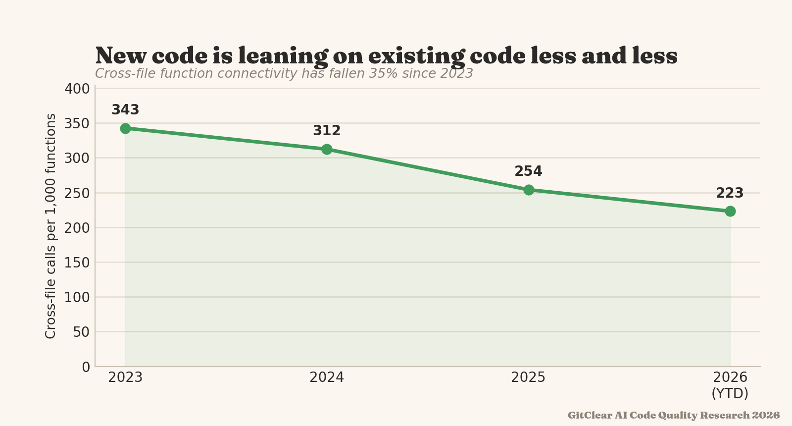
The denominator of Connective Line Rate is "per 1,000 consequential line changes." A consequential line change is a non-keyword, non-comment change in a file type where function calling is possible (e.g., not JSON).
linkCopy/Paste Percent
The most obvious change in the AI era is that more code is getting duplicated. GitClear's "Issues & Quality" => "Code Quality" stats offers a for "Copy/Paste Percent," in the reports API as copy_move_percent.
A "copy/paste line" is a non-keyword, non-comment line that is added multiple times within a commit. Copy/paste lines are attributed to the date that their commit was authored.
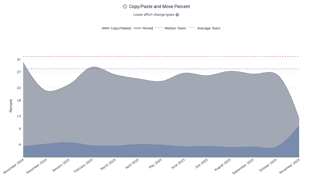
linkRefactor (Move) Percent
A sea change that has accompanied "higher copy/paste" is "lower move/reuse." Prior to widespread AI, around 25% of all code changes involved elevating repeatedly-used methods into shared libraries. Now, the percentage for many teams has plummeted below 10%. See yours as the "Move Percent" in the Code Quality tab.
A "moved" line is a distinct code line that is removed ("cut") from one location and added ("pasted") into a new location. Moved lines are attributed to the date that their commit was authored.
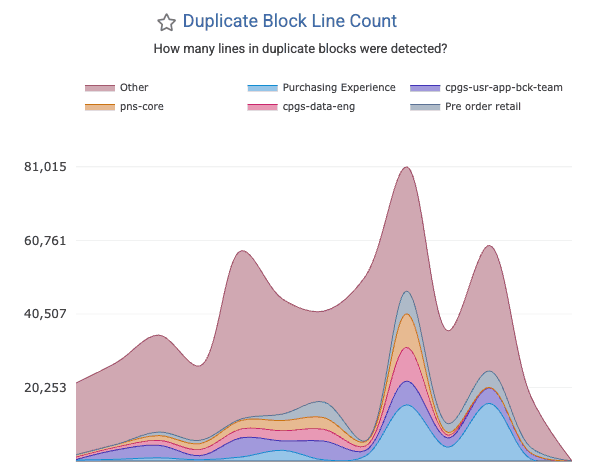
linkDuplicate Block Line Count
How often are large blocks of identical code found in your repo? The divergence of once-duplicated code blocks accounts for a significant percentage of AI-driven defects: after code is initially copy/pasted, there is an implicit contract that all versions of the copy/pasted blocks should be updated together. When that doesn't happen, your developers will end up fixing a bug in one system, only to later discover the same bug exists in other systems.
This chart, graphed as "Duplicated Block Line Count" under the "Code Quality" tab, shows many lines were changed that existed among large blocks of duplicate code. Note that this is not a measure of the total "duplicate lines" in the repo: it is a measure of "how many duplicate lines are present in blocks that were modified within a given time interval?" For example, if a developer adds a line to three 10-line blocks of code in July 2026, the "Duplicate Block Line Count" for that month would be "30 lines." The metric is counted on a per-commit basis, so if that same 10-line block is changed 3 times in the month of July (without diverging), it would register as 30 lines * 3 commits = 90 Duplicate Block Line Count. If the second commit consolidates half of the duplicate block into a shared method (aka "DRY the code"), then the Duplicate Block Line Count would be "30 lines" for the first commit, and "15 lines" for each commit that changed a line within the 3 blocks of 5 duplicated code lines.
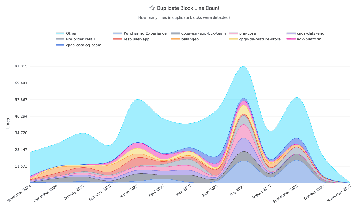
It is retrieved from the Reports API via duplicate_block_line_count. You can also set up alerts when new duplicate blocks emerge.
linkDuplicate Block Rate
The factors that constitute a Duplicate Code Block are described in the "Duplicate Block Line Count" section directly above this one. Converting duplicate blocks into a rate is a matter of dividing it by a denominator that approximates the total amount of code lines that are changing (as the maximum possible duplication that could be introduced in a commit). GitClear research has shown that transforming "duplicate line count" into a rate proves that a growing proportion of all code changes between 2023-2026 have been duplicate blocks:
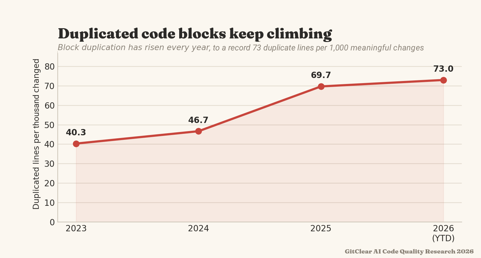
A growing proportion of changed lines are duplicate code blocks
The denominator of Duplicate Block Rate, "Meaningful Lines Changed," includes comments and any code line that isn't a keyword, whitespace change, or in an ignored context. We would consider a Duplicate Block Rate of 40 or below to be a healthy target for AI-assisted teams.
linkLegacy Refactor Percent
Legacy Refactor Percent, aka “Long-term update percent” is the share of changes that revise code last touched more than twelve months ago. Healthy long-lived repositories require developers to periodically return to old code: consolidate it, document it, retire (delete) it. That maintenance work is increasingly not happening. The codebase grows ever outward with fresh additions, while its older strata are left frozen. As legacy cruft accumulates without being reevaluated, the likelihood that it will break slowly increases.
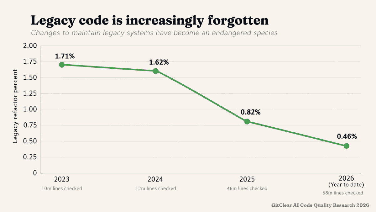
The denominator in "Legacy code percent" is "Sum of meaningful line changes."
linkObfuscation Rate
Obfuscation Rate measures the frequency of using constructs that hide the state of program execution. Specifically: the count of lines with rescue/catch blocks, safe-navigation operators (&. in Javascript), and stubbed methods, per 1,000 meaningful lines of code change. Each such instance 1) reduces the extent to which maintainers can know that an unexpected state is occurring 2) increases maintainer burden to discern valid/expected responses received from external code 3) creates uncertainty trying to evaluate how an error originates. State obfuscation has become an especially concerning problem as the rate of AI-assisted commits has grown.
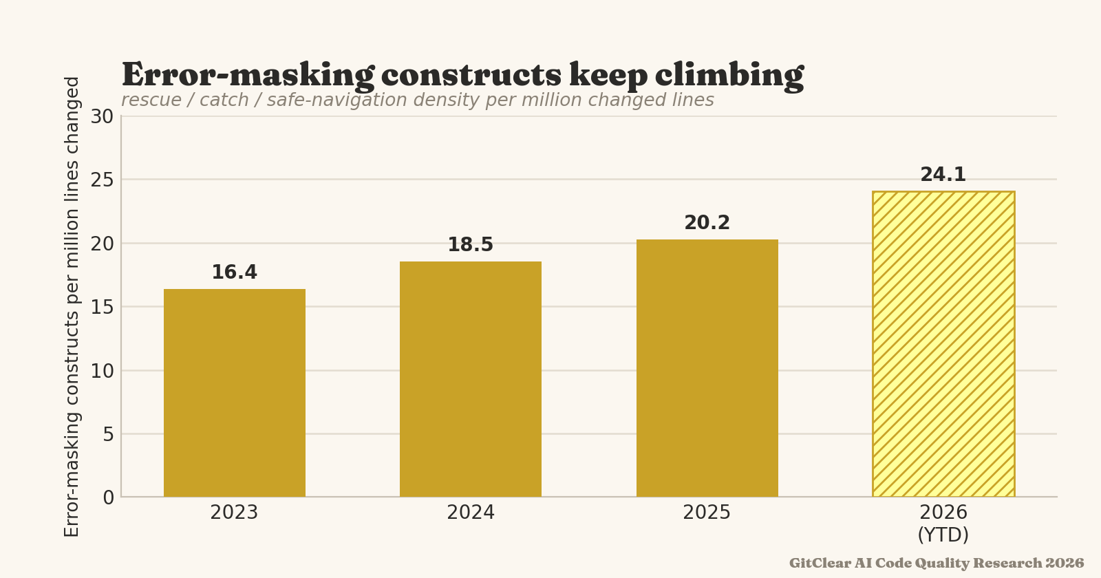
In moderation these are expected. In bulk, they can become tantamount to sweeping unexpected behavior under the rug.
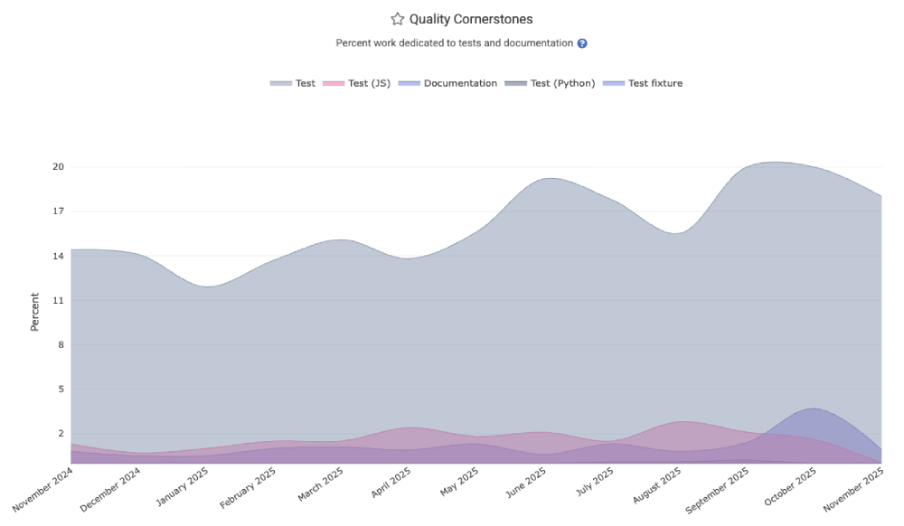
linkQuality Cornerstones: Documentation Frequency
While it is a small percentage of a team's overall work, developing a culture of writing and updating documentation is critical to efficiently onboarding new team members. The "Quality Cornerstones" graph in the "Code Quality" tab provides an assessment of the relative documentation occurring.
The quality_cornerstones segment of the Reports API is also available.
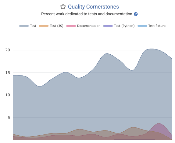
linkQuality Cornerstones: Test-Writing
Healthy teams spend 15-30% of their energy writing and maintaining various forms of test code (unit, integration, system, QA). The Quality Cornerstone graph shows what percentage of all work has been expended for various types of tests. This is also available in the quality_cornerstones segment of the Reports API.
linkBug Work Percent
How much of the Diff Delta for the team has been expended working on tickets that are classified as type "Bug" within Jira?
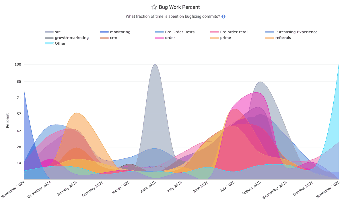
The "Bug Work Percent" graph can be found within "Issues & Quality" => "Code Quality" tab, and the bug_work_percent segment of Reports API.
linkChurned Line Percent
What fraction of lines were revised within 10 days of being pushed to the repo? The Churned Line Percent graph on "Code Quality" stats can break it down by repo for the selected team.
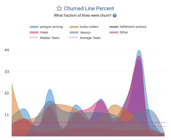
The churn_line_percent segment in the API allows this to be retrieved programatically.
linkTech Debt Priorities (aka "slow work time sinks")
When visiting "Browse" => "Tech Debt Priorities," you can receive a prioritized list of directories that are both active and slow to work in. Use the report's filters to only target directories that had a certain amount of time spent working on them.
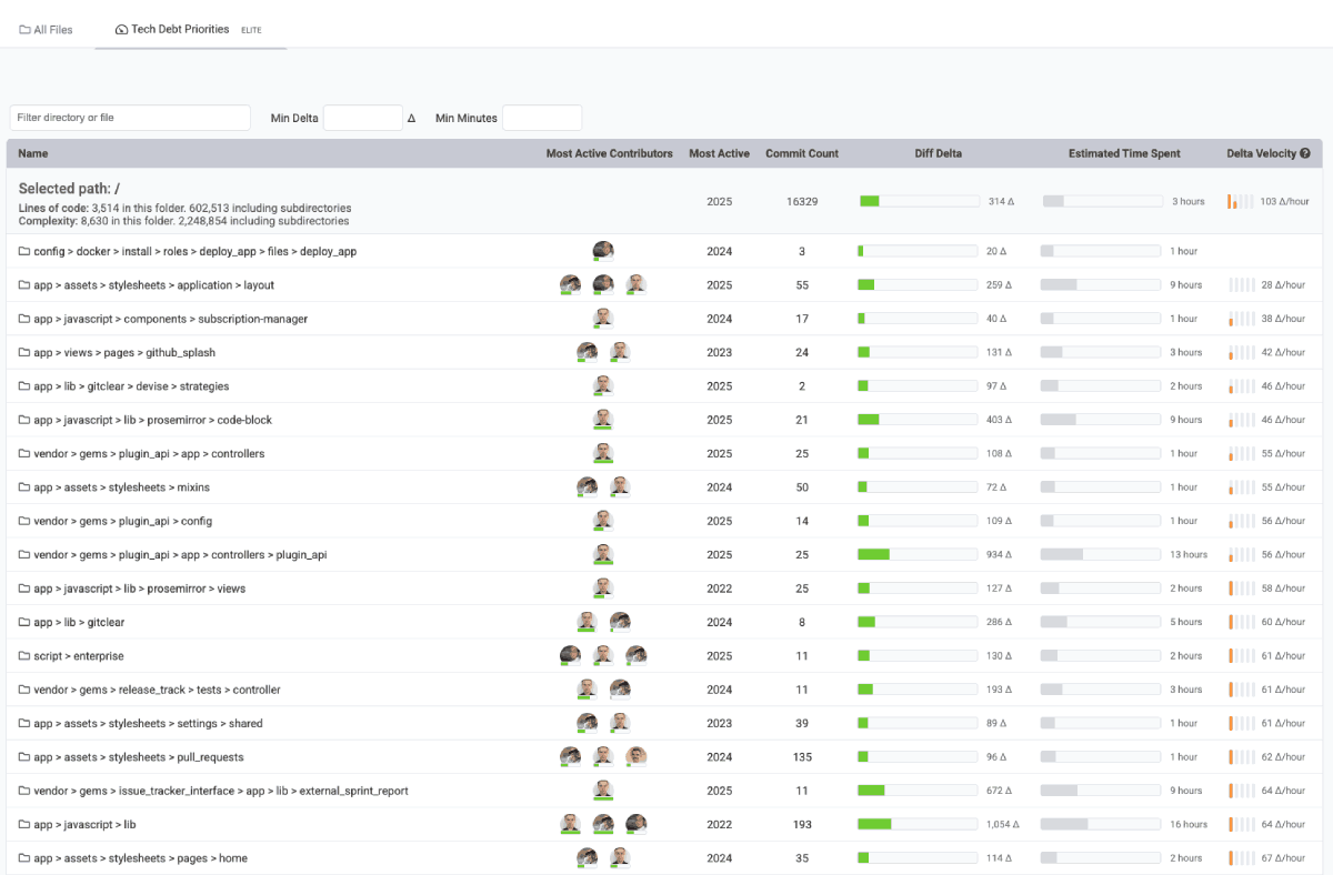
Which directories are hardest to change? Usually config & application-wide directories, since they take the most consideration.
Note the optional means to filter by a minimum threshold of "time" or "Diff Delta" to filter out directories that are changed too rarely to be worth amending.
linkFile Complexity
Determine the energy required for a developer to digest a code file that's new to them. File complexity can be found by using the Directory Browser to navigate to specific files that are suspected problematic, or you can set up goals to receive notifications when a file's complexity exceeds a chosen threshold. You can also monitor how file complexity is changing during the pull request review process, in the Code Quality tab.
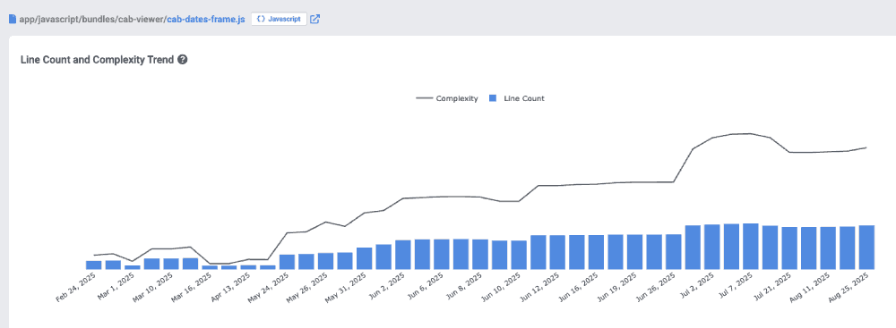
Viewing a code file within the Directory Browser to understand how its complexity has changed over time
linkFile Coupling
When files are always checked in together, it suggests that developers must learn (potentially implied) associations between files that require them to be changed in unison or create defects. File coupling is highlighted in the Pull Request "Code Quality" tab , as well as when clicking through a file in the Directory Browser.
linkOversized Files
The longer a file gets, the more difficult it becomes to parse for a new editor. When reviewing a pull request, the "Code Quality" tab shows which files & functions exceed goals that can be set per repo. File size over time is also shown when navigating to a file in the Directory Browser. You can also set up goals to generate a notification when files reach a chosen threshold of "unwieldiness."
linkGoogle DORA Stats
An industry standard for more than 10 years, the latest Google DORA report calls out several areas that warrant measurement for high-performing teams.
 |  |
Stat Name | Description | Date Defined By | Reports API Segment |
Release Frequency | How often did developers initiate a deploy that marked a release of the repo to its customers? |
| |
Mean Time to Repair | Sum of business hours between when the defect(s) in an interval were detected, and when they were resolved, divided by how many defects occurred | When were the defect(s) initially detected |
|
Change Lead Time per Issue | Among resolved issues, the sum of business days between ( | Date of final release involving issue |
|
Releases with Defect % | What percentage of releases in an interval resolve a Critical Defect? | When release occurred (see "Release Frequency" for more detail) |
|
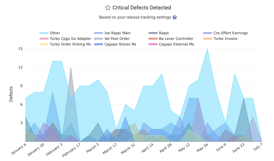
Critical Defects Detected | How many Critical Defects were detected (by API, Jira, or Defect Term) in a particular interval | When defects were detected |
|
Change Lead Time per Pull Request | See "Hours to Fix PR Merged" | Date on which Critical Defect was detected |
|
Hours to Fix PR Merged | Among defects resolved by a pull request, how many business hours elapsed between "when the defect was detected" and "when the fixing PR was merged," divided by how many defects had fixes merged | Date on which Critical Defect was detected |
|
Hours to Fix Activity | Sum of business hours between ( | When first fix activity for the defect occurred |
|
Absolute Hours to First Repair | On a per-defect basis, how many absolute (real-world) hours between when a Critical Defect was detected, and the soonest of | When defect was detected |
|
Absolute Hours to Resolved | On a per-defect basis, how many absolute (real-world) hours elapsed between when a Critical Defect was detected, and the sooner of | When defect was detected |
|
linkRelease Frequency
According to Google, "Elite" teams deploy at least once per day, whereas underperforming teams deploy closer to once per month. The "DORA" tab's "Activity" (default) tab features a glimpse at "Release Frequency" by team, repo, or aggregated.
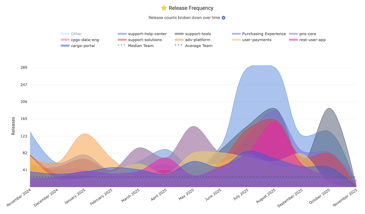
In the Reports API, this is the release_count segment. It is set up with Repo Release rules.
linkMean Time to Repair (MTTR) (aka "Defect recovery time")
Another of the "classic four" Google DORA stats measures how long the team takes to recover from a defect. GitClear measures MTTR as "time from defect was opened" to "time defect fix was deployed, or issue was marked as resolved." The resulting MTTR chart is shown on DORA => Activity, where it can be segmented by team/repo/neither.
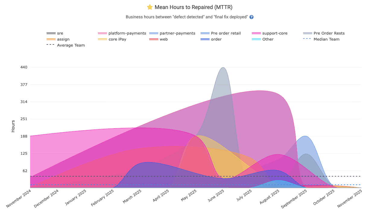
It is available in the API as the mean_hours_to_resolved segment.
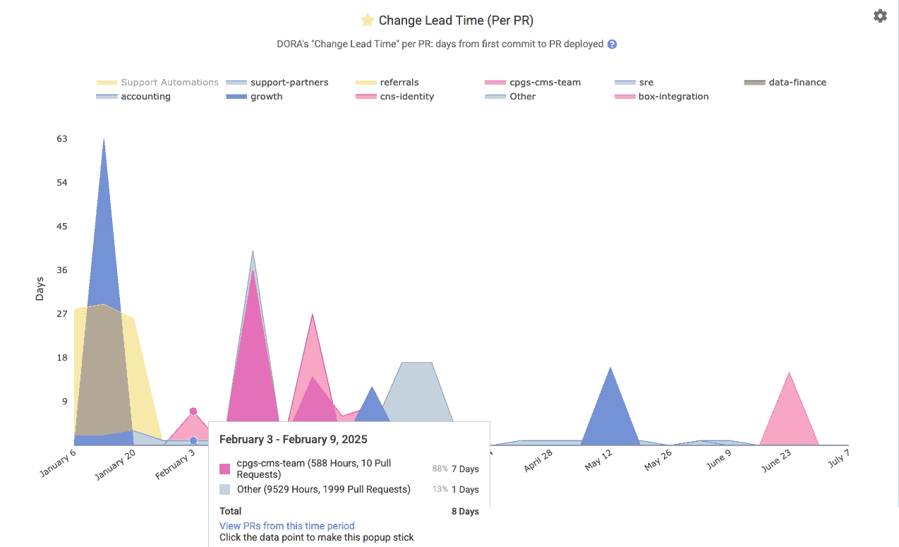
linkChange Lead Time per Issue
Lead Time for Changes (DORA Change Lead Time) measures how long it takes code to go from development to running in production. GitClear defines it typically as the average number of days from the first commit on an issue or PR to that code being deployed. This is a key DORA metric indicating delivery speed: elite teams average under a day, whereas slower teams might take weeks. Shorter lead times mean faster value delivery to users.
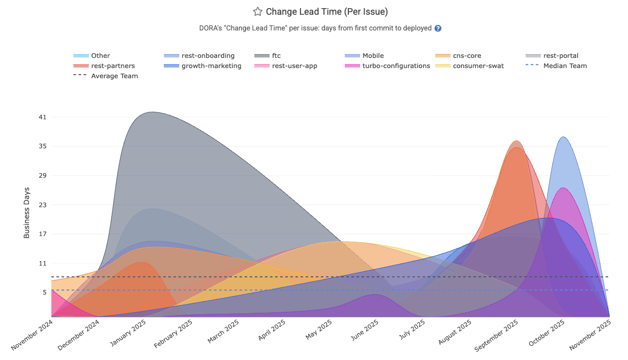
It's API Segment is dora_change_lead_time (for issue-based lead time), pr_lead_time (for PR-based lead time)
linkReleases with Defect percent (aka "Change Fail Rate" aka "Defect Rate")
The "Releases with Defect" graph is a percentage graph in the DORA Stats tab. It is calculated by dividing "number of releases that resolve a Critical Defect," by "total number of releases/deploys made by the team."
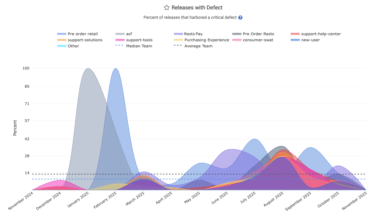
It is found in the API as release_defect_percent, which is anchored to the time at which releases were made. For example, the "Defect Rate" for September would be 30% if the "Purchasing Experience" team releases 10 versions of their app during September, and 3 of those releases include a fix for a Critical Defect. The "fix for a Critical Defect" might take the form of "a merged pull request that resolves a Critical Defect" or "commits that resolve an issue that had been designated a 'Critical Defect,'" or "commits in a branch or pull request that included a Defect Detection Term like 'hotfix."
Even if one of the three releases from our September example included fixes for 5 Critical Defects, it would still be counted as "one release that remediated urgent bug fix(es)," so the Releases with Defect percentage would be 30%. In other words, 70% of the releases for the month were made on behalf of releasing features or upgrades, as opposed to urgent bugfixes.
If one of the defects was not fully resolved by its initial release, it will increase the "Releases with Defect" percent, since that implies a follow-on release being necessary to resolve the Critical Defect.
linkCritical Defects Detected Count
The starting point for all DORA stats: how many critical defects are being reported per time interval? Learn about many ways to define a critical defect. On the DORA tab, it's simply labeled as "Critical Defects Detected."
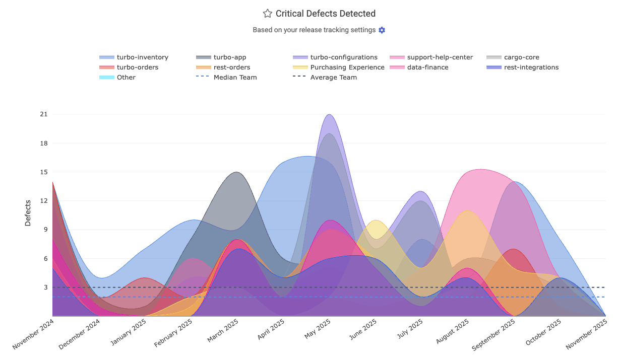
In the API, it's known as defect_detected_count
linkChange Lead Time per Pull Request

DORA => Activity shows this stat among the graphs available, as a measure of "how much latency (in business hours) between when a bug is detected and its fix is merged and ready to deploy?" This data is available via the Reports API as the hours_to_fix_merged segment, which can be combined with the detected_defect_fix_merged_count segment to produce a "per PR" measure of business hours consumed.
linkHours to Fix PR Merged
Measures the business hours from when a defect (critical bug) is detected to when a pull request addressing that defect is merged. If the defect is defined by a Jira issue, the bug is considered "detected" when the Jira issue was opened. This helps gauge how quickly the team delivers a code fix before deployment. Reports API segment: hours_to_fix_merged. See GitClear's DORA implementation guide to learn more.
linkHours to Fix Activity Onset
Known as "Hours to fix activity" on the DORA => Activity tab, this measures the business hours between the onset of defect and when the first commit is made to address the defect. "The onset of a defect" can be marked by an API call to create a Critical Defect, by the time that a qualifying Jira ticket is opened, or the time that a hotfix is detected), and when the first commit was authored to begin to resolve the issue (or when the issue's fix was marked as "Deployed" via Releases API, if that's sooner).
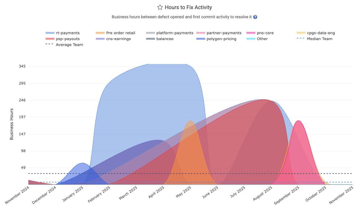
The Reports API labels this as hours_to_fix_activity.
linkAbsolute Hours to First Repair per Defect
What were the average number of absolute hours that elapsed between when Critical Defects were detected, and when they received their first fix activity (whether a commit, a release, or marking the defect as "resolved")? This is distinct from "Hours to First Repair" in that it includes the vast expanse of time that is considered non-working hours. But, for teams that use Critical Defects to designate when an issue has occurred that is impairing customer access to the site, this metric can provide a valuable means to understand the amount of real-world time in which Critical Defects were awaiting first action. It is recognized in the API as absolute_hours_to_first_repair_per_defect.
linkAbsolute Hours to Resolved per Defect
What were the average number of absolute (real world) hours that elapsed between when Critical Defects were detected, and when it was resolved? As with MTTR, this segment counts the "defect resolution" time as the sooner of "when the defect fix was deployed" and "when the defect was explicitly marked as resolved." The time associated with each defect is based on the date the defect was detected. In the Reports API, this segment is available as absolute_hours_until_resolved_per_defect
linkIssue Tracker & Sprint Stats
Much of a team's progress is best understood through the lens of their Sprint schedule. GitClear offers numerous ways to follow the rate of progress on issue-related stats.
Stat Name | Description | Date Defined By | Reports API Segment |
Story Points Resolved per Developer | Sum of Story Points resolved during interval, divided by number of active contributors on team at that point | When was an issue with Story Points marked "resolved" |
|
Issues Resolved per Active Developer | Count of "Issues resolved," divided by number of active contributors on team at that point | When was an issue marked "resolved" |
|
Work by Ticket Type | How much committer work (in Diff Delta) was accumulated, segmented by type of Jira issue ("Bug," "Feature," "Task," etc) | When commit was authored |
|
Issue Cycle Time | Sum of business days between ([ | When issues were marked "resolved" |
|
Issue Lead Time | For issues first released during the current interval, sum of ( | When issue was first released |
|
Story Point Velocity | What percentage of the Story Points that were planned for the sprint were completed within the sprint? | When sprint began |
|
Story Points Added During Sprint | What was the sum of issue Story Points that were added to a sprint after it began? Or, in the case of | When sprint began |
|
Biggest Issues of the Quarter/Year | During a given time period, which issues consumed the greatest amount of energy (via Diff Delta as proxy) | When commit that worked on issue was authored |
|
Story Points Completed per Jira Assignee | How many Story Points were completed per Jira assignee during a given time period? This segment is the superset of "Story Points Resolved per Developer," where this segment accounts for work by developers that could not be associated with a commit or PR | When were issues with Story Points marked "resolved" |
|
Unplanned Story Points % | For | "When sprint began" or "when commit was authored" |
|
linkStory Points Resolved per Developer
Indicates how many story points (issue estimates) are completed on average per active developer over the selected period (example graph, documentation). This helps normalize productivity by team size, showing output per person. Learn more about setting up Story Points.
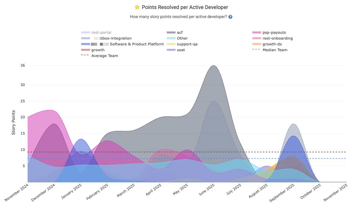
For teams that use Story Points and have good hygiene in referring to an issue when it is worked on, this is often a metric that managers will add to their Starred Reports, where it can be aggregated by team to understand where the model team performance is happening with an organization:
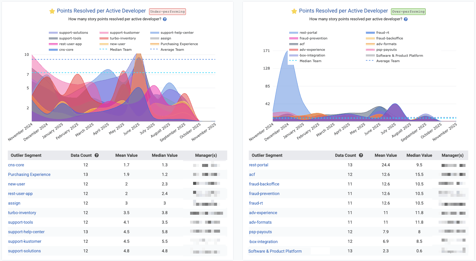
In Starred Reports, with "Outlier View" checked and "10 segments" shown for the biggest "positive" and "negative" outliers
Reports API segment: story_points_per_active_developer. Learn more about setting up Story Points.
linkIssues Resolved per Active Developer
For teams that don't use Story Points, or teams that want to get a holistic sense for how many units of work are being completed, "Issues Resolved per Active Developer" shows the rate at which issues are being closed per developer per time unit (in the screenshot, we're looking at the past year, so each interval is one month). The "per active developer" means that, for each interval, we are dividing the number of "Issues Resolved" by the number of developers on the team who had made a commit within the past month.
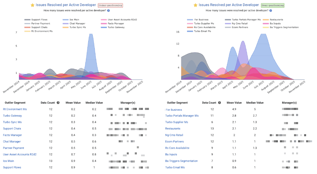
Screenshot shows Issues Resolved per Active Developer through the lens of Outlier View in the Starred Reports, but you aggregate your own stats by "repo" or "team" in the "Issues & Quality" tab under "Issue Stats." The Reports API segment is issues_resolved_per_active_developer.
linkWork by Ticket Type (bug, feature, etc)
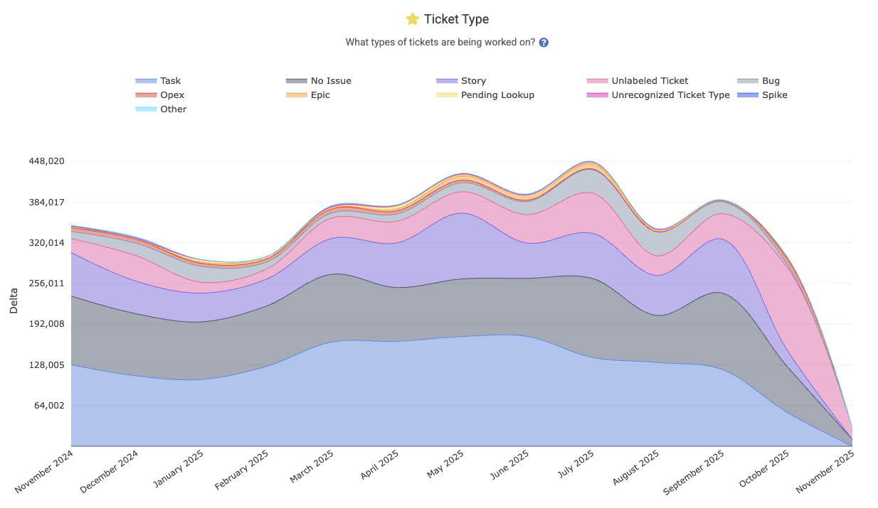
Shows a breakdown of the team’s work by issue type – for example, what portion of work went into bugs, features, chores, etc. This graph illustrates how the team’s effort is distributed across ticket categories. The Reports API segment is ticket_type, and you can read more about how this metric is calculated on the Issue Stats help page.
linkIssue Cycle Time
Represents the average cycle time for issues: the business days from when work started on an issue (first commit) to when the issue is "marked resolved" or first deployed to production. It measures the active working time on an issue, as found on Issues => Stats and "Issue Cycle Time."
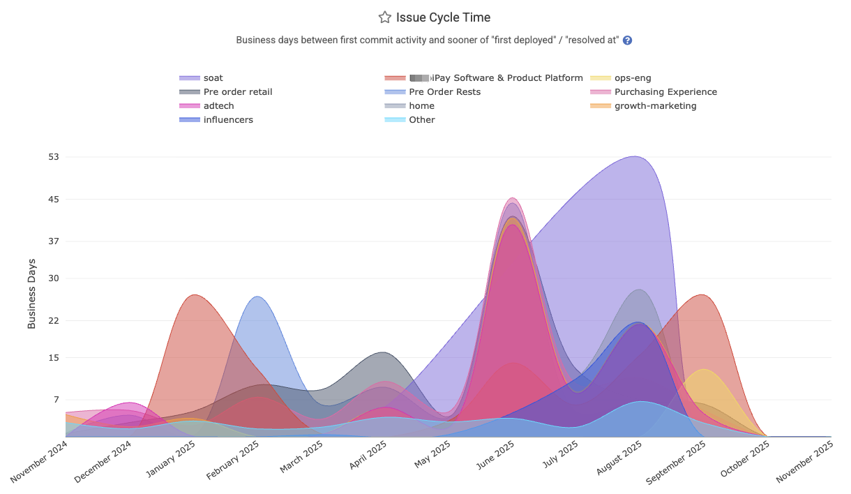
The Reports API segment is issue_business_days_to_fix. Can be aggregated by repo or team.
linkIssue Lead Time
Represents the average lead time for issues: the business days from when an issue was opened (created) to when it was ultimately deployed (closed in production). This includes waiting + development time. It is found under Issues => Stats => "Issue Lead Time," and described on the Issue Stats help page.
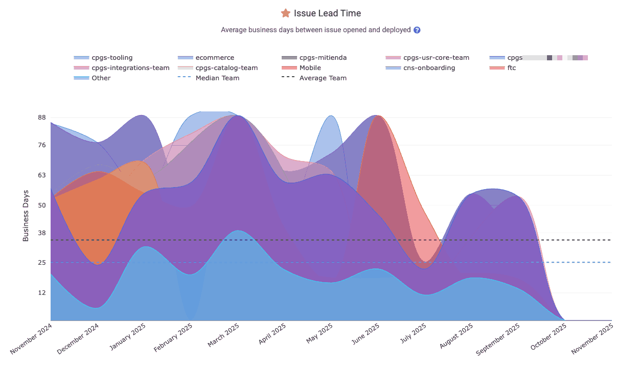
The Reports API segment is issue_days_lead_time. Also Related: In-depth DORA implementation guide.
linkStory Point Velocity
Tracks what percentage of the planned Story Points for a sprint were completed during the sprint. This metric reflects the team’s planning accuracy by indicating what percent of their planned issues were completed by the end of the sprint.
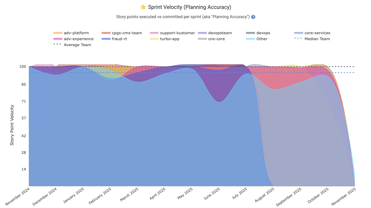
Enterprise customers often wish to zoom out to consider which teams are meeting their goals at scale:
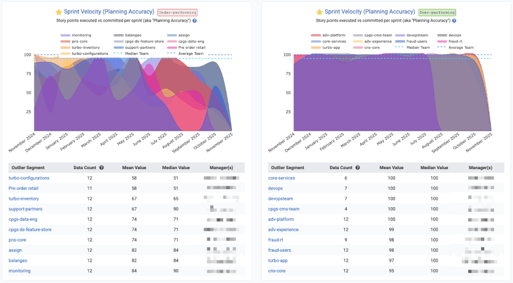
Viewing teams that are sticking to their plan vs those that have struggled to execute on the Sprint vision as originally constructed
The Reports API segment is story_points_velocity. Its date is defined by
linkStory Points Added During Sprint
Among issues added to the sprint after it began, how many Story Points were introduced? This stat can return a raw number of Story Points added to the sprint after its onset (via the story_points_added_during_sprint segment). Or, if requesting the story_points_added_during_sprint_percent segment, receive a 0-100 percentage integer that reveals "among sprints that started within the date range provided, what percentage of the Story Points in those sprints were added to the sprint(s) after they began?" In a perfect world, zero Story Points would be added to a sprint after it was initiated. In the real world, teams often find that 10-30% of their work is discovered & added to the sprint post hoc (after the sprint started).
linkBiggest Issues of the Quarter/Year
Highlights the issuess that involved the most work (measured in Diff Delta or Story Points) over a given period (date-based or sprint-based). It surfaces the top “big” tickets by impact – for example, issues that had the highest Diff Delta. This can be useful to prepare for a developer's annual review (with the Annual Review tab), for summarizing a team's largest accomplishments (via "Issues" => "Browse" tab) or for finding issues that took significantly more effort than had been predicted when Story Points were estimated (via Issue Browser). It's also available on Issues => Stats as the "Biggest Issues Worked by Ticket ID.
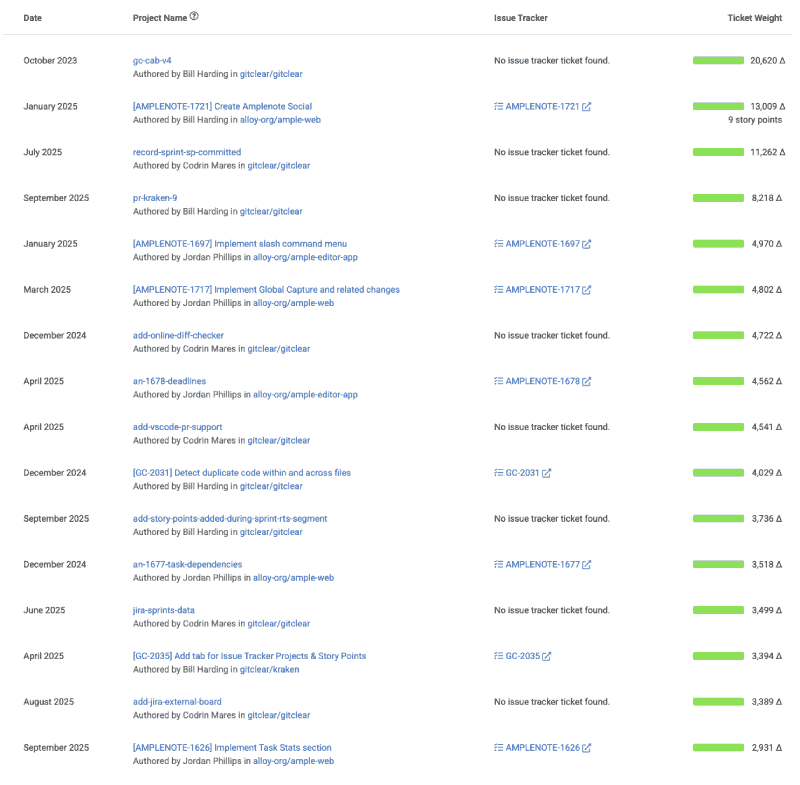
Try the Reports API segment issue_external_identifier for programmatic access.
linkStory Points Completed per Jira Assignee
This metric serves as a counterpart to "Story Points Resolved per Developer," but in this case, it also includes Story Points that were resolved without a commit or pull request that referenced them. Most teams encourage developers to mention the issue identifier in a commit or pull request, but this can be difficult to enforce in an enterprise context, so GitClear offers this segment to ensure that large teams can still assess the amount of Story Points being completed per-team.
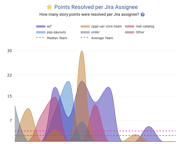
It is known in the Reports API as story_points_per_assignee.
linkUnplanned Story Points Percent
How much of the work that was completed during a sprint had not been part of the sprint when it began? Captured in the Reports API as unplanned_work_story_points_percent. This is calculated by recording the issues that were planned when a sprint began, and comparing it to the issues that were completed at the end of the sprint. If 5 of the 20 Story Points completed were from issues that had not initially been planned, the "Unplanned Story Points Percent" is 25%.
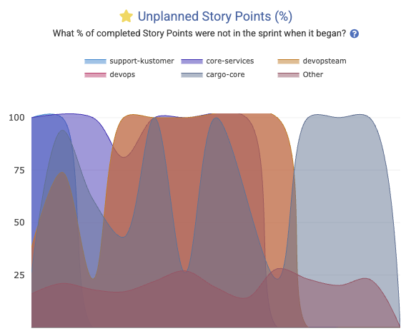
This is another graph that lends itself to Outlier View in Starred Reports:
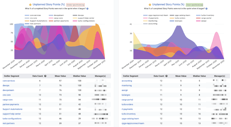
"Outlier View" in Starred Reports gives a high-level comparison of which teams are being driven by chance vs intention
There are other ways to evaluate the amount of work happening that is unplanned. On can also refer to the ticket_type API segment, evaluating the percent of Diff Delta attributed to commits that had "No issue" associated with them.
linkPull Request Stats
A critical juncture in the development process is getting code from "proposed" to "merged" and "deployed," the pull request activity stats help teams understand where there are bottlenecks to resolve in their code review.
 |  |
Below we cover the more common pull request-related stats that users ask about, but there are also rudimentary aggregated PR stats available via the API that aren't mentioned in this list, like prs_opened (total count of PRs submitted by a team or committer), prs_resolved, and prs_deployed.
Stat Name | Description | Date Defined By | Reports API Segment |
Abandoned Count/Percent | How many pull requests were closed without being merged? | Date pull request closed |
|
Change Lead Time per PR | Sum of business hours between when ( | When pull request marked deployed |
|
Hours to First Review | How many business hours passed during this interval between when PRs were opened and when they received their first comment | How many PRs were awaiting first review on the date in question |
|
Merged without Review | How many pull requests were merged without receiving a human review? | When pull request was merged |
|
Pull Request Cycle Time | Sum of business hours between ( | What PRs were resolved in this interval |
|
Pull Request Lines Saved | For customers using GitClear's PR review tool, how many fewer lines were reviewed, compared to the lines that would have been shown with a traditional git tool? | When the PRs were opened |
|
Pull Request Minutes Saved | For customer using GitClear's PR review tool, how many minutes were saved by reviewing fewer lines of code with GitClear? Calculated by taking the reviewer's average "review time per line" and multiplying it by the lines saved | When the PRs were opened |
|
Pull Requests Reviewed Count | How many pull requests did a developer review over a given time frame? | Time the first review comment was posted |
|
Reviews Left per Developer | How many reviews were created during the given interval? | Date that review was completed |
|
Review Comments Received per Developer | How many PR comments were received by the selected committer(s) during the interval? | When comment was posted |
|
Teammate Review Minutes | How much time did this developer's teammates spend reviewing their pull requests? See also | When the pull request receiving comments was opened |
|
Test Work Percent | What percentage of the work put into the pull request was dedicated toward adding or updating tests? | When pull request commits were authored | N/A |
Under Review Time | Sum of business hours between ( | Date of pull request merged |
|
linkVideo of Pull Request Code Quality Stats
While many of the "tech debt" and "code quality" stats are presented via charts and notifications (team goals) as described in the Code Quality section, it's also possible to monitor how code quality is changing during the pull request review (when action can be taken to remedy it). Check out our quick video to see how pull request review & code quality is presented (screenshots of PR code quality begin around the 4 min mark):
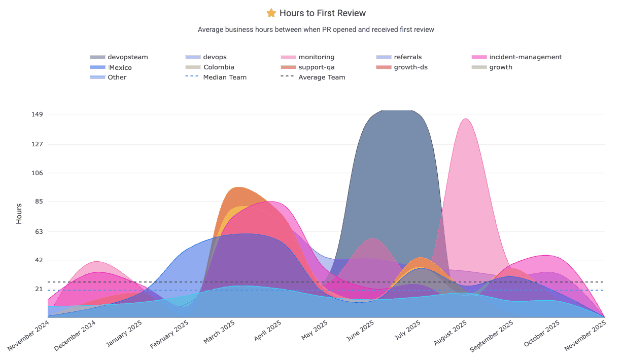
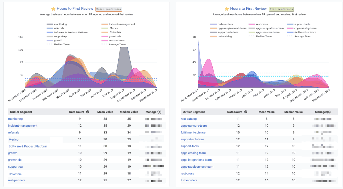
linkHours to First Review (aka "time awaiting review," "average time awaiting")
"Hours to First Review" measures the sum of business hours within a given interval that pull requests were waiting for review. For example, if developers on a team opened 3 PRs on Monday morning, then had one closed Tuesday morning, one Wednesday morning and one on Thursday morning, the "Hours to First Review" would be 8 * 3 = 24 hours for Monday (when 3 PRs were open the entire business day), 8 * 2 = 16 hours for Tuesday, and 8 hours for Wednesday. If the graph is zoomed out to show "weekly," "monthly" or "yearly" intervals, the week would show the sum of hours that those 3 PRs were waiting: 24 hours (for the PR closed Thursday morning), 16 hours (closed Wednesday morning) and 8 hours (closed Tuesday morning) = 48 hours total.
We recommend striving to keep "Awaiting hours" less than 8 (one business day). This chart can be found under "Pull Requests" => "Activity Stats"
This graph is one of GitClear's most popular graphs to include in an Outlier View comparison for Enterprise customers, where you can get a sense for the range of "time awaiting review" between various teams:
The Reports API offers pr_awaiting_review_count and pr_awaiting_review_hours to measure statistics on how long pull requests have to wait until they get reviewed.
linkPR Cycle Time (first commit to merge)
Pull Request Cycle Time, a graph found on Pull Requests => Activity Stats, represents how much time passes between a pull request's first commit and when it is merged. It’s an important indicator of development workflow efficiency – shorter cycle times mean PRs are reviewed and merged quickly, reducing wait states and keeping work moving.
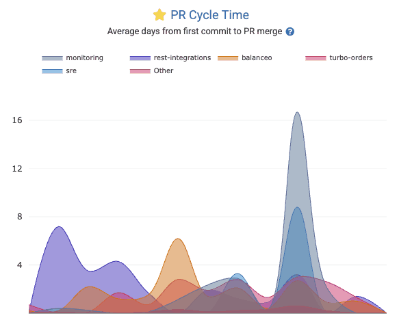
Check out the pr_cycle Report segment to retrieve the business days between when work begins on a PR vs when the PR is merged.
linkAbandoned Count/Percent
PR Abandoned Count tracks the number of pull requests get closed without being merged. An “abandoned” PR could indicate wasted effort or changes that became irrelevant or too stale. While some PR attrition is normal, a high abandoned count may highlight process problems (e.g. poor planning or review bottlenecks). Use the Reports API segment_by value of pr_abandoned_count
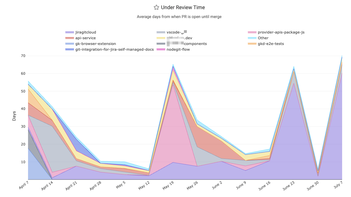
linkUnder Review Time ("Opened" to "Merged")
How many business hours passed between when the pull request was opened and when it was merged? This metric is divided by the count of pull requests that were resolved within the given interval. The Reports API references this as pr_resolved_days.
linkCollaboration: Reviews and Comments left per team member
Measures team collaboration in code review by tracking how many pull request reviews and comments each team member has left during a given time frame or sprint. Its graph can be found within the Pull Request => Collaboration Stats tab, as documented here.
In the Reports API, segments available include:
pr_review_count: Total number of reviews left on non-ignored pull requests. Date is tethered to the time the review was submitted
pr_comments_left: Total number of PR comments left on eligible pull requests by a non-exiled, non-ignored reviewer. Date is "when the comment was posted"
prs_reviewed: For a given committer, how many pull requests did they leave a comment on during the specified time interval? Date is "when the comment to a PR was posted."
linkCollaboration: Comments received per team member
Measures team collaboration in code review by tracking how many pull request reviews and comments each team member has received during a given time frame. Its graph can be found within the Pull Request => Collaboration Stats tab, as documented here. For accessing data via the Reports API, use pr_comments_received.
linkChange Lead Time per PR
A DevOps (DORA) metric for how long (in business days, aka "business hours divided by 8") it takes code changes to reach production. GitClear measures this per pull request as the average days from the first commit of a PR to when that PR is deployed to production. This indicates how quickly code changes are released. Reports API segment is pr_lead_time.
linkMerged Without Review
How often do pull requests get merged without a review or comment? The Reports API provides two segments to instrument this measurement: pr_merged_without_human_review_count and pr_merged_without_any_review_count. The former will be higher, to the extent that the customer has some PRs that are reviewed only by bots. This metric can also be found on Pull Requests => Activity Stats in the "Merged without Review" chart, and can be instrumented with a notification using the "Unreviewed Work" Pull Request Goal.
linkReasonably-sized for Fast Review
The bigger a pull request becomes, the more prohibitive for it to be reviewed. We recommend striving to submit pull requests with 500 Diff Delta or less, which generally corresponds to about an hour of review time. This can be tracked via the "Oversized" pull request goal, or via the histograms shown atop the pull request during its review, which draw from the pull request targets that can be set up per-repo, per-organization, or per-entity.
linkTeammate Review Minutes
How many total minutes did were consumed reviewing this developer's work? Especially as developers deploy increasingly AI-driven code authoring solutions, it becomes imperative to understand the cost (usually born by senior developers) of reviewing the code submitted by a developer. When no developer is specified, this segment returns the sum of all minutes spent reviewing code. For more detail on how "time spent reviewing" is calculated, see "Code Review Hours per Developer" in the following section. The time for this metric is tethered to the time that the pull request receiving comments was opened.
Known to the Reports API as teammates_review_minutes.
linkTest Work Percent
What percentage of the work in incoming pull requests is dedicated to adding or maintaining test coverage? When reviewing a pull request, the histogram on the PR Overview page will indicate how the amount of test coverage in the pull request compares to the goals that can be set per-team.
linkVelocity and Domain Expert Stats
GitClear offers a multitude of options to understand how much progress is being made, at what pace.
 |  |
linkCumulative Rate of Durable Code Change (Diff Delta)
Within the "Velocity" tab, you'll find a graph that shows development throughput (rate of code change) across repositories or teams. This helps identify the circumstances in which your teams achieve the greatest velocity (which usually corresponds with greatest developer satisfaction). Find it on the first page of the "Velocity" tab, labeled "Diff Delta by Repo" in its graph. Or fetch it programmatically as the repo segment of the Reports API.
linkDurable Code Change per Active Developer
One of the best "bottom line: how much durable code are we generating?" metrics.
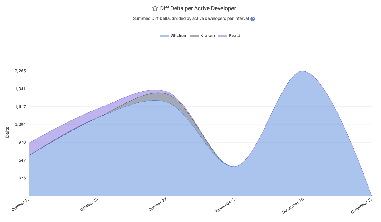
The "Diff Delta per Active Developer" chart lays out how much Diff Delta (strongly correlated with "developer effort") is being generated per-active developer. It can be aggregated by "team" or "repo." All Diff Delta is ascribed to the date on which the developer's commits were authored (so it is not impacted by rebase & force push). The segment is available via the API as diff_delta_per_committer and is available on-site under the "Velocity" =>
linkProgress by Code Domain
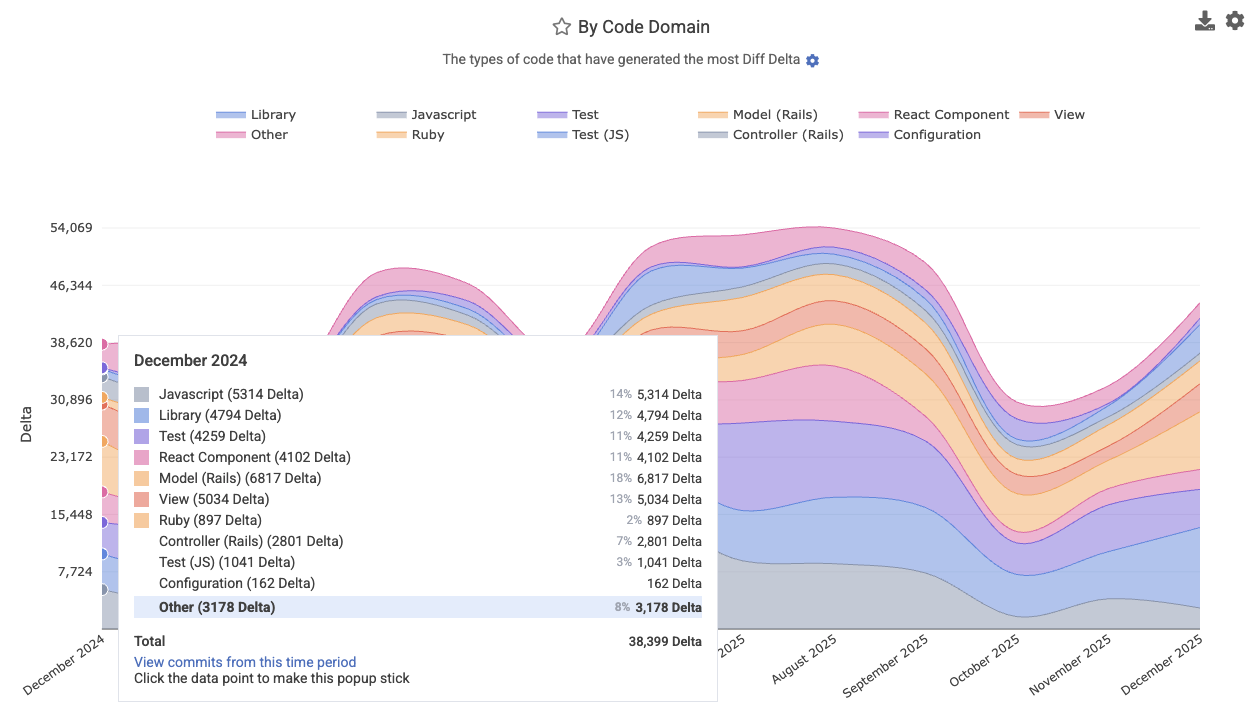
Breaks down coding output by code domain or category (e.g., "test," "documentation," "front-end," "back-end," "configuration," "devops," or other custom domains). This reveals where the team’s effort has been focused for a particular date range or sprint. Find it at Velocity => Cumulative Stats, labeled "By Code Domain." This metric makes excellent fodder for a Snap Changelog graph to share with customers or execs who are curious how a product's progress is proceeding.
Its Reports API segment is code_category.
linkDomain Experts per Code Category
Identifies the key contributors (“domain experts”) for each repository, in each technology domain your repo spans. This report highlights which developers have been most prolific in specific types of the code, and thereby helps to identify which developers to consult when a new developer (or manager) is seeking out "who's our expert in X?" for a particular repo? This data is especially useful for routing questions or reviewing complex changes. Find it under the Issues & Quality => Domain Experts tab.
linkEstimated Development Hours
Estimates the rough amount of time the team's developers spent coding. This metric is emphasized as an estimate because it only counts minutes spent on commits where it is possible to resolve the amount of programming time consumed with minimal ambiguity. For around 10-25% of commits, it isn't readily possible to estimate the amount of time consumed (e.g., when a commit is made on the weekend), and so that work isn't included in the chart. Still, this data can be useful not as an absolute source of truth, but a relative means to estimate whether "more" or "less" time has been available for programming during a given time period. The chart is available under the "Velocity" tab, and in the Reports API as the minutes_used segment. Note that, like all GitClear metrics, this is subject to our Developer-Friendly Metrics Policy, so it can't be filtered on individual committers over more than a short window of time.
In the Reports API, it's available as minutes_used.
linkDelivery Consistency (ensure commits on non-PTO days)
Establish a sense for the consistency of code activity on the team. There are two main vectors to instrument "daily progress." One is the "Daily Progress" team goal, which works in tandem with the concert Planned Absence API to allow a notification to be generated when a developer doesn't push a commit on a business day where they weren't marked on PTO. The other vector is the Velocity Consistency graph, which visually illustrates the density of commit activity on different days of the week for a selected time range.
linkChanged Lines by Provenance (how old is the code we're updating?)
Analyzes code changes by the age of the code being modified. For example, how much of the changed code this week was originally written more than a year ago vs less than two weeks ago? The provenance chart helps reveal if the team has been more active in refactoring old code (more activity in the 1+ year cohorts, healthy behavior for long-term products) or on re-re-re-writing new code, as we sometimes observe among teams that commit AI-authored code without thorough review.
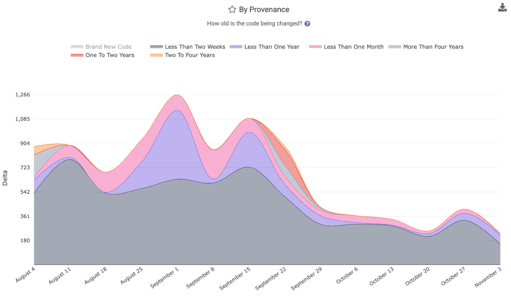
The graph for "age of revised code" is available in the "Velocity" tab, as well as the Reports API as the segment provenance.
linkCode Review Hours per Developer
How much "code review" time is induced by the work submitted for review by a team or particular developer? The "Code Review Hours per Developer," available in the "Velocity" tab, relates the answer. The stat is calculated by combining "pull request review work" with "individual commit comments," to estimate the cumulative time that has been spent reviewing the code submitted by a developer. It is calculated by summing the time spent on all review comments: for the first comment, we estimate the amount of time spent based on the author's historical "words per minute" writing comments. For the follow-on comments, we calculate their duration as "Time comment was posted minus time previous comment was posted," so long as the follow-on comment is not left an unrealistic length of time (indicating that reviewer may have been multi-tasking during the review). In the case where a comment is posted implausibly far after the previous comment left, we fall back to estimating the duration of the comment based on its length.
The impetus for this stat is to allow managers to assess whether the "AI Power User" cohort is causing a disproportionate burden on their teammates by submitting a high volume of insufficiently-reviewed crap code. It is available view the Reports API as review_time_per_active_committer.
linkCommit Counts
We don't recommend it, but fine: as long as you understand that Commit Count is among the "most game-able" metrics, you might find value reviewing the Commit Count graph on the "Velocity" page. It's also available via the Reports API as (you guessed it) commit_count
linkDiff Delta per Hour
How much durable code is being authored per hour? The "Diff Delta per Hour" graph within the Velocity tab can reveal the answer.
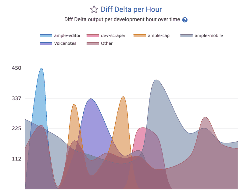
This segment can be accessed via the Reports API as the delivery_velocity.