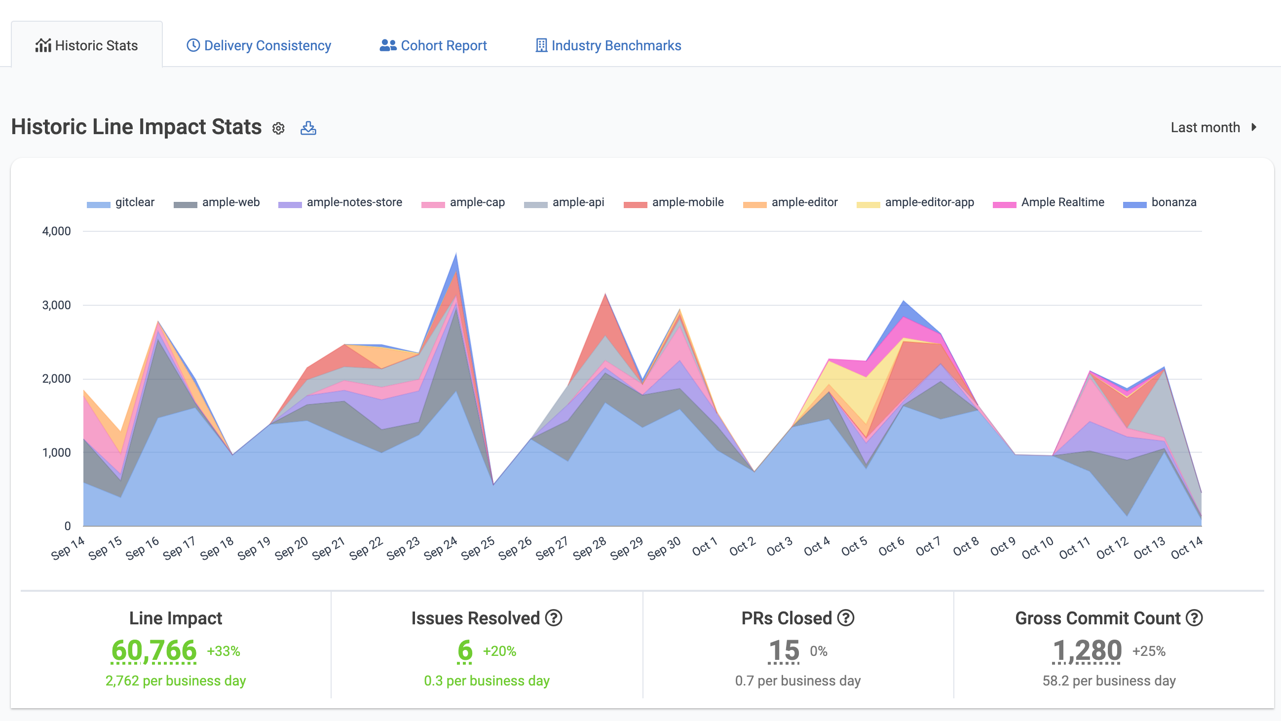
The Delivery Velocity tab is the best report to build a sense for how the company's long-term fortunes are unfolding. As will be shown below, this elements on this page offer clarity as to whether the team's velocity is growing or shrinking over time.


As with most all pages on GitClear, this page can be setup to filter on any combination of:

Time range

Repo

Organization

Committer

Team

See also: the various menus that GitClear provides to control which data is shown on the Delivery Velocity page.


GitClear's "Velocity" tab offers numerous different graphs to get a sense for how a team, developer, etc is progressing over time:


linkDelivery Velocity by Repo

The first graph shown on the page is called "Historic Diff Delta Stats," and by default it shows how Diff Delta per repo or per team is changing over time:


Historic Diff Delta stats show which repos (or teams) have made the most progress on writing durable code during the time range selected


Hover over any data point to get a more detailed breakdown:

Hover on a data point in the Stats Historical Graph to get a detailed breakdown of its constituents


You can also use the download icon to the right of the graph's title to download all of this data into a CSV file.


linkLine Operation Counts

See the type of work being undertaken by a particular team or developer over time


In accordance with our 10x media-cited research into AI Code Quality, smart Team Managers often seek to ensure a baseline level of "Moved" and "Deleted" code, while minimizing the frequency of Copy/Paste. The "Line Operation Counts" graph makes apparent the frequency with which these types of changes are occurring.


linkVelocity by Team

The default chart under the "Velocity" tab shows how much Diff Delta has been accumulated by team


When the "All Contributors" team is chosen, the "Velocity" tab will start with a graph that shows how much Diff Delta has been registered per-team over the selected time range, in the organizations and repos being viewed.


linkWork by Code Domain

What type of work has the team (or developer) spent most time on lately?


The "Code Domain" graph shows managers the high-level type of work that has been underway during the selected time range.


linkVelocity By Release/Deploy

For teams that have set up deploy tracking, it's possible to see how much work has gone into each release (deploy) over the time range selected:


Which recent releases included the largest amount of work?


For teams that release specific versions of their app (e.g., v1.3.2), this graph can help managers understand how the relative size per product release is changing.


linkVelocity By Code Age (Code Provenance)

Another graph analyzed by GitClear's AI Code Quality research, this shows how much of a team's energy has been spent revising "Recent code" vs "Older code"

How much work is revising legacy code vs. churn?


By shift-clicking the "Brand new code," it's possible to revise this graph to just focus on the code that has been revised.


linkEstimated Developer Hours

Approximate amount of time that has been spent working in various repos for a particular team/developer


This graph builds upon GitClear's unprecedented work to estimate the time spent authoring commits. This information is also embodied in GitClear's Directory Browser, where it helps to pinpoint the directories that cause the biggest slowdown to developers forced to work in them.


linkPercentage of Work Spent Bug-Fixing

This velocity graph, located under the "Issues" tab, shows how much Diff Delta for a team or developer is being spent on "bug fixing"

Viewing how much developer energy has been spent bug fixing, by team or repo, over a chosen time range


When Google DORA stats are showing a high rate of defects, or customers have complained about the stability of recent releases, the "Bug Work Percent" graph cuts straight into the percent of Diff Delta per repo that has been consumed by bug fixing efforts over the chosen time range.


"Bug fix work" is principally defined by a Jira integration (i.e., work on tickets that were marked as "Bugs") but can also include commits that include language indicative of bug fixing. Read more about the Bug Work Percent graph here.


linkQuality Cornerstones Graph

This graph, shown under "Issues" => "Stats" tabs, reveals how code quality indicators are trending:

Viewing a team's energy spent on "Documentation" and "Test," relative to industry benchmarks


This graph is for teams that want to confirm that they are undertaking work that will maximize the velocity of the team's repos over the long haul.


linkPer-Developer Stats

For teams whose count of developer has changed rapidly, these same graphs are available in a separate tab, that enumerates each stat on a per-developer basis. Read more about the Per-Developer Velocity Stats here.