Hiring the right developer is a time-consuming process that can drain productive hours from your week. Recruitment takes time. Mistakes can be costly. And your competition is out there, wooing the very same software engineers. After agonizing over your decision and bringing a new developer on board, how do you know if you've made the right choice?
link🤔 Estimating new developer performance before GitClear
For those of us without a crystal ball or the ability to travel into the future, we’ve had to rely on a hodgepodge of questions to quantify the performance of a new employee.
Traditionally, measuring an employee’s performance relies heavily on subjective information. Appraisals are based on what the manager can easily remember, which are usually the most recent – but not necessarily the most relevant – events. As a result, appraisals end up relying on unsubstantiated opinions and incomplete information. Recency bias – the tendency to assign more significance to a recent event – can also skew appraisals.
Any measurement of engineer productivity that doesn’t include quantitative data is underqualified for the task at hand. If you need to know how long your pinkie is, you don’t ask questions and speculate – you get a ruler. Cohort analysis is one of the best ways to add a quantitative component to your existing developer evaluation process.
link📐 Measuring ramp up speed using a GitClear Cohort Comparison
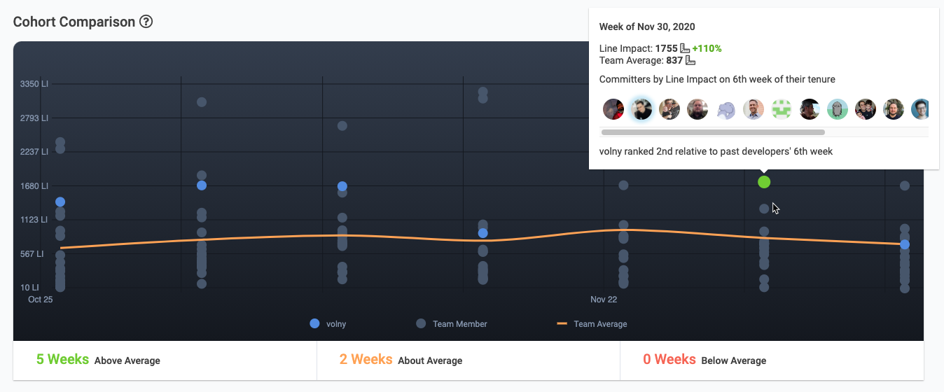
The Cohort Comparison graph shows how quickly a new developer is getting up to speed relative to past developer hires. The committer shown here scored the second highest ever Line Impact for a 6th week of tenure.
A cohort is a group of people who share common characteristics within a defined period of time. It’s a great method to compare an employee to others who are at the same stage in their career, or in a similar role. Comparing individuals to a group of their peers makes it easy to spot differences in performance or work style. It’s a good way to identify the highest (or lowest) performing developers and gain insight into the factors that influence their productivity.
But traditional cohort analysis can be a time-consuming and flawed process. First, you need to define the cohort you’ll be measuring – not an easy task if you manage multiple teams working on a disparate collection of coding assignments. What type of projects should receive the most emphasis? What data points will you use? Most often, engineer cohort analysis is based on data gleaned from ticketing systems like JIRA. But counting closed tickets is an overly simplistic way of evaluating engineer productivity. Once a manager makes all these decisions, the data still has to be imported into Excel, normalized and formatted before the first report can be created. No wonder so many managers loathe the task. It’s a perfect recipe for procrastination, followed by settling for recency bias.
GitClear uses cohort analysis to give development managers a powerful new code metrics tool built for reliability. Based on our experience, we’ve listed a few areas where code metrics can steer a new developer toward their path of maximum throughput and satisfaction:
linkIdentify strengths
Does your new hire excel in Python, but struggle with Ruby? What types of tasks do they excel in? Are they willing to learn others?
linkCompare like-with-like
Is your new hire struggling to commit code? How little should you expect in weeks 1-4? Can better onboarding speed that up? How does that measure change by week ten?
linkAward consistency
Does the new hire possess the self-discipline needed to work remotely? How can you challenge them to work more efficiently, without sacrificing quality? How can you identify and award those that consistently improve their output?
linkReliably identify top performers
Quantifying output is a tricky proposition. GitClear determines developer output using Line Impact. This metric combines over 10 overlapping measures of engineering output, to form a composite measurement that managers can trust. The most flattering compliment we receive is “wow, this output chart matches up with what I already thought!”
link📈 Charting a developer’s contribution over time
Here are a few ways that GitClear uses cohort analysis and other visualizations to create a more accurate measure of engineer productivity.
linkCohort Comparison Chart
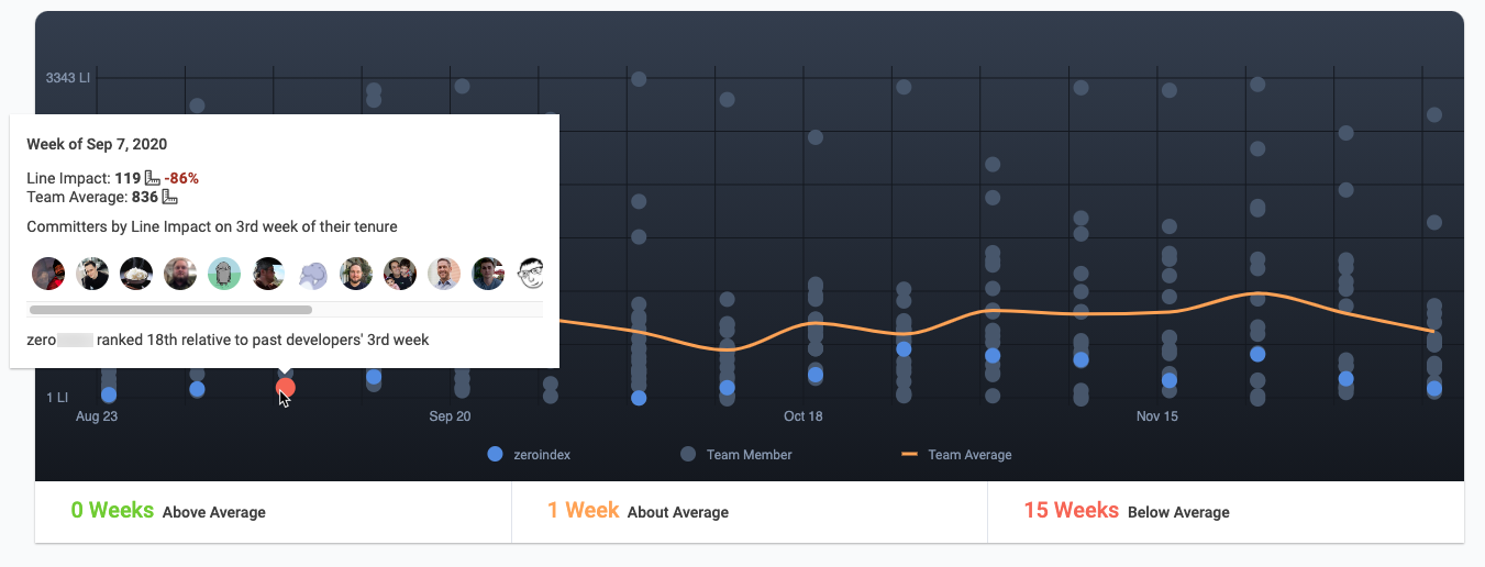
The best chart we have to understand how a new developer compares to their teammates at the same point in their career is the Cohort Comparison chart. Compare the Line Impact over a configurable time range. Check up on how the first 2, 4, or 6 months of the Developer’s career compare to that of their colleagues at the same point of tenure. This chart can be filtered to only show “Junior Developers,” “Devops Team,” “Software Architects,” or whatever other groups your organization identifies.
linkCategory Comparison Table
This table paints a broad-strokes picture of your employee’s strengths. Quickly grasp how a developer’s Line Impact varies based on where they’re working within your tech stack (e.g., front-end, engine, documentation). Understanding where a developer excels can help identify tasks that will maximize their productivity and job satisfaction.

linkDeveloper Comparison by Week
Similar to the Cohort Chart, but not anchored to employee tenure. On this chart, you’ll learn how developers of all experience levels compare to one another over your selected time range. For developers past their second year of experience, it’s often most informative to use this chart, since it normalizes shared temporal conditions that may impact productivity (like the holiday season).

link👼 How are your new hires doing? How do you know?
Re-inventing cohort analysis is just one of the ways GitClear creates a clear picture of developer productivity. As a development manager, you’ll have the confidence in knowing that you are evaluating your team fairly. An evenly-applied measurement like Line Impact can be less subject to bias than human evaluators. And that, in turn, will give your developers the assurance that their hard work is rewarded – leading to even more productivity, and more great hires.
Interested in seeing what cohort analysis can tell you about your new hire? Visit our home page, or sign up for a free trial.