The second half of 2025 marks a turning point for engineering analytics. As generative AI assistants have grown ubiquitous, the traditional signals that reliably helped leaders understand productivity -- Commit Count, Diff Delta, PRs Opened -- have begun to break down. Assistants are inflating code metrics across the board, while applying gravity toward deep-seeded tech debt via quiet code duplication.
Given these challenges, GitClear's latest round of updates takes aim at the key question: Which AI agents are delivering the most value right now, and which teams are measurably getting ahead thanks to their use of AI?
Q3 introduces the most comprehensive upgrade in our history: granular, AI usage visibility, cohort-based analytics, context-rich metrics, and a fully consolidated Developer Analytics Encyclopedia. Together, these tools form a framework we call Contextual Intelligence—the ability to not only see that code changed, but to understand why, how, and by whom.
If Q2 was about uncovering AI’s growing influence, Q3 is about making that influence measurable, comparable, and actionable.
linkHeadline Upgrade: Quantify Long-term Impacts of Heterogeneous AI Use (Copilot, Cursor, Claude Code)
A defining challenge of 2025 has been code line inflation. Earlier GitClear research revealed a dramatic surge in duplicated code, churn, and “easy wins” generated by LLM coding assistants. I spoke about this at LeadDev New York, and now we’re delivering the tooling to quantify the phenomenon at scale.
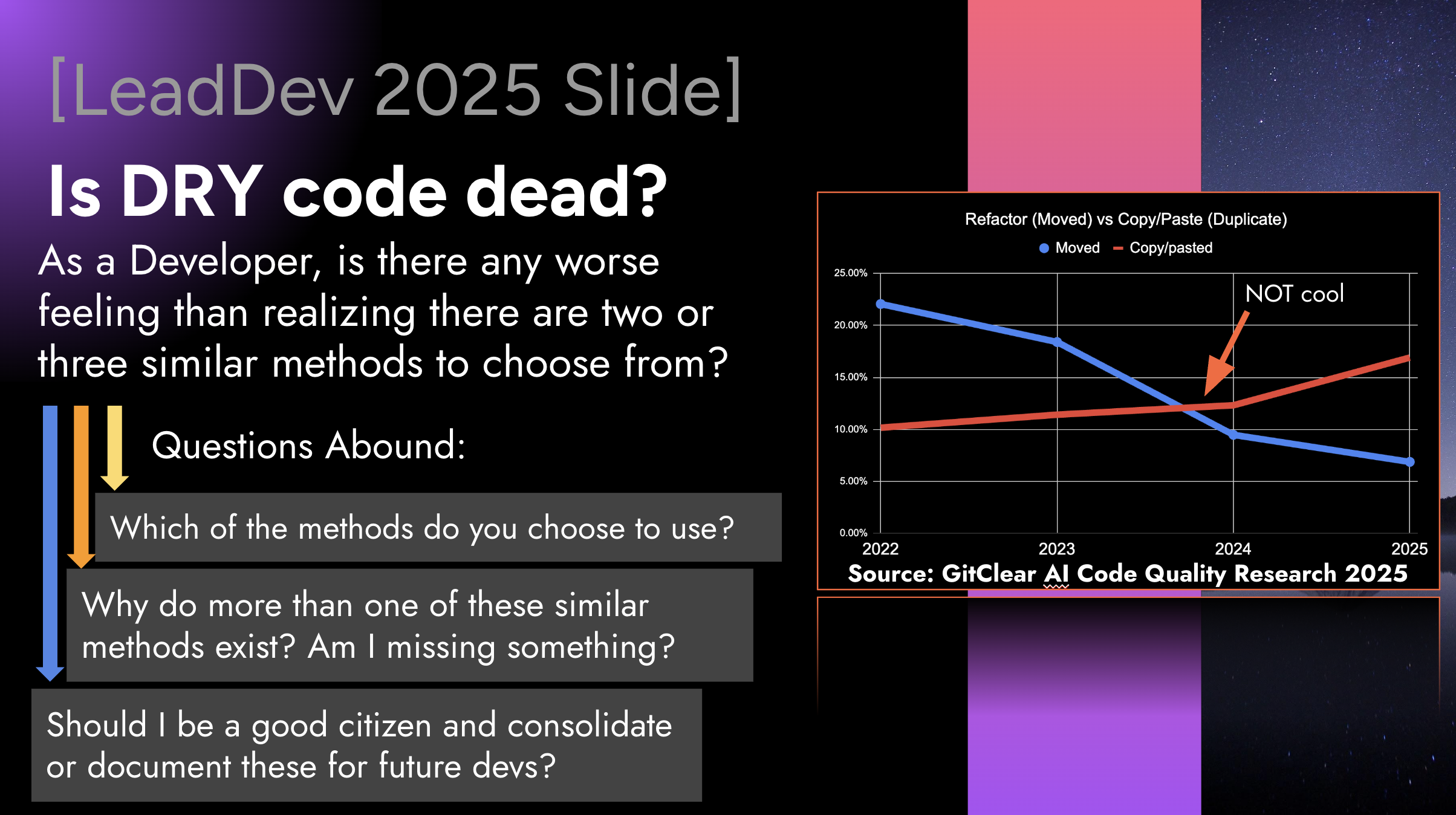
A slide from LeadDev New York, showing how developers have crossed to the dark side of "moving code" to "duplicating it"
Now, we have not only the stats to go beyond these generalities. We also have a brief 3 minute video to introduce GitClear's AI usage stats:
linkAI Usage Data: Piercing the Black Box of AI Attribution
The foundation of the Q3/Q4 strategy is the ingestion and processing of AI Usage Data, like "All Suggestion Count":
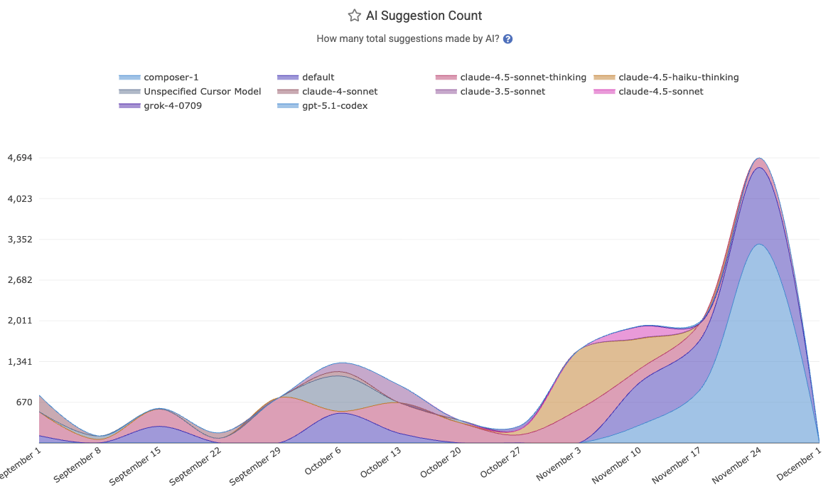
Every snippet of AI involvement is now captured:
All Suggestion Count
Model-invoked autocompletions
Prompt-level interactions
Agent-driven refactors
Code block insertions
linkAI Acceptance Rates: What Has Your Model Done for You Lately?
In a full-circle moment in the AI wars, it was recently reported by WSJ and others that OpenAI declared a "Code Red" in response to Google...about one year after Google had declared a "Code Red" in response to OpenAI. 🎭 These billion-dollar companies are fighting tooth-and-nail to keep their edge. How can developers and execs ensure that they are leveraging the best option of this month?
GitClear's API integrations now ingest telemetry regarding the intensity & quality of every team's AI interactions. This goes beyond binary "enabled/disabled" flags to track granular details about how developers from various teams are liking the LLMs they choose to interact with:
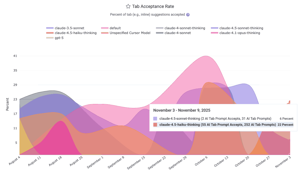
The AI Usage charts will relate per-team (and for Cursor/Claude, per-developer) truths like
Prompt Acceptance Rate – What percentage of explicit AI suggestions are accepted and committed
Tab Acceptance Rate – How often “ghost text” autocompletions actually become code
Flow Quality Indicators – A measure of cognitive overhead vs. multiplier effect
This gives engineering leaders a grounded way to evaluate model performance—without relying on anecdotes or marketing claims.
linkAI Cohort Stats: Tease out the True Impact of AI Use
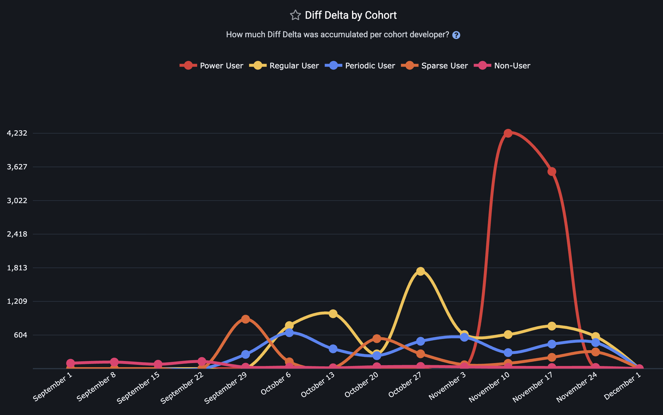
The most significant breakthrough of Q3 is GitClear's AI Cohort Stats framework. This feature acknowledges a critical reality: AI adoption is non-uniform. In any given engineering organization, distinct behaviors emerge as ad hoc A/B tests.
You can ignore the A/B tests happening around you, or you can leverage them into wisdom that can be applied across teams. Recognizing the truth of who has played the role of "Power Users," "Regular Users," and "Skeptic/Non-Users" lets you tie behaviors to KPIs.
Treating the team as a monolith dilutes the signal of "which metrics are impacted by AI?" Segmenting them reveals the truth.
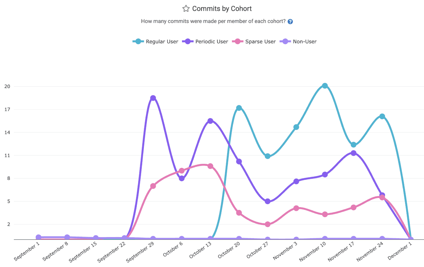
"Commit Count" is a common, if easily gamed, measurement used among "productivity gauging" metrics
Cohort levels are broken into five strata, explained on the Cohorts help page. GitClear dynamically segments developers per-week, based on their interactions with AI tools (Copilot, Cursor, Claude).
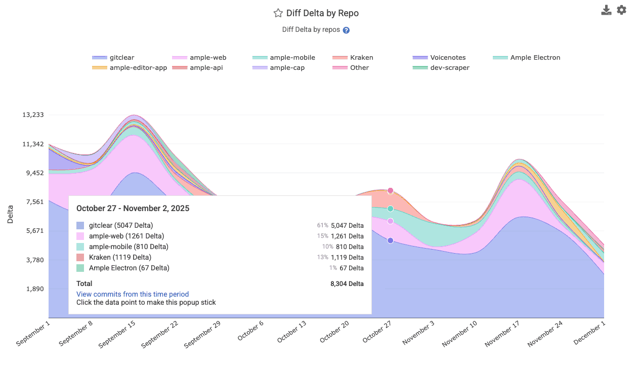
Note that, for each cohort, the value shown on the cohort graph is the average value per developer among developers in a particular cohort. This distinction ensures that the cohort with the highest value isn't de fact the cohort with the highest amount of "Diff Delta," "PRs Opened," etc. For a Cohort curve to soar, the developers who inhabit that cohort must each prove their mettle.
linkCohort Metrics Available
Metric | Strategic Question Answered | Implication for Management |
Diff Delta per Cohort | Do power users generate more durable value? | If Power Users have high LOC but low Diff Delta, they are generating noise, not features. |
Churn Prevalence | Does heavy AI usage lead to fragile code? | High churn in the Power User cohort suggests AI code is often rejected or rewritten shortly after commit. |
Teammates Review Time | Are AI users burdening their peers? | If AI users generate code 2x faster but increase peer review time by 3x, the net team velocity decreases. |
Pull Request Volume | Is AI fragmenting the workflow? | Identifying if AI encourages smaller, more frequent PRs or massive, unreviewable code dumps. |
Copy/Paste Prevalence | How much is AI causing code to be duplicated? | The more that code is duplicated instead of being reused, the greater the likelihood that the team's long-term velocity will decrease. |
Story Points Completed | How many difficult issues is a developer closing? | For teams that use Story Points, there is often no purer barometer of how rapidly a developer is advancing the product roadmap. |
Commit Count | To what extent does AI use accelerate commits? | If developers with more AI use aren't authoring more work, then something happening on your team is arresting progress. |
Test Delta | To what extent does AI use lead to confirming code validity? | Since developer surveys suggest that "writing test code" is one of developers least favorite activities, higher AI use should accelerate this best practice. |
Some representative customer graphs, showing real world data. It has been comforting to see our initial customers who deploy AI Cohorts have observed results in line with what one might naively expect (more AI use = more productivity, but also more AI sludge to process).
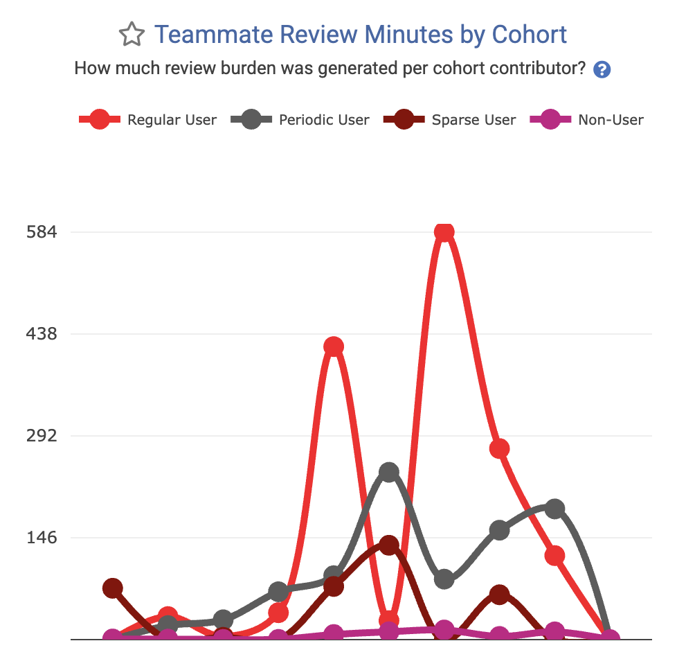 Metric to minimize: How much time is being soaked up reviewing code generated by each cohort? | 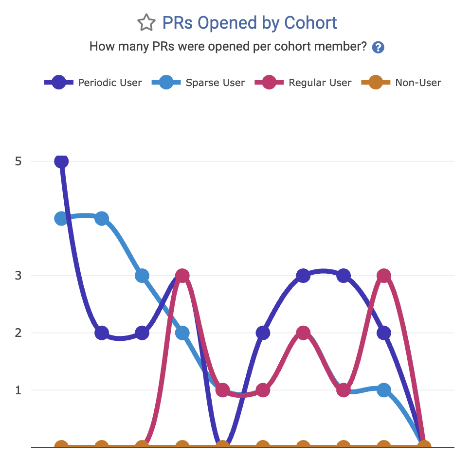 Metric to maximize: How many pull requests are being opened by developers in each AI cohort? |
There are a wide and growing variety of AI Cohort stats available, see the entire set of them (Diff Delta by Cohort, Story Points Completed by Cohort, Copy/Paste per Cohort, etc) on our dedicated AI Cohorts help page.
linkComprehensive Sprint Stats for Jira users
For teams that plan with Story Points, GitClear now offers an entire tab dedicated to comparing teams' performance (teams plural because this feature most often applies to Enterprise customers) at planning and executing the goals of the company.
All of the current sprint stats are explained on our new help page dedicated to configuring and using Sprint Stats.
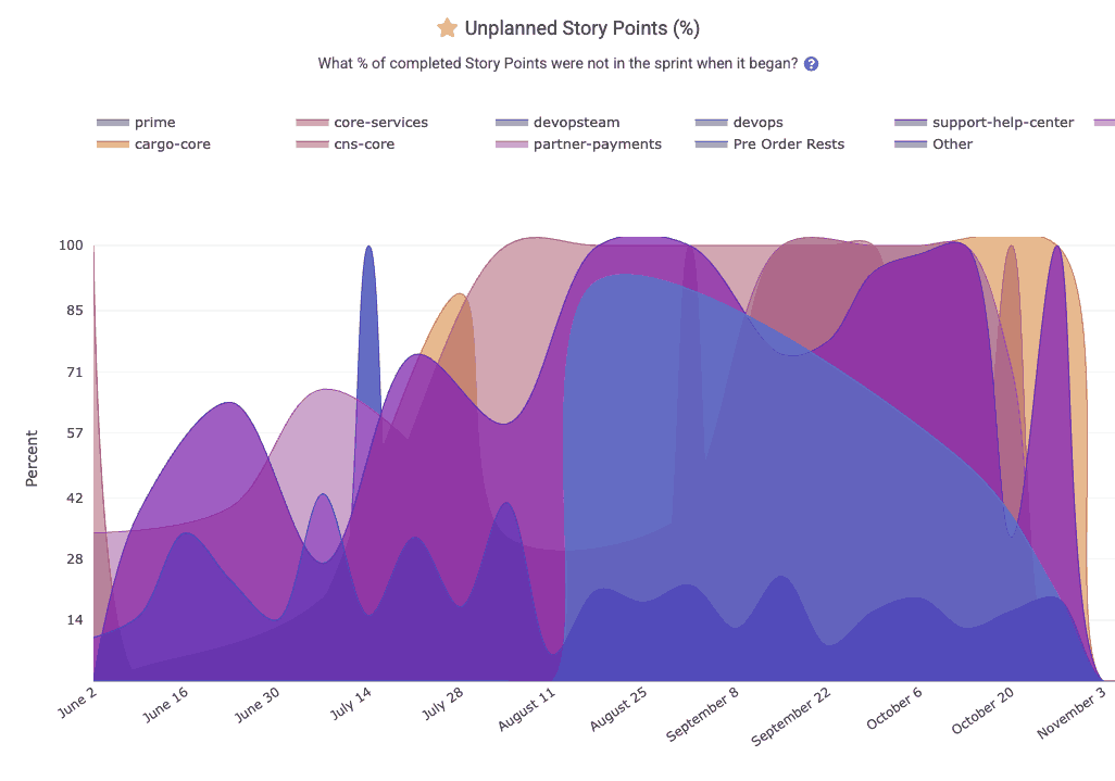
What percent of the team's issues worked were planned at the beginning of the sprint?
The Sprint Stats tab is ready to surface graphs that answer questions like:
How many points were committed?
How many were completed?
How many unplanned points were added mid-sprint?
Consistency of execution across teams?
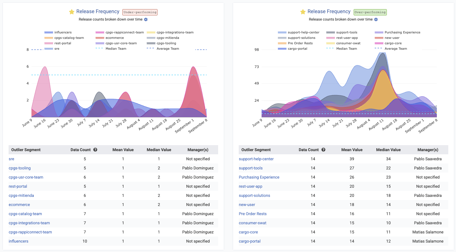
Enterprise teams using Starred Reports Outlier View, will get an instant sense for which teams are the "role models" that can be used as inspiration and examples to inspire those teams that have struggled to execute on the plans they set.
linkArea Chart Improvements: Tooltips, Resizing, and Much More
A major focus this quarter was improving the readability and usefulness of GitClear’s charts.
Specific chart upgrades include:
linkMedian, 10th percentile and 90th percentile comparison lines: Now live
Most charts now support the means to show the "median," "10th percentile" and "90th percentile" performance across all teams in your entity. This is crucial information for understanding how far a team's results are from the median team among a large set, as viewed in Starred Reports Outlier View.
This is a favorite feature among our enterprise customers.
linkMore Q3 Upgrades: Documentation, Release Rules, Developer Velocity & Diff Viewer Enhancements
A grab bag of upgrades originating from customer requests.
linkContextualized Per-Committer Velocity
Now, when you hover on a committer's avatar on the left side of the CAB, you'll get the full rundown of how their recent velocity compares to historical velocity from the past year.
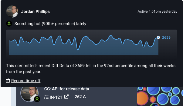
As always, use "Record time off" when a developer is taking PTO in order to avoid having them designated as "behind their average velocity."
linkUnified Metric Documentation
While the AI tools provide the mechanism for measurement, the new Encyclopedia of Developer Analytics, provides the meaning. This initiative represents an effort to standardize the taxonomy of developer analytics, addressing the "Consensus Gap" that has historically plagued our industry, and it's reports (even DORA).
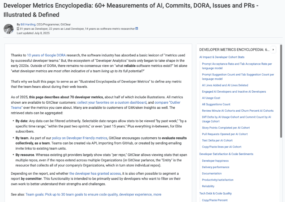
A full, browsable rundown of available metrics from GitClear now resides in one place
Perhaps the most welcome upgrade for consumers of the GitClear API: each section of metrics now includes a table to summarizes each available metrics. This table includes how we define the date for each metric.
Side bonus: Did you happen to notice, as your read this blog, how you now have a scrolling sidebar to contextualize where you are within the page, and how you have a ubiquitous path straight to another section?
linkNew Release Rules: Github Actions and Merged Pull Requests
Two new ways to define when a release is occurring in your repos. These rules are particularly useful for capturing historical releases, which are difficult to reliably detect with historical branch-based rules.
One of the new options is a rule to allow a release to be designated any time that a pull request is merged to a specified branch:
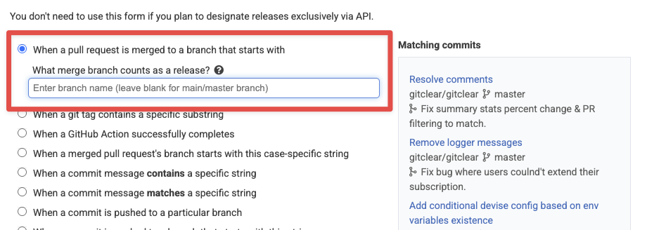
Release defined by branch that release is merged into
There's also a new option to capture a release whenever a Github Action successfully completes:
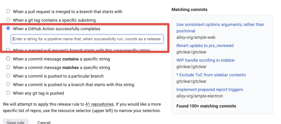
Define a release to occur when a Github Action successfully completes
We can also integrate the new "Github Action" rule to apply to the "Pipeline Actions" offered by Bitbucket, Gitlab and Azure Devops, if paying customers write to us to request it.
Note that, if a single commit qualifies as a release by multiple rules, we will only designate the commit as a single release, as long as all of the rules converge to that single commit (e.g., if the commit pushes a tag, merges a PR, and has a particular deploy message in it).
linkDiff Viewer Improvements
For those using GitClear for pull requests (like us! 🐶), substantive progress was completed during Q3.
linkCopy code from "Unified" or "Split" view
linkAllow a diff file to be marked "Reviewed" from top of file
For those that are accustomed to the Github convention of marking a file as "Reviewed" using a checkbox atop the file, guess what:
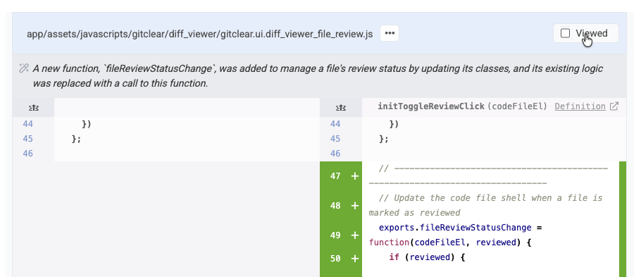
Marking a file as "Viewed" will close, it while marking its contents as "Reviewed" unless/until the developer makes additional changes to the file during a subsequent PR review pass. As always, you can also automatically mark files as "Reviewed" by just scrolling through them and not clicking anything. 😇
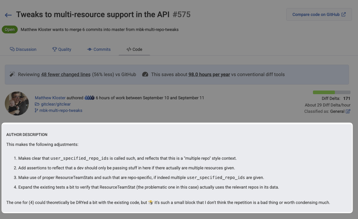
linkPull Request Diff Viewer Includes Author Description
No need to visit the "Discussion" tab to see what changes a pull request seeks to implement. That is now present atop the main "Code" tab used to review the PR's contents:
This blends especially nicely with GitClear's updated Slack pull request notifications, letting you can jump straight from a Slack message about "This PR has been sitting around longer than your team prefers" to clicking the adjacent link to "Review the PR." Most every pull request goal now includes a link to review the pull request when the notification is sent via Slack.
linkAPI Upgrades Across the Board
Now that GitKraken Insights is utilizing GitClear's full breadth of stats, we've been busy with more upgrades than could be fully enumerated in one blog post. A taste of recent improvements include:
New Critical Defect segments for absolute_hours_until_resolved_per_defect and absolute_hours_to_first_repair_per_defect, for managers that want the time recorded for "Critical Defects" to be measured in real hours, instead of only business hours.
Explicit control of report aggregation. aggregate_by can now be explicitly set to group any Reports API segment by "repo," "team," or "all data"
Submit AI data for custom providers. Are you using an AI provider not yet covered by GitClear? You can now submit AI usage data directly to the GitClear API and have it incorporated into your Cohort & AI Usage reports
linkGithub Team sync will reuse an existing team when available
When you initiate an import of teams from Github, we will now only create a team if the team does not already exist on GitClear.
linkManually refresh list of importable repos
When choosing which repos to import, you can now manually refresh the list of importable repos:
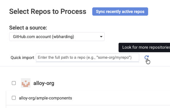
This is especially useful if you decide to add new repos to your account while you are in the process of choosing which repos to import to GitClear.
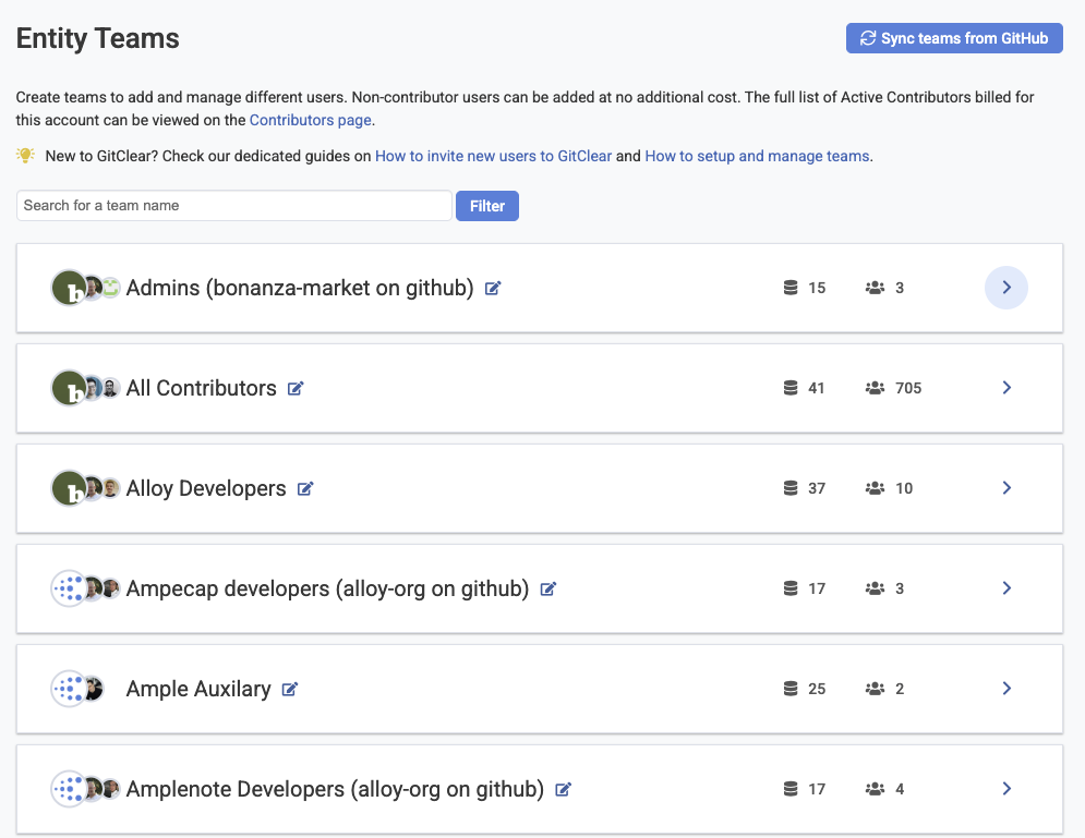
linkContributors Page: Canonical Source of Truth for Seated Developers
The "Settings" => "Contributors" page now presents a wealth of information to answer common customer questions like "How many seats do we have?" and "How many seats will we have after our next renew?"
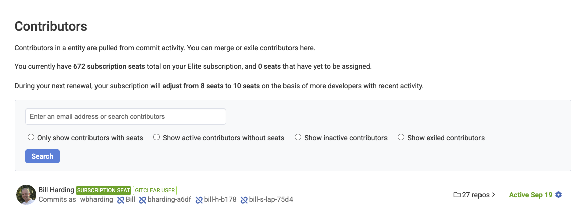
As always, you can manually adjust which developers are processed by clicking on the "Gear" icon at the right of any contributor line. We have also improved our bot detection handling to recognize Cursor and Copilot as types of bots.
linkOdds & Ends
Smaller improvements worthy of a mention.
Better committer dupe spotting. We now use the full name of contributors as an additional means to recognize when two git identities represent a single developer.
Callout when job processing is delayed. A common question from customers is "when will settings changes be propagated to my chart data?" The primary determinant is "the status of the GitClear asynchronous job queues;" the possible backup on these queues is now spelled out next to the site icon when a job queue is delayed (in the case of prod) or always (in the case of Enterprise)
Snap Changelogs now allow explicitly choosing "Magnitude" of change. Choosing "Epic" improvement/bugfix/upgrade promotes the changelog entry to the top of the list.
link🔮 What's next? Help us pick
This quarter was about clarity -- illuminating how developers interact with AI, exposing patterns that were previously invisible, and restoring trust in engineering analytics.
But clarity is only the beginning.
In the coming quarters, we plan to leverage our AI late-mover advantage to move from analysis to action. As Amplenote is doing with “task-strategizing AI,” GitClear will begin helping teams execute more effectively — from identifying unstable code to proactively recognizing which charts looks amiss, which tickets that seem off-schedule, or model usage strategies.
The marriage of empirical developer analytics and intelligent AI assistance is the future toward which we’re accelerating.
As always, your feedback guides our roadmap! 🗺️
What do your AI cohort stats reveal?
How do your acceptance rates compare across models?
Which teams are becoming power users — and what can we learn from them?
Drop us a line! We want to build this super-dashboard together.
linkAppendix: Feature & Upgrade Matrix (Q3/Q4 2025)
The following table summarizes the key features, architectural updates, and research initiatives launched or significantly updated between July 7, 2025, and the end of the year.
Category | Feature / Update | Context / Description | Key Benefit |
AI Analytics | AI Cohort Stats | Segmentation of developers into Power, Regular, and Non-User cohorts. | Allows comparison of Diff Delta and Churn across user types. |
AI Analytics | AI Usage Data | Ingestion of telemetry (Prompt/Tab acceptance) from providers. | Measures the efficiency and distraction levels of AI tools. |
AI Analytics | Churn Prevalence | Metric tracking the % of code deleted shortly after creation, per cohort. | Identifies "fragile" code generation by AI. |
Education | The Encyclopedia | Standardized definitions for 60+ metrics (DORA, Tech Debt, etc.). | Creates a shared language for engineering management. |
FinOps | Opex/Capex Tracking | Automated categorization of issues/commits based on "Epic Category." | Automates financial compliance and R&D tax credit reporting. |
Workflow | Issue Browser | Dedicated view correlating Jira issues with Diff Delta and Story Points. | Connects planned effort to actual code impact. |
Workflow | Issue Lead Time | Chart measuring time from ticket creation to deployment. | optimizing delivery pipelines (Lean/DORA). |
Visuals | Snap Changelogs | Updates including Magnitude Selector, Branch Exclusion, and Reactions. | Enhances remote status reporting and team morale. |
API | Project Results | Standardization of projection logic for incomplete time periods. | Ensures consistent reporting between API and UI. |
Research | Code Clone Study | Integration of findings regarding "4x growth in copy/paste" into UI. | Alerts managers to declining code uniqueness and modularity. |