The second quarter of 2025 has been our most ambitious to date, with over 60 significant updates spanning four changelog pages. From the "done here first" drag-enabled Commit Activity Browser, to User Favorite chart collections, these improvements are a significant leap forward in making GitClear the most powerful and developer-friendly code intelligence platform on the market.
Whether you're a programmer seeking a smoother "code review" & "work publishing" experience, an engineering manager focused on maximizing AI velo or an executive, understanding how tech debt is evolving with AI -- this quarter's releases deliver measurable improvements to transform your daily workflow.
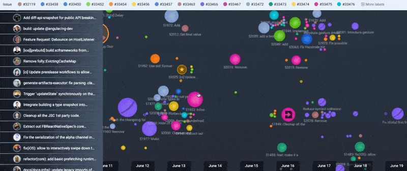
Here is a quickie 5 minute video to illustrate the headliner feature: Scrollable Commit Activity:
And with that -- one feature described, 59 to go! 😬
link🚀 Epic Feature Releases
The "George Clooney and Margot Robbies" of the past three months. These are the features that can immediately change your processes for interpreting repo progress, code quality, and defects.
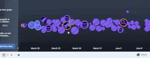
linkDraggable History in Commit Activity Browser
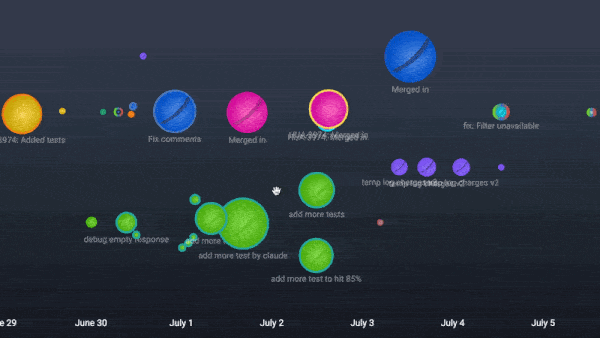
Our most-awaited feature enhancement makes commit history into a canvas of visually apparent milestones.
Being able to drag back through history in the Commit Activity Browser dramatically improves the ease of browsing through all work on a sprint (news on "Sprint Detection" also bundled in this update! 😉), making it, almost, dare-we-say.... fun? to navigate through a multi-repo codebase timeline.
⏩ For Developers, this update eliminates the friction of navigating through your commit history, to enable rapid review of your recent work, and the work of teammates from you're collaborating with.
⏩ For Engineering Managers, the smooth drag interface makes it effortless to jump between days, weeks, or multiple sprints of team activity, to pick out trends or anomalies in development velocity.
⏩ For Technology Executives, this enhancement flattens the learning curve for new team members who want to find examples of how/where AI is being adopted. It also offers a means to see the circumstances when your teams are operating at peak efficiency.
linkNew Issue Browser, Clarified Diff Delta<>Story Point Correlation
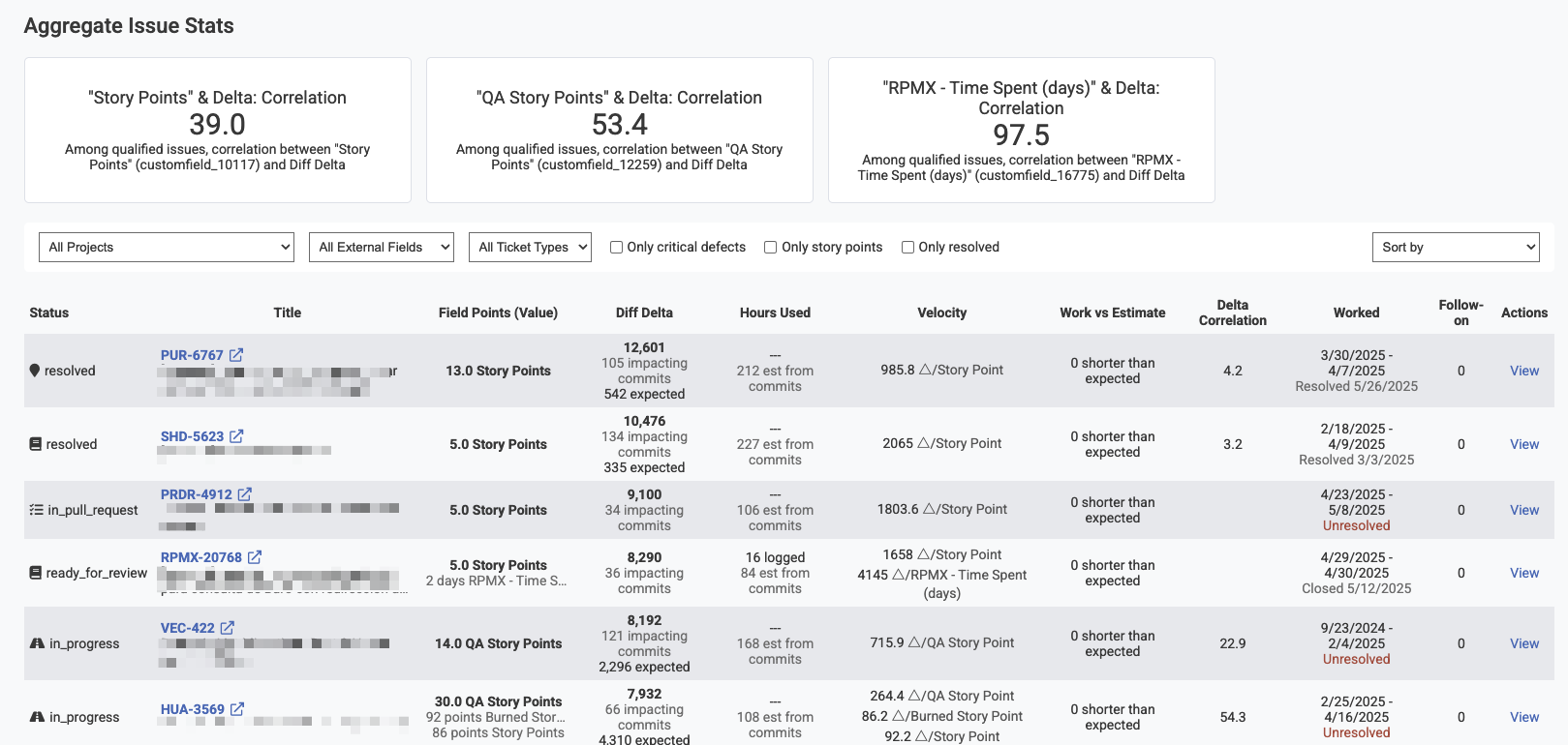
This feature introduces a comprehensive report for viewing individual Jira issues and their story point correlation. All graphs for issue stats now link to the Issue Browser, where a viewer can quickly isolate issues metastasizing beyond their planned outlay of time/effort.
The higher that you can drive your "Diff Delta" / "Story Point" correlation, the more predictable your release cadence becomes. And, when a developer is struggling to get purchase on an an important issue, this data can let a Senior Developer intervene when proactive help/clarification will be received warmly by a struggling implementer.
linkUser Favorite Chart System
Users can now designate charts as "User Favorites." The favorite reports get bundled together into a single "Starred Reports" tab that let you follow the exact metrics (from 50+ metrics GitClear now tracks) you care about most. This addresses the common challenge of navigating through numerous reports to find the most relevant data for daily decision-making.
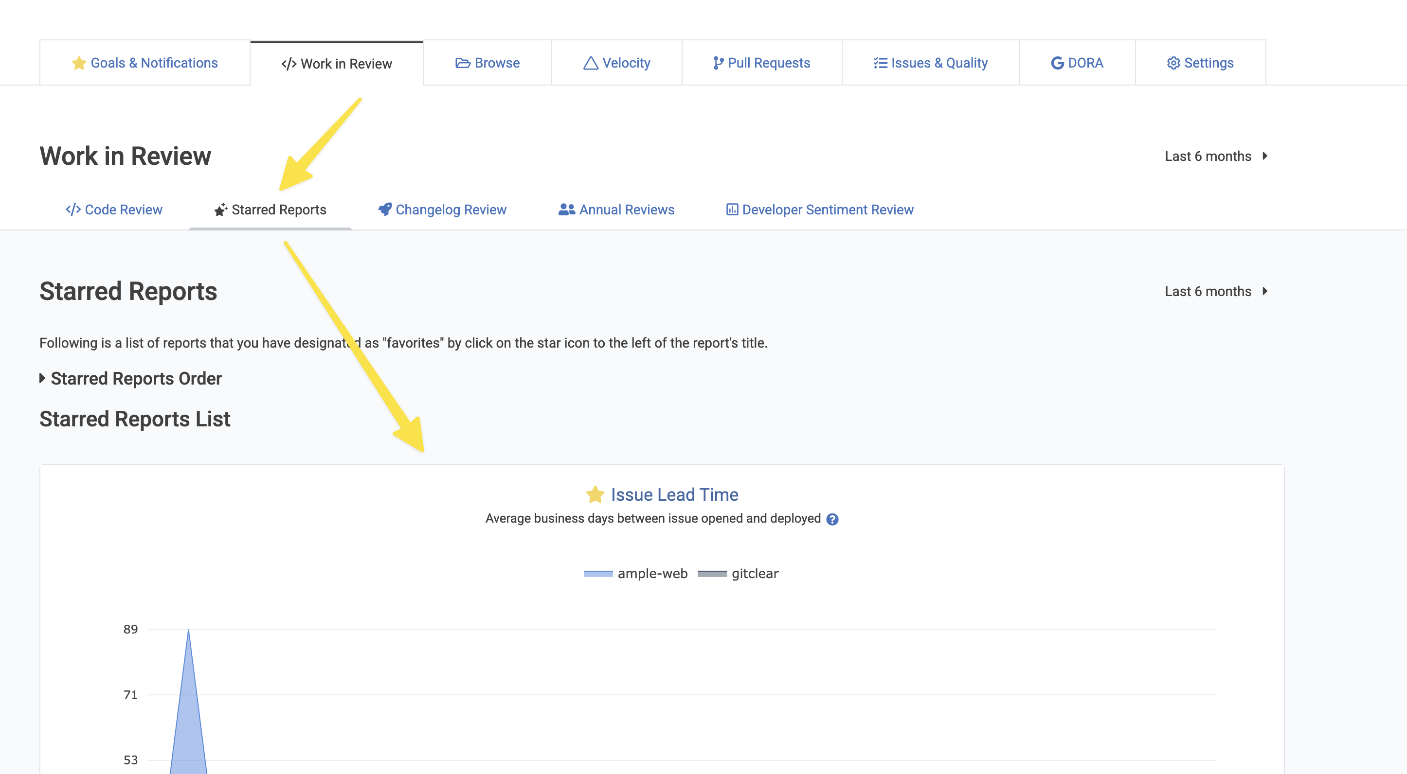
For programmers, Starred Reports can become a personalized dashboard of the metrics that matter most to your individual workflow and productivity tracking. Engineering managers can create focused views that highlight team performance indicators and quickly identify areas needing attention. Technology executives benefit from executive-level dashboards that surface the most critical organizational metrics without the noise of less relevant data.
linkSprints Now Processed
Charts and Date Selector screenshots will be added in the coming days, if we remember. But, as of July 2025, GitClear now parses all sprints for Jira projects that are imported. This means that we can allow users to view stats on a per-sprint basis, and pinpoint which sprint issues look most likely to slip based on the current trajectory.
Note that one new Jira permission was necessary to fetch all the desired Sprint detail, so you'll need to re-login to Jira (while logged in to GitClear) to get access to Sprint data.
link🔧 Significant Enhancements
The "the 1-3 day improvements" tier.
linkCommit Activity Browser Dates Affixed to Bottom of Viewport
For large teams, tracking dates while viewing commit history was challenging, especially with the new historical commit viewing capability. Now dates remain visible at the bottom of the viewport, even for massive teams like Facebook React.
linkSee Recent Commit Activity with Past Year's Context
Newly added to the Recent Activity module above the Commit Activity Browser:
Already possible: see "PRs awaiting your comment," "recent changelogs," and "open PRs"
Newly added: A sparkline glimpse at the team's Diff Delta over the past year. As you use draggable commit history, the sparkline highlight shifts to the region you're viewing
We could also make it possible to allow clicking a region of the year to scroll the Commit Activity Browser, if paying customers express belief that they would use it?
linkAllow Changing Chart Data Aggregation Methods
Chart data can now be aggregated by team, repo, or neither. User aggregation preference is persisted for charts in the "Starred Reports" gallery.
This includes a new corresponding API parameter for programmatic control with the Reports API: suppress_aggregation
linkToggle Commit Titles as Text in Commit Activity Browser
Even with long first sentences, commit titles are now limited to around 60 characters with the rest moved to descriptions. The truncated title displays in the Commit Activity Browser when the text icon is clicked. Commits are pushed away from each other more strongly when commit text is enabled.
Especially for teams that don't have ultra-dense commit activity, this is a great option to glance at what each commit is doing without the (half second) delay of a hover.
linkMore Options to Configure AI-Fueled Diff Delta Outliers
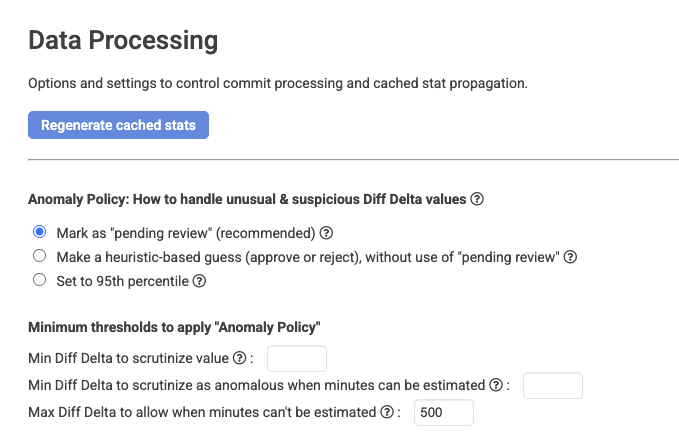
As AI continues to proliferate, there are an increasing number of situations where vast reams of new lines are added in minutes' time. How do you think this new 2020s wrinkle should be handled? There is no one right answer, so GitClear now offers three separate options for what to do when Diff Delta per hour is firmly in "outlier" territory:
Mark the commit for review, where the author or a team lead can estimate a percent of Diff Delta to give, based on how much of the commit is distinct, valuable and newly authored (or whatever litmus you count as "progress"). Such commits are now highlighted in Commit Activity Browser with a magnifying glass.
Reduce the commit's Diff Delta to the 95th percentile Diff Delta of commits made by the developer who authored it
Make a heuristic-based guess ("approve" or "reject") from the evidence available
You also now have the option for fine-grained control of the thresholds where code review should be considered
link"Issue Lead Time" Chart
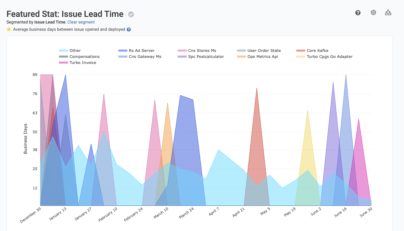
DORA stats now include measurement of Issue Lead Time, defined as business time between "issue opening" and "issue deployed or marked resolved." Includes averaged lead time calculations per time interval.
linkDORA Release History Tab
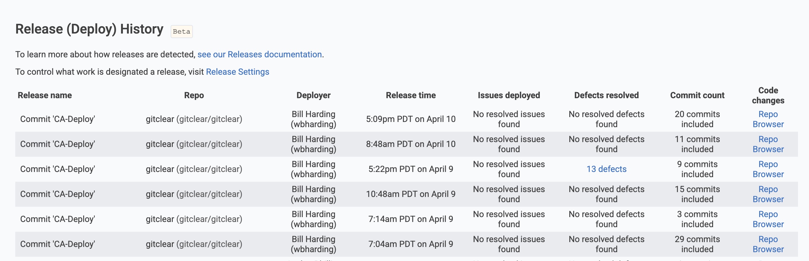
A new tab in the DORA section allows users to browse across all repos for what deploy/releases were made during a given time range. Each release shows the columns seen in the image. If you expect to use this data, let us know what other columns you would like it to contain?
Release Browser is now the default linked reports for charts pertaining to release velocity.
link⚡ Platform Improvements
Faster improvements that improve "fit and finish" of the GitClear experience for our daily users. ✨
linkEnhanced Team Switcher with Member Counts
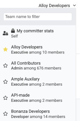
For large entities, the team switcher now shows how many members are on each team, making it easier to recall team composition.
linkSortable Favorite Reports
User favorite charts can now be sorted via drag-and-drop, allowing personalized presentation of your Starred Reports tab.
linkMagnitude Selector for Snap Changelogs
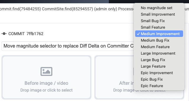
Instead of guesstimating the impact of a changelog based on its Diff Delta, we now combine Diff Delta with "issue type" (e.g., "bug," "feature") to derive the likeliest magnitude label to describe the change. But now, when the commit's Diff Delta does not fully express how significant the change was, the magnitude selector gives the changelog maker direct control of how important the change is compared to other changes in the Snap Changelog.
How do you think our small team found time to craft a blog post of this magnitude, anyway? Spoiler: we didn't. We combined the RSS feed for our Product Changelog with the Anthropic Artifact generator to get a first draft the blog post describing our past three months' improvements. Coolest part: The pictures/videos and change descriptions were pre-filled in each blog section. 5/5 experience, will cheat at expedite future blog updates
If you would like the three paragraph query I used to transform our changelog RSS into a draft of this blog, drop a line in the comments?
linkCustomize Initial Tab + "Dashboard" Button in Header
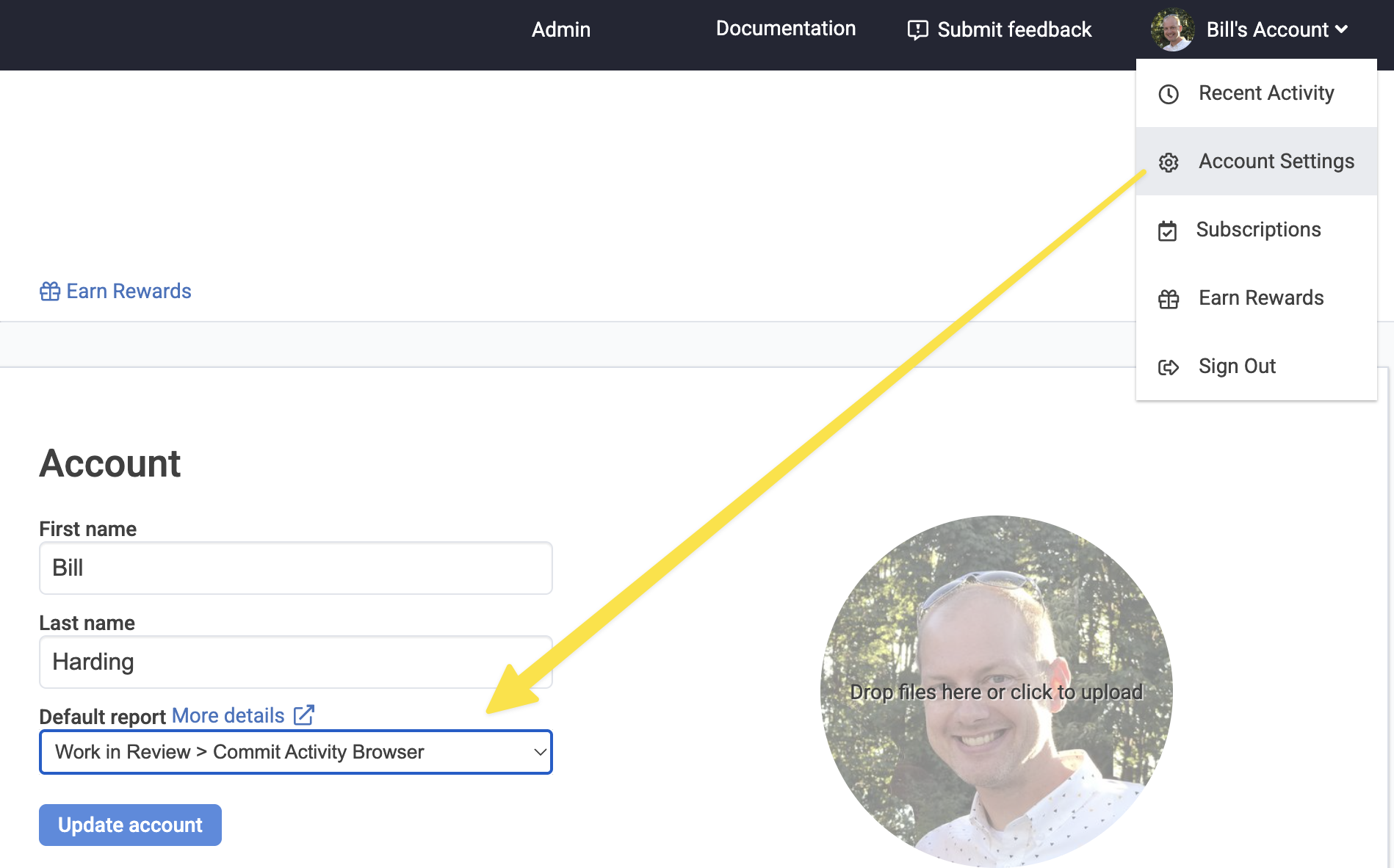
Users can now choose their initial report after login, and when clicking the "Dashboard" button present when visiting pages outside the scope of your entity. The "Default report" is configured under "Account Settings" after hovering on one's profile icon in the upper-right of the header.
linkEnhanced Commit Bubble Icon Explanations
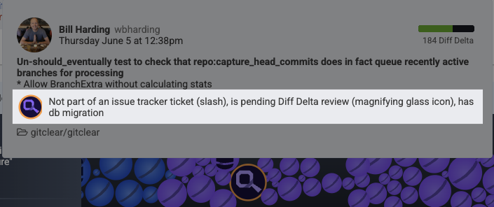
Hovering in the Commit Activity Browser now shows explanations of commit bubble icons with proper precedence hierarchy. In particular, the magnifying glass icon now calls out commits that appear to have potentially been AI-generated or copy/pasted from the web.
linkEnhanced Defect Timeline Visualization
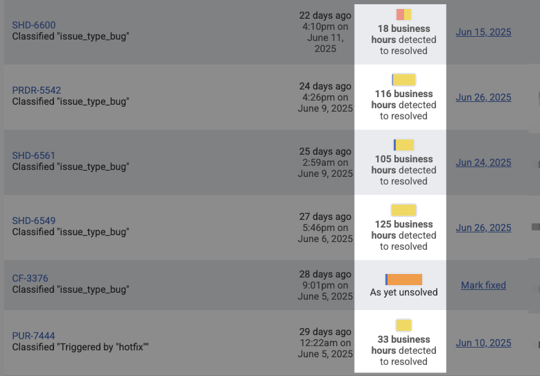
Defect timelines are now sized relative to the sum of defect time to resolve, providing better relative representation of the time it took to resolve recent critical defects. In general, evolving the Critical Defect Browser was a significant point of emphasis in early Q2 development, there are lots and lots of improvements to this dashboard. It has evolved sufficiently that we now use it as the go-to report to substantiate defect-based data aggregated on charts.
linkExpanded Slack Channel Support
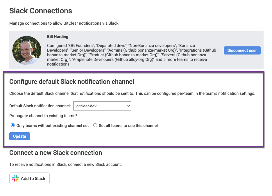
Teams with high numbers of Slack channels can now choose from among 200+ channels for notifications.
linkCritical Defect Field Configuration
linkImproved Awaiting Review Notifications
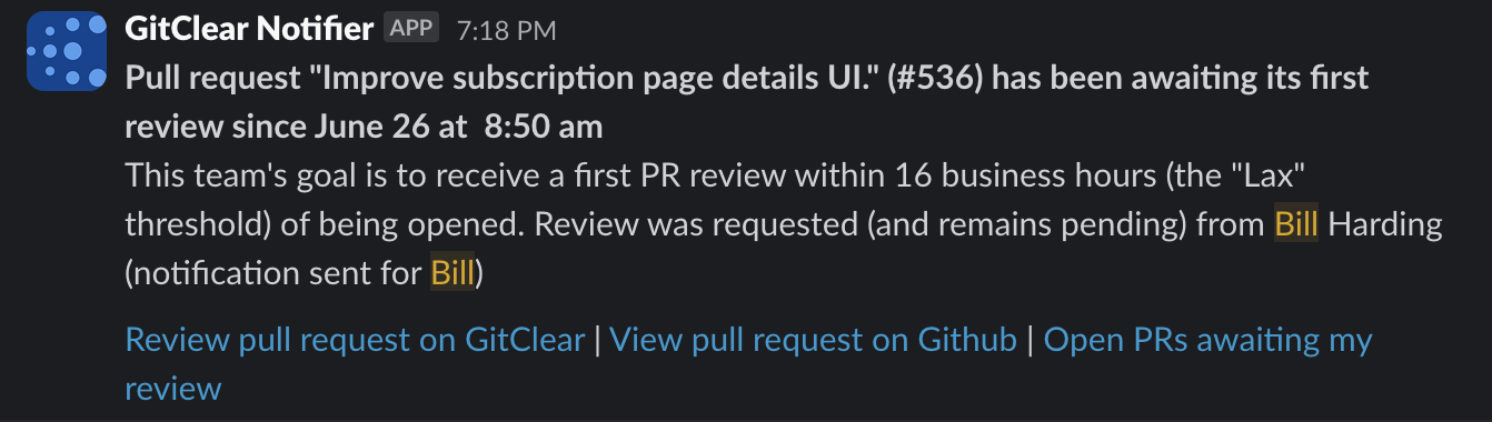
"Awaiting first review" notifications now link to both the review tab on GitClear and the git provider for better workflow integration.
link🛠️ Additional Updates & Improvements
This quarter also included numerous enhancements that improve the overall GitClear experience. All of this scaffolding was transformed from the changelog items designated "small" or "medium"
linkAPI and Integration Enhancements
New API Endpoint for Import Status: Documentation available for tracking repos being monitored without manual busywork
Sticky Index for API Documentation: Improved navigation for API reference materials
Enhanced Reports API: Now accepts multiple comma-separated committer user names
Jira Connection Improvements: New redirect system for entities without functional Jira connections
linkUser Experience Improvements
Snap Changelog Branch Removal: Users can now remove commit groups and branches from Snap Changelogs
Code Quality Tab Separation: Split stats into dedicated tab, so that all stats pertinent to code quality can be found in one location (and/or set as the "Default Report" if desired)
Experimental Settings: New experimental options available in user details pages
Enhanced Commit Details: Show all branches associated with commits in peek views
linkDevelopment and Performance Optimizations
50% Faster CAB Load Times: Commit Activity Browser caching dramatically improves performance for frequent users
Improved Delta Explanations: More detailed breakdown of reasons commits might lack Delta values
Enhanced Squash Commit Handling: Better processing and display of squashed PR commit (upon merging a PR as a squashed commit)
linkEnhanced DORA Metrics and Analytics
Release List Enhancements: Shows what triggered each release with filtering by RepoReleaseRule
Critical Defect Integration: Direct links from release lists to resolved critical defects
Default Tag-Based Releases: Repos now automatically demarcate releases when tags are pushed
Issue Browser Filtering: Filter by external ID, resolution status, and tracker projects
Defect Severity Filtering: Enhanced browsing with severity-based filters
Defect Aggregation Stats: Comprehensive statistics displayed on defect browse pages
Critical Defect Keywords: Ability to designate defects by terms in branch/PR or issue titles; "hotfix" now automatically interpreted as indication of Critical Defect
Story Point Correlation Analysis: Deep analysis of estimation accuracy vs. actual effort
Time Tracking Integration: Enhanced recognition of time tracking fields for correlation analysis
Business Days Conversion: Automatic conversion for hour values greater than 100
linkLooking Forward to Copilot & Cursor Measurement
GitClear and its customers are both surfing an unprecedented wave of progress. According to a recent Lex Friedman podcast with Google CEO Sundar Pichai, as of Google is authoring about 30% of their lines with AI, and has measured a 10% increase in "productivity" (quotes because he doesn't elaborate) so far.
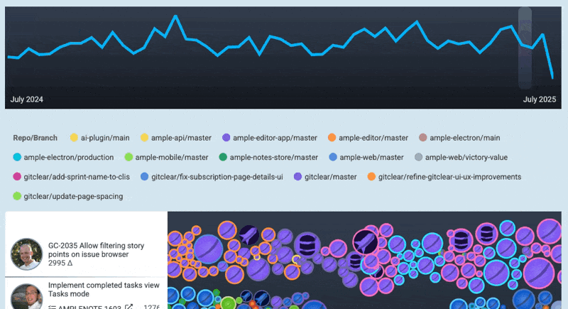
Our own measured increase in velocity certainly doesn't look like 10%:
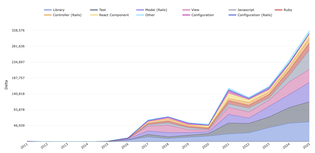
GitClear "Diff Delta per code category" since inception. Extrapolating from YTD velocity, 2025 is on pace to be more than 40% higher than 2024. 😳
What's the difference? We would like to say "it's the tools," but the data doesn't exist yet to prove it. The day-to-day bump in progress we have experienced seems to originated from a combination of IDEs and LLMs, as we have been documenting in our 2025 Evergreen LLM Coding Showdown comparison.
Qualitatively speaking, the difference is that, in past years, we would sometimes get stuck on a problem for awhile. In 2025, when the going gets tough, the tough get measuring how different LLMs compare on answering the hardest questions we can throw at them.
And that sets the stage for what's coming next down the pike: correlation between LLM usage and measurable outcomes. By the end of Q3, GitClear users of GitHub Copilot (plus, likely Cursor & others) will be able to visualize the trade-offs between "code maintainability," "velocity," and "developer satisfaction" that modern developer teams balance. It is apparent that human programming talent will multiply its potential with every passing year.
The potential to move faster and faster creates unprecedented opportunity. It also creates unprecedented risk:
To duplicate so much code that the growing project becomes unmaintainable
To leave humans stuck reviewing AI pull requests all day
To generate a repo so littered in FUD that it becomes a chore to comprehend & maintain
In the months to come, we'll help teams measure how each of these vary with the amount of AI code authorship. We will use the resulting work to deliver improved insights to developers, and to generate new empirical software research we can share for free with anyone who is curious about macro-trends in code quality.
As always, our comprehensive documentation has been updated with detailed guides for each new feature. We're excited to see how these enhancements improve your development workflow and look forward to your feedback as we continue building the future of code intelligence.
tl;dr GitClear continues to deliver a developer-friendly platform for Software Engineering Intelligence metrics. We help teams understand their code, get more done each sprint and ship less defects with AI. The pace of updates delivered in a single quarter prove we're more committed than ever to providing the transparency, insights, and developer satisfaction your team needs to meet its potential.