GitClear's home page brands us as "The first Developer-friendly analytics platform." Adopting a dual focus, to equally benefit "developers" and "engineering management," came naturally to us as a consequence of our parent company's tagline: "Software products dogfooded daily by people who love building software." GitClear's CEO and CTO both program daily, and we rely on GitClear to help us catalog what is getting done.
To help developers get an actionable sense for how GitClear can benefit them, we'll list a "5 Favorite Developer Features," and then zoom out for some final thoughts on how we would like to improve developer experience generally.
linkTop 5 Developer Features
This list counts down the 5 features that GitClear programming staff utilize to enjoy their job more.
linkHonorable Mention: Directory Browser
While it's not a feature we use every day, the Directory Browser: Where is time and energy focused in this project? is incredibly useful in situations that tend to happen a couple times per month:
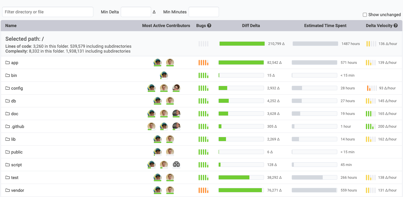
Which directories have received the most attention over the last sprint, last month, last quarter, etc?
Have any directories caused developers to consistently slow their change velocity?
Which developers have the most experience in a particular library/domain? I.e., who best to ask a question to for a particular section of the code?
Which actively-developed directories seem to potentially harbor tech debt?
How are file size/complexity evolving over time, especially in the files that seem very difficult to change (based on Delta Velocity)
This data can help developers make a case to management when they know there is a certain section of code that should be refactored, but it is otherwise difficult to prove what the benefit would be to it. Directory Browser gives you numeric substantiation for the extent to which progress is impeded.
linkHonorable mention: AI Impact Stats
Many Developers are incredibly curious to understand how their use of AI is impacting their velocity, their ability to later modify their own code, and many similar questions. GitClear's AI Impact stats that are launching in Q4 2025 will provide devs a window to understand the cases where AI offered them greatest benefit, vs cases where AI seems to have afforded an initial productivity boost that later evaporated when the code had to be debugged/maintained.
link5. Developer surveys: Advocate for Better Experience
GitClear makes it easy for Developers to request surveys to help executives gauge where lie the biggest opportunities to improve developer happiness and throughput. The documentation for setting up a Developer Satisfaction Survey is here.
The surveys come pre-built with more than 100 questions sourced from past research done by the Google DORA team. The surveys are intended to help developers bring attention to issues like:
Does a Continuous Integration process exist? Does it complete in a reasonable amount of time -- ideally less than 30 minutes?
Is it trivial to make a deploy of the app?
Do developers have the hardware they need to do their job well?
Does the mix of office vs remote work allow developers to maximize their potential?
What obstacles exist to ensuring developers get large, uninterrupted focus blocks?
The survey creator is able to curate how the results are used: it can be visible to all participants, downloaded as a CSV, or otherwise viewed on GitClear and shared via email. However the data is processed, we strongly believe that incorporating the collective wisdom of the development team is key for managers that want to deliver the best product.
link4. Annual Review tab: Skip a Chore
Annual reviews, quarterly reviews, even weekly reviews: they all carve away developer time/focus. There are few things more tedious than parsing through a dense wall of commit messages to recall the high points of what got implemented over a quarter or a year.
With the Annual Review tab, you get an immediate weekly- or monthly-breakdown of the main projects you worked on. You also get a glimpse at which areas you are a top-3 subject matter expert for your team.
link3. Snap Changelogs: Instant Progress Sharing with Anyone from Anywhere
You know that email that your PM nags you with every month or two about how they need a list of everything you've worked on lately so they can write up the product release notes / changelog?
We got tired of responding to that email. We also got tired of launching features but not having customers know that they were actually live.
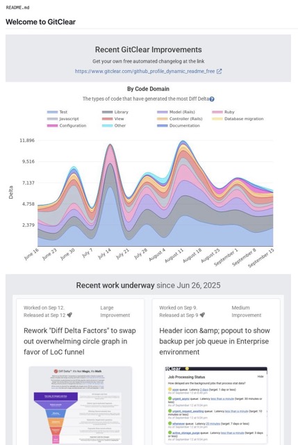
Snap Changelogs let a developer (or an open source team) show their audience (whether manager, customers, followers, etc) what has gotten done lately. Sometimes a Snap Changelog is a live-updating image, like this one:
But it can also be a fully navigable Commit Activity Browser, like we made for our favorite tech podcast, the Syntax Podcast. Or it can be something in-between, like the Amplenote Product Changelog or Bill's Github profile.
If you ever work on programming front-end or otherwise visualize-able features, this feature also integrates automatically with "Top feature #4," the Annual Review tab.
link2. Pull Request Review Tool: 30% Less Lines to Review
Maybe you prefer to let a video save reading 200 words? If so, here's a video showcasing what the GitClear Pull Request Review Tool can do.
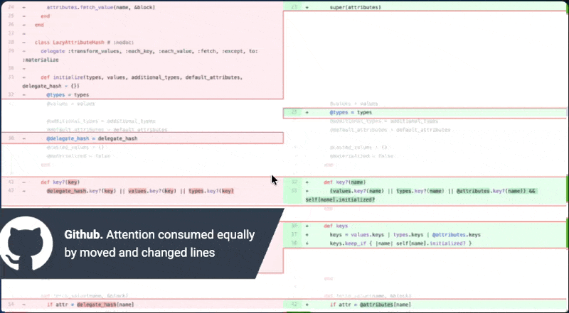
GitClear recognizes about 4x more code operations than GitHub, so you review fewer lines
You don't have to take our word for it: we commissioned an independent researcher to measure 49 developers, split evenly between two pull requests that would be randomly viewed on GitHub or GitClear. We surveyed them after to measure whether "faster review time" meant "less comprehension," and it did not.
Most importantly: Since GitClear automatically syncs PR comments back to Github, you don't have to commit to GitClear as your one-and-only PR source. In fact, we strongly recommend using GitClear alongside Github. It opens the door to receiving Copilot's PR comments, where they can be reviewed on GitClear in a more concise viewing format and/or dismissed as warranted.
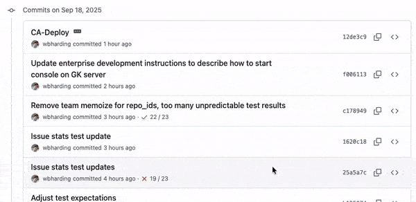
link1. Commit Activity Browser: Mission Control to Save Review Time
GitClear's single greatest cumulative time investment has been the evolution of our Commit Activity Browser (slightly dated Youtube Intro) into the current, history scrolling version now available to developers.
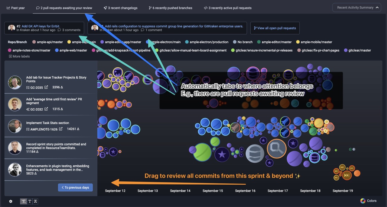
A daily dashboard to draw attention to what matters -- no status meetings, no missed code that deserves review, regardless of whether it traveled to main branch via pull request
What are the icons representing?
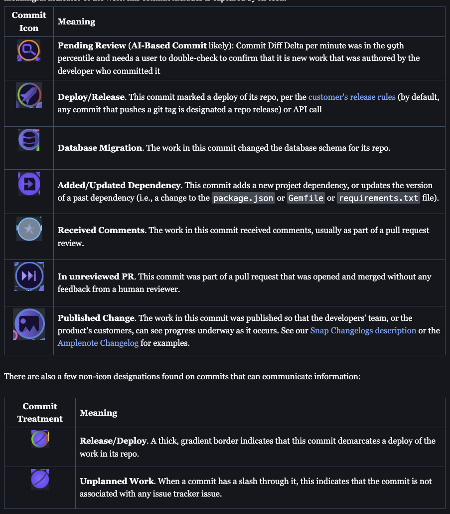
Several at-a-glance icons help interpret what work is happening in your repo(s)
Benefits that our developers take from the Commit Activity Browser?
Self-review own code on any schedule, across repos, to ensure that our recent changes are not overlooking important details
Affirm one's own progress, especially on days spent mostly working on backend code, or reviewing pull requests
See when commits are pushed that change dependencies, database schema, or commits that have received visual accompaniment as part of a Snap Changelog
See teammates' recent code automatically grouped together - peruse it at your leisure, either as-its-pushed, or in the days after. Less need for a rigid pull request process for small teams.
Fun to see animations and review latest commits as new commits are pushed
Highlight changes likely made by AI, to ensure they are consistent with repo conventions & quality standards
This is a topic we have written about extensively. Start with Quick Start Guide: Commit Activity Browser or the Recent Activity Summary (e.g., PRs where your review has been requested) which is embedded above the Browser on the "Work in Review" => "Code Review" tab.
linkEnsuring Developer-Friendly Metrics
GitClear goes beyond building tools for Developers - we have also built policies to reduce incentive for metric misuse. By ensuring that developers have control over who can access their long-term data, GitClear is unique in giving Developers a chance to participate in the conversation about "how to get the most from the team?"
GitClear also frames all metrics by team or by repo. Except where developers have granted permission, we avoid graphs that imply any kind of "developer ranking" or "precedence." We have built GitClear with the philosophy that transparent metrics and developer-friendly goals help to create healthy conversations where all parties are aligned in wanting to maximize the team's output.