Located under Velocity -> Delivery Consistency, the reports on this page help a manager or developer hone their sense for the cadence at which work is happening on their team. These reports shine when you sense that a team or developer are struggling to make consistent inroads into the tasks that have been assigned.
linkHourly Line Impact
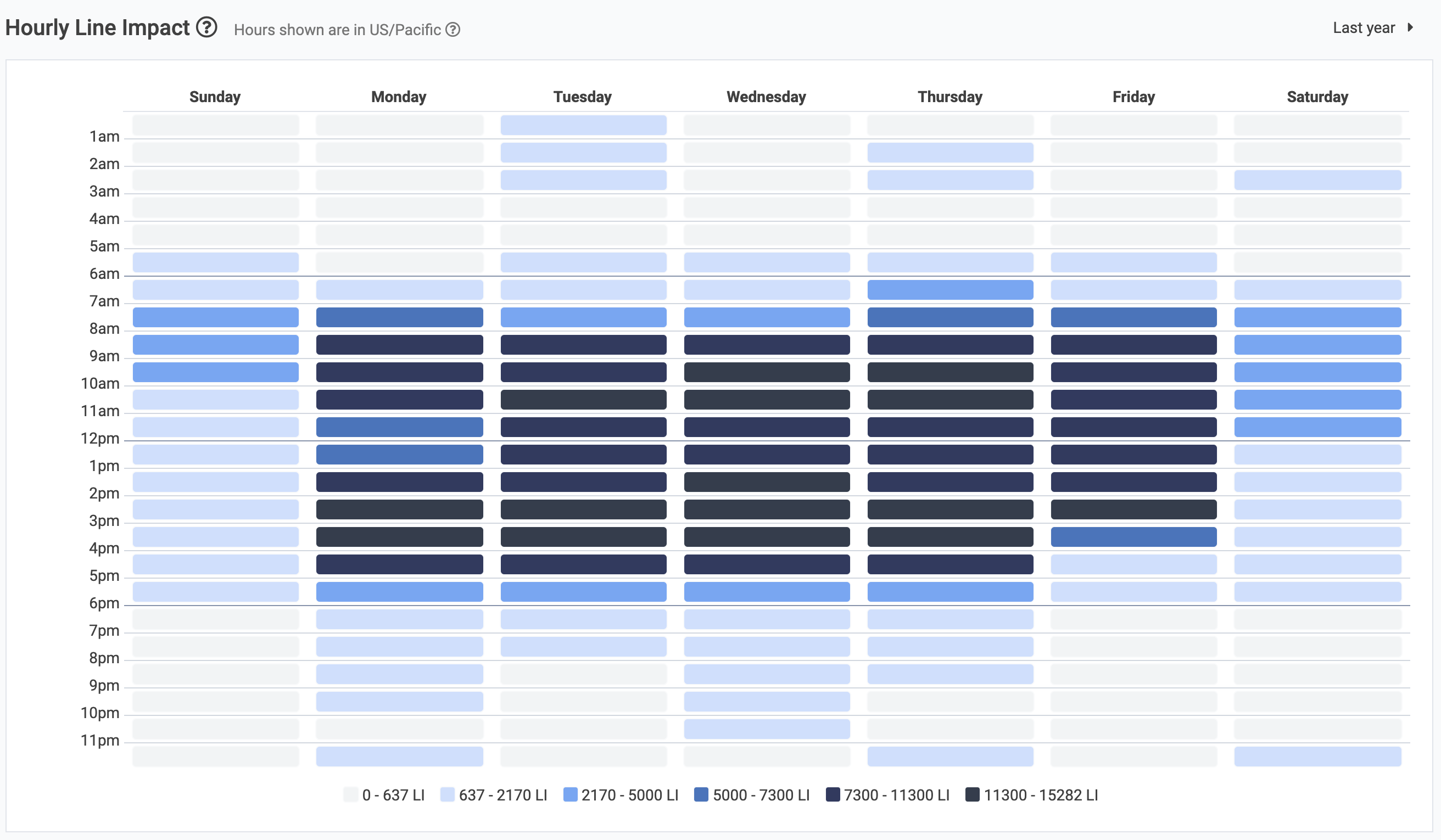
This graph shows how much Line Impact has been accumulated per hour over the time you've selected. Note that this graph does not simply count up how many commits were made each hour, like more naive "hour graphs" offered by competitors. Instead, the Hourly Line Impact graph uses factors in the duration of each commit to spread that commit's Line Impact across the span of time in which that commit took place.
For example, if a developer takes four hours to make a 100 Line Impact commit at 3pm, then the Line Impact graph would attribute 25 Line Impact for each hour in the range from 11am-3pm (the full length of time the developer was authoring the commit).
This graph is most useful when seeking to understand the impact of routinely scheduled meetings or events on developer productivity. The lighter blue areas (that fall within business hours) indicate productivity being lost to external factors. A good manager can intervene to eliminate any hours of the week that consistently produce less productive outcomes.
linkPunch Card

The punch card will show which days have the most active during the period selected. The radius of each circle on the calendar corresponds to the relative Line Impact for that day. Hovering over the circle will provide the number of commits and total Line Impact on the combined days during that period.