During a GitClear trial, customers are given the opportunity to upgrade to TrialPLUS by adding a credit card to their account during the trial. Here is a summary of the benefits that are unlocked for customers that upgrade their trial:
link📚 Higher repo import limit
Instead of being limited to 3 repos during the trial period, up to 10 repos can be selected for import.
link🕰️ Higher history limit on Commit Activity Browser
In a standard (basic) trial, it's possible to scroll through history up to 10 days. In a TrialPLUS subscription, it's possible to scroll up to a full month back through the history of the repos selected.
If the customer goes on to become a paying GitClear subscriber, all limits to Commit Activity Browser history are lifted.
link🧙 10x more Data Deep Dives
The basic trial offers 1 Data Deep Dive question. TrialPLUS allows up to 10 Data Deep Dive questions to be asked.
link🕵️ Double the history length for charts
In a basic trial, it's possible to see up to 90 days (one quarter) of history for any chart. In a TrialPLUS subscription, up to 180 days (half a year) worth of historical data can be browsed.
Upon becoming a paying customer, a user can get 3 years of history (for Pro) or 15 years of history (for Elite).
link♻️ Unlocked chart: Churn Line Percent
On the Delivery Velocity tab, it becomes possible to see the amount of churn code that is occurring within the selected team+repo combination. This chart can also be added to the user's Starred Reports, where it can be used to pinpoint teams or repos that have an especially high rate of churn (code that is revised or removed within two weeks).
link🧑🦳 Unlocked chart: By Provenance (Code Age)
The "By Provenance" graph is one of the most useful graphs GitClear offers for those who want to understand their team's patterns in interacting with legacy code. It shows how much of recent work has been dedicated to updating or deleting various-aged code lines.
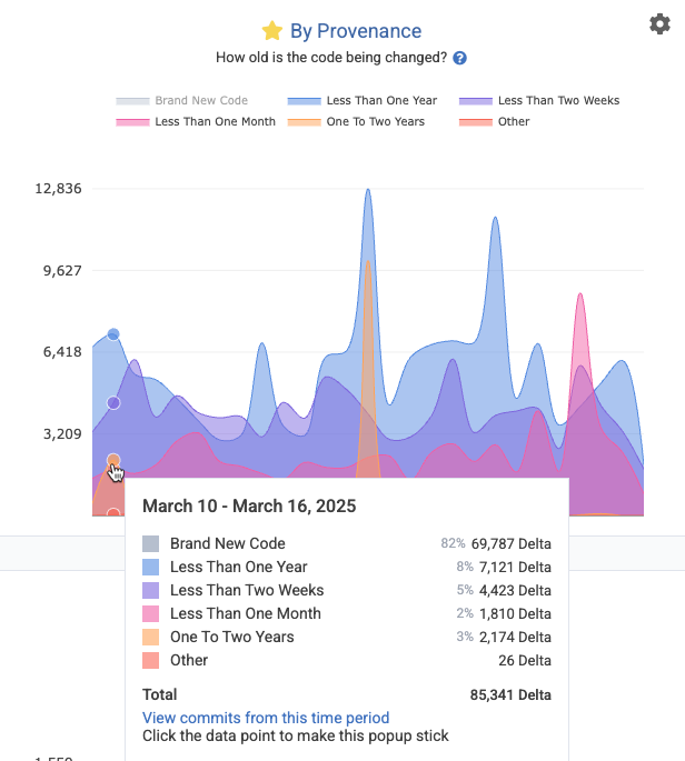
Appearance of the Provenance Graph after using the settings icon to switch to "Overlay" view, and click "Brand New Code" to hide the dominant segment
Healthy dev teams that excel at reusing code will often see 70% or less of their code lines being "brand new." The more that the team makes a habit of incrementally revising old lines, or deleting legacy code, the more continuity, documentation, and test coverage the repo will typically enjoy. GitClear recommends striving to minimize code revised in "Less than One Month" and "Less than Two Weeks," while maximizing the other categories that aren't "Brand New Code."
link🚀 Unlocked chart: Release Phase
How much work is being deployed with each release? The "By Release" graph (aka "Release Phase" graph) under the "Delivery Velocity" tab shows the largest releases by Diff Delta over the recent time period. It also shows how much code is pending release.
link🗃️ Unlocked chart: Duplicate Lines per 1k Changed
On the Delivery Velocity tab, the "Duplicate Block Line Count" chart shows the prevalence of code blocks with 5+ lines of non-keyword, non-blank, non-standard blocks of code that are duplicated within the repo.
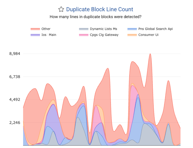
Duplicated Blocks often become much more prevalent with heavy AI use, so this chart offers one of the more effective opportunities to gauge the extent to which the team may be using AI without attention to typical best practices (to implement a single, canonical version of each method).
link🏭 Unlocked chart: Comparative Industry Stats
Upgrading to TrialPLUS opens access to view Velocity => "Industry Benchmarks," where you can see how your team's Diff Delta velocity compares to bellwethers like Google, Amazon, Microsoft, as well as to various-sized companies like "Enterprise," "Mid-sized," and "Startup."
link🗓️ Unlocked chart: Hourly Velocity
Under "Velocity" => "Delivery Consistency," it becomes possible to spot the presence of any "dead spots" in the team's productive output. In effect, this chart can serve as a means to detect whether there are meetings that are crushing the throughput of the dev team. It also makes apparent the extent to which the team may be making a habit of working on weekends.
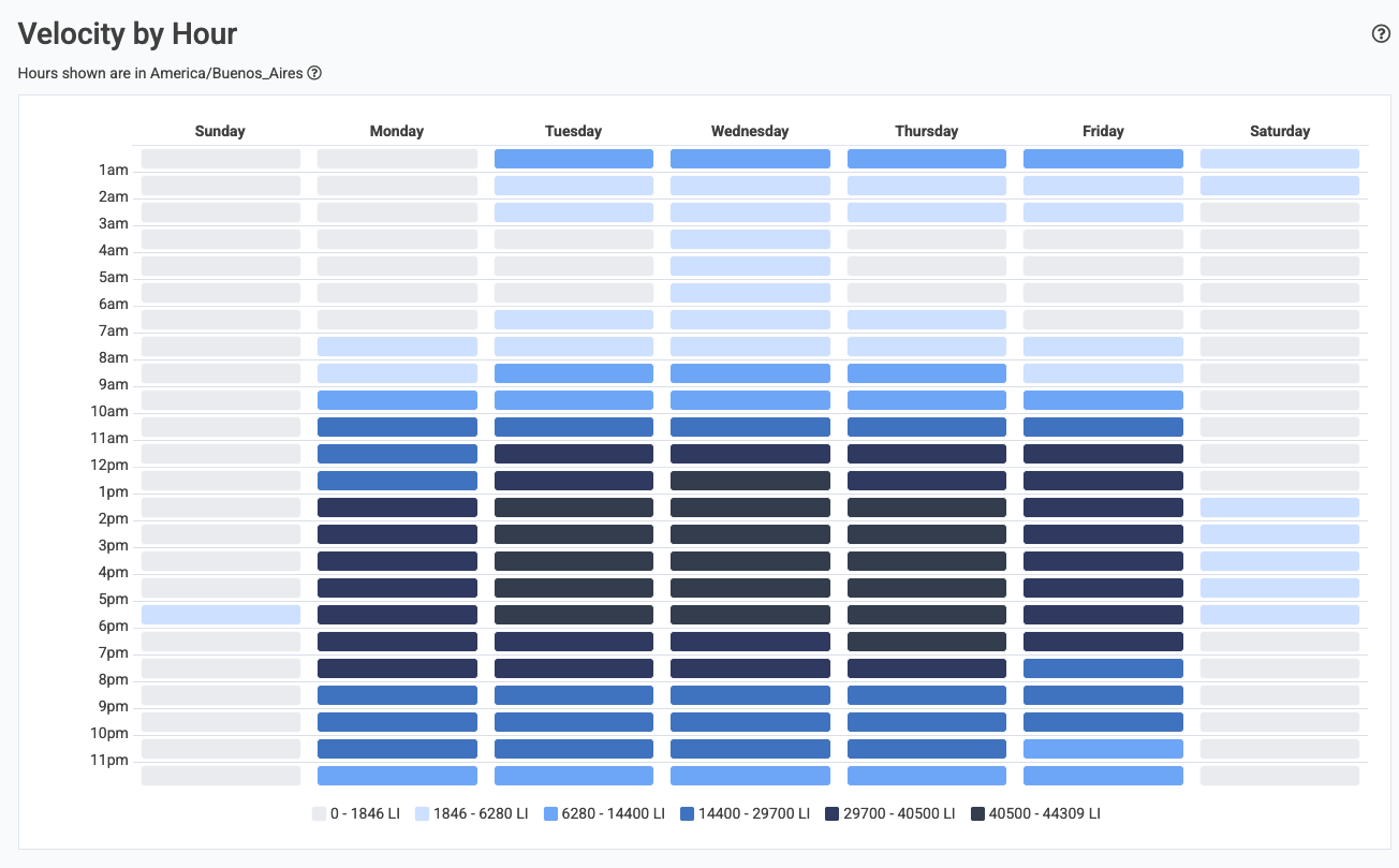
A typical Velocity by Hour graph will have 90% of the activity within a 8-10 hour range during weekdays