For the first 20-or-so developers that work together, the opportunities to optimize behavior are usually centered around the Pull Request and Code Quality reports.
But for our true Enterprise-sized customers, with 50+ developers spread across 10+ teams, it becomes essential to zoom out. VPs and executives at large companies need to work at a many-teams scale, and that is what GitClear's "Outlier Mode" within Starred Reports can offer:
Outlier View is a team-centric executive dashboard. It provides a highly customizeable interface to drill down into the stats that matter right now, this quarter.
linkSet up: Pick from 50+ reports that correspond to your KPIs
Over several years of working with large customers, GitClear has accumulated more than 50 different developer metrics to build your dashboard from. If you would like GitClear's experience-based advice on which metrics to track for your situation, email us us with 1) your team size 2) current goals. We'll send back 5-10 starting suggestions (+ why).
Refer to the Starred Report documentation to see videos and screenshots where charts are picked to be added to the "Work in Review" => "Starred Reports" tab. If you don't have time to read Starred Report documentation, the basic idea is simple enough: click the star next to the report name. Do this whenever you find a report that corresponds with your KPIs or goals:
Every chart on GitClear has a ⭐ next to it. Click an empty star to add it to your Starred Reports
You can collect charts from several different tabs. Help pages are linked, or you can visit any yourself by navigating to the tab names when you are logged in.
Remember to connect your issue tracker (a free, 1-minute Oauth login) to unlock DORA & issue stats!
linkChoosing Outlier View Options
Once you have configured your gallery of Starred Reports (you might want to change this tab to your default?), you can turn on Outlier View by clicking the button on the filter on the Starred Reports page. It should look something like:
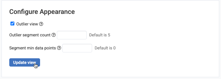
As explained by its tooltip, "Outlier segment count" controls how many outliers you'll see for each report. "Segment min data points" controls how many data points a segment (usually a team) needs to have within your range for it to qualify. For our Enterprise customers (particularly those with more than 20 teams), we recommend settings like:
The "Segment min data points" becomes relevant when you are looking at teams that have the least amount of something undesirable, like "Issue Lead Time." Ideally, you want teams to have a low Issue Lead Time (time from issue "opened" to "deployed"), but if a team was only active for a single week in a three-month data window, you might not want to see that team, even though they scored a very low value during the single week they were active. Setting "Segment min data points" to 5 ensures that you'll only see teams or repos ("segments") that had at least five dates of activity over the time range you select.
linkBrowsing Outlier Teams
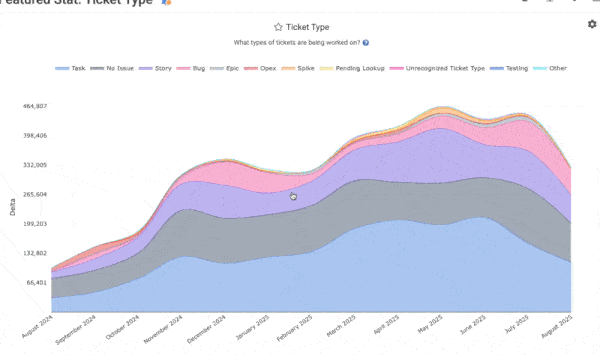
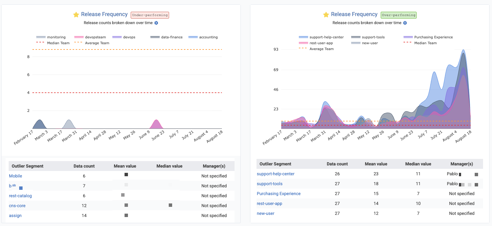
Once you click "Update view", you'll see each of your charts, segmented by "Team" or by "Repo." For example, which Teams have made the greatest number of deploys during the past six months?
The Team Manager is in the best position to understand the circumstances of their team's performance. Remember: It's often possible that a developer with low stats is one that is providing value to their teammates (a multi-time front-page Hacker News story is The Worst Programmer I Know).
By viewing stats per-team, an executive can quickly understand where more resources, documentation, or counsel may be required
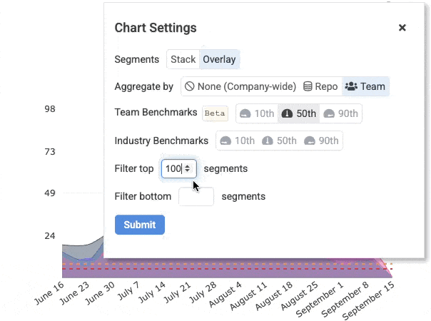
To toggle between viewing stats per-Team or per-Repo, hover on the graph and choose the gear ⚙️icon:
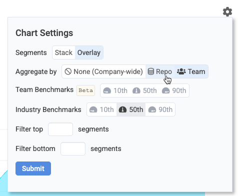
Change the "Aggregate By" option to switch between seeing "Repo" and "Team" outliers
Segmenting by repo can be useful when interpreting stats like "Hours until first pull request review":
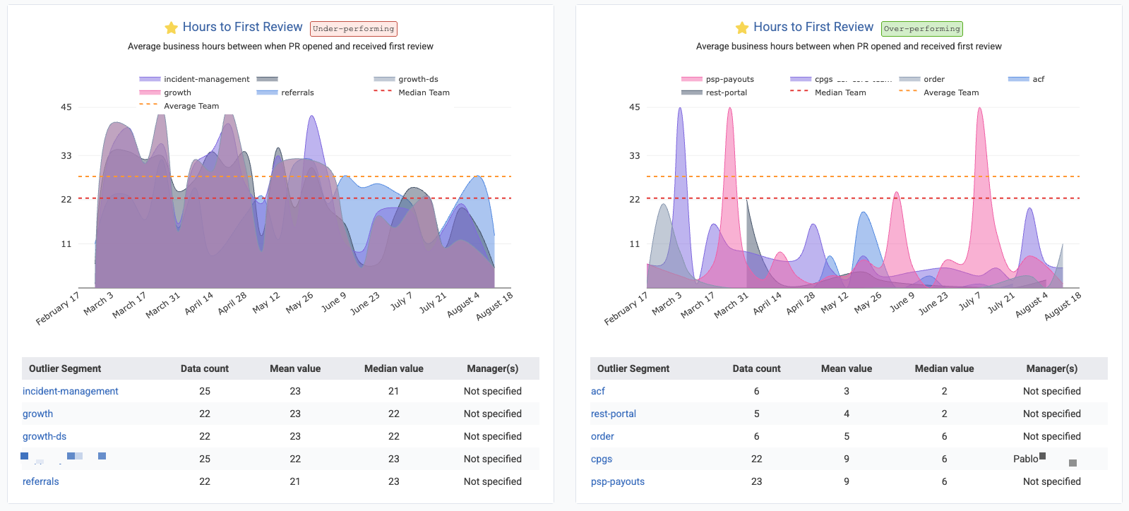
You may have noticed that most of these charts present a line showing the "Average" and "Median" value for the stat. This is enabled when you click the "Team Benchmarks" option for "50th" percentile line. As of Q3 2025, this feature is still in beta, and not available for all charts. It will become available on an increasing number of charts as we observe which charts users pick for their gallery of Starred Reports.
linkBrowsing Outlier Team Members
One of the most common questions we hear from managers who are trying to promote AI use throughout their organization is "who are our role models?" when it comes to adoption?
The Outlier View, toggled by "Team Member" helps to answer questions like these:
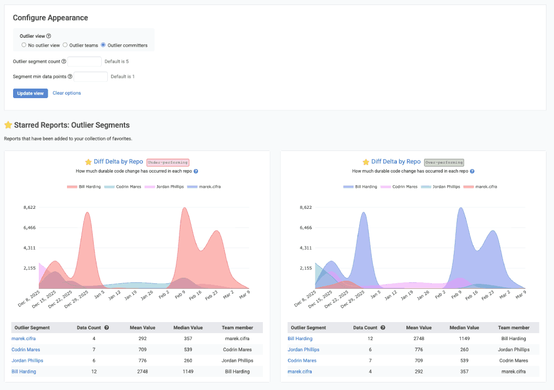
Outlier team members rendered for each of favorite reports
Note that "Outlier by Team Member" can not be applied to certain stats, like "Defect lead time," where there is no often no attribution possible for a single team member for an abstract metric like this. It is only possible to present outliers for segments that can be attributed to an individual's activity.
linkDownloading CSV Data for LLM Analysis
Outlier Reports enable a popular strategy for business leaders that want to synthesize multivariable performance into a narrative suitable for executives. By downloading chart data as a CSV, it's possible to retrieve files that give a per-date, per-team assessment of how various teams or repos have fared during the time range selected.
By default, an Outlier Graph will download the number of segments that were specified by the "Outlier segment count" described in "Choosing Outlier View Options," above. If you want to return more data, use can hover on a chart to gain access to "Char Settings," and choose a large number of segments to filter, like 100:
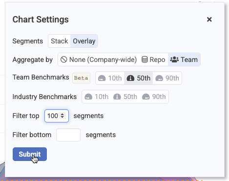
Choose a large number of segments before downloading CSV data to maximize data provided to an LLM
After you have chosen the desired number of segments, you can hover over the chart again to click the "Download" icon, for any subscriber with an "Elite" or "Enterprise" subscription: